Little girl pictures for critique
May 23, 2012 23:47:10 #


May 24, 2012 00:30:40 #

Photos 3-4 are very charming, and well done.
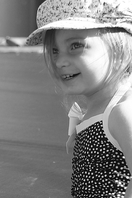
#1 and #2, however, are sadly lacking in the lighting department. #1 in particular: Look at your shadows on her face as related to the highlights. This can be a project for you, to actually see how the light is falling on your subject when they look this way, or that way.
It's not the easiest thing to do! Many have trouble with this, so don't feel like the Lone Ranger!
May 24, 2012 00:35:37 #
Danilo wrote:
Photos 3-4 are very charming, and well done.
#1 and #2, however, are sadly lacking in the lighting department. #1 in particular: Look at your shadows on her face as related to the highlights. This can be a project for you, to actually see how the light is falling on your subject when they look this way, or that way.
It's not the easiest thing to do! Many have trouble with this, so don't feel like the Lone Ranger!
I agree on 1 and 2. It was bright out, I had an area set up with a reflector but to keep the kiddo in that area wasn't easy, or to keep following her around with it. Even though I didn't get it right was my thinking correct in that a reflector of some sort would be best for the shadowing on her face?
May 24, 2012 05:48:40 #

Perhaps using flash would have been a better option as she wouldn't stand still long enough to use the reflector. I have had good luck with going that route.
May 24, 2012 05:58:35 #
May 24, 2012 06:45:03 #

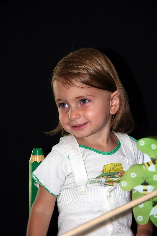
Well you chose a great subject! The camera loves her! There's not so much wrong with any of these pix that can't be solved with some thoughtful PP with the possible exception of some skin detail on 2 that's completely blown out. Most software these days will have the tools to solve the minor problems you have in these pix. your compositions are good but 4 has some distractions on the bottom right that I'd remove by some selective cropping. All your images are a good place to start the pp process.
J D
J D
May 24, 2012 07:33:47 #

May 24, 2012 11:03:27 #

I think these are very nice photos of a very cute little girl. It's a thing to always want better but don't be disappointed in what you have now.
May 24, 2012 11:07:23 #

May 24, 2012 22:39:30 #

In one and two there is no squinting from looking into the sun. And the trees in the background make the first picture very natural. It also helps to have the charming model. I think every relative would pay dearly for those pictures.
May 24, 2012 22:54:42 #
Lovely girl with lovely eyes. Please keep trying and be wary of the strong contrasty lighting (as in picture 1 & 2). You can use a white reflector, bedsheet, cardboard, etc to throw some light back to the shadow areas. This will reduce the contrast and the camera will cope better with that. The digital sensor, like the old slide film, can only cope comfortable with a 5-stop difference between the lightest and darkest areas.
May 25, 2012 05:29:32 #

All 4 of them are nicely composed! Though on on hand I'd have to agree with Danillo (photo #1), on the other I'd say #2 was perfect! The strong side,ish lighting actually makes her face and eyes "pop"!! As a monochrome, to shade the sun or to use fill lighting may have detracted from the hilighting!! Keep shootin!!!
May 25, 2012 22:37:58 #

May 26, 2012 01:53:09 #

Well, I am going to buck the tide here, which is not unusual for me.
Numbers 1 and 2 are your best images of the four. They are real, candid shots of a wonderful child outdoors. The "moon" of the face and the eyes are well taken and seen. None of the shadows are blocked up, nor are there any blown out highlights of anything important. Both of these images are "real", with number 2 being a potential contest winner. . .very likely a "Peoples Choice". These are both fresh, natural and alive.
Number 3 is a cute and well taken "snap shoot". Great for the family; but, not a contest winner.
Number 4 is just not very good at all. The lighting is horrible, as is the black background which swallows her head. A very poor attempt at a studio shot, which just does not work. Her face and skin have the look of paste.
That's my story, and am sticking to it! :)
May 28, 2012 02:01:05 #
mooseeyes wrote:
Well, I am going to buck the tide here, which is n... (show quote)
Thanks for your comments. I like #2 best myself.
You'll have to see my post titled 'Go ahead laugh at me" to see why the lighting on #4 is so bad! ;-)
If you want to reply, then register here. Registration is free and your account is created instantly, so you can post right away.