resubmitting Help with choice for competition
Oct 22, 2016 08:34:50 #
I posted yesterday, but all the photos did not go thru. My local clubs annual print show is coming up. We have many categories. We are allowed to enter 4 photos.
I will list the category with each photo that I would put it in. there should be 6 photos to choose from. Please tell me your favorites, or even if you don't like one.
Your constructive criticism is welcome.
I will list the category with each photo that I would put it in. there should be 6 photos to choose from. Please tell me your favorites, or even if you don't like one.
Your constructive criticism is welcome.
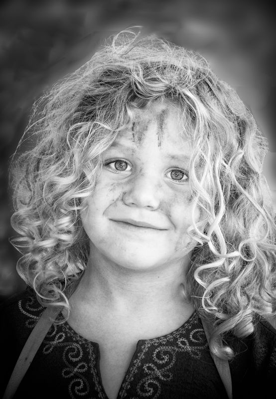
Portrait

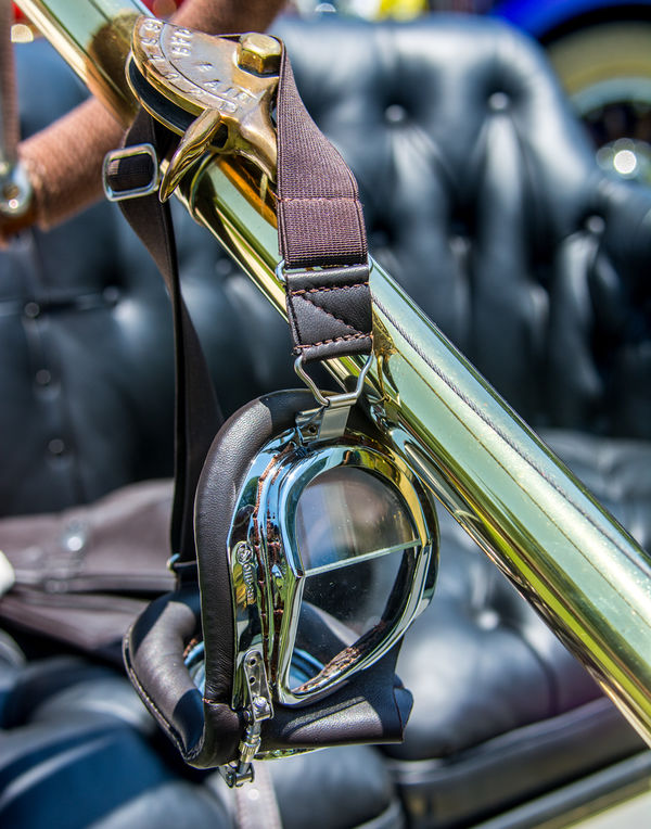
Hand of Man( made by Man)
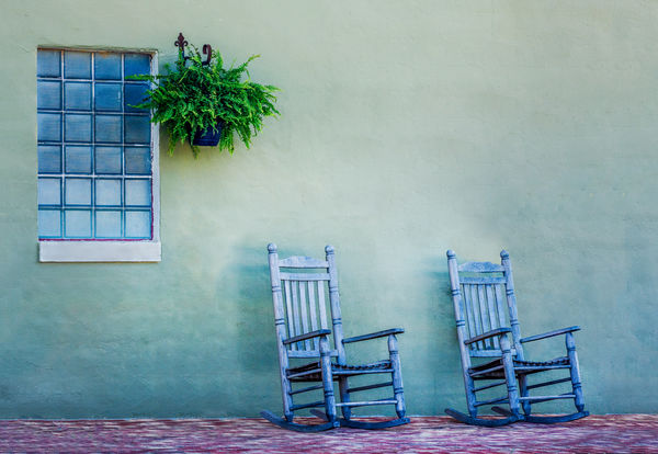
Portrait B/W
Hand of Man( made by Man)
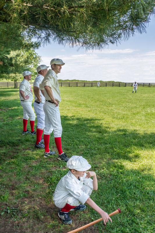
Sports
Architecture
Oct 22, 2016 08:44:25 #

I really like them all. The first one is too posed. my first choice is either the stairs or the two rockers. really nice work.
Oct 22, 2016 08:51:17 #
Oct 22, 2016 08:54:42 #

philo wrote:
I really like them all. The first one is too posed. my first choice is either the stairs or the two rockers. really nice work.
Agreed. Those two are my favorites as well. Very nicely done.
Oct 22, 2016 09:27:12 #

Oct 22, 2016 09:52:49 #
Wayne there are 2 hand of man's. the rockers and the driving goggles which one of them did you like
Oct 22, 2016 09:57:30 #
Oct 22, 2016 10:13:04 #

As a previous judge Hand of Man and Architecture are the clear winners.Good luck. Let me know how you did please.
backroadgirl wrote:
I posted yesterday, but all the photos did not go thru. My local clubs annual print show is coming up. We have many categories. We are allowed to enter 4 photos.
I will list the category with each photo that I would put it in. there should be 6 photos to choose from. Please tell me your favorites, or even if you don't like one.
Your constructive criticism is welcome.
I will list the category with each photo that I would put it in. there should be 6 photos to choose from. Please tell me your favorites, or even if you don't like one.
Your constructive criticism is welcome.
Oct 22, 2016 10:14:35 #
To clarify, the hand of man with the two rockers.
backroadgirl wrote:
I posted yesterday, but all the photos did not go thru. My local clubs annual print show is coming up. We have many categories. We are allowed to enter 4 photos.
I will list the category with each photo that I would put it in. there should be 6 photos to choose from. Please tell me your favorites, or even if you don't like one.
Your constructive criticism is welcome.
I will list the category with each photo that I would put it in. there should be 6 photos to choose from. Please tell me your favorites, or even if you don't like one.
Your constructive criticism is welcome.
Oct 22, 2016 14:13:44 #

Oct 22, 2016 17:56:22 #
Oct 22, 2016 17:59:14 #
Oct 22, 2016 18:33:45 #
Oct 22, 2016 22:13:17 #
i do tone adjustments bring down highlights, bring up shadows, white up slightly, black down slightly add clarity it gives a crisp detailed photo
objects or city scare can be given extreme adjustments, be careful on people though it can get scary
objects or city scare can be given extreme adjustments, be careful on people though it can get scary
Oct 23, 2016 05:52:59 #

backroadgirl wrote:
I posted yesterday, but all the photos did not go thru. My local clubs annual print show is coming up. We have many categories. We are allowed to enter 4 photos.
I will list the category with each photo that I would put it in. there should be 6 photos to choose from. Please tell me your favorites, or even if you don't like one.
Your constructive criticism is welcome.
I will list the category with each photo that I would put it in. there should be 6 photos to choose from. Please tell me your favorites, or even if you don't like one.
Your constructive criticism is welcome.
First all are great images!!!!
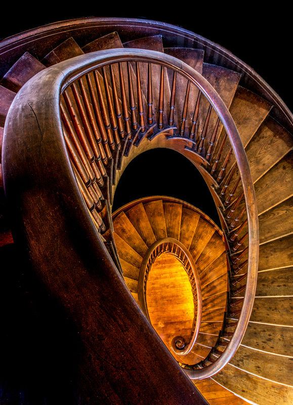
Having sat in on club competitions for 10 yrs # I would enter #2 The chairs and #6 The stairs
#1 The subject is too close to the right side of the frame
#5 The image while tech, good is boring
#4 There are too many blown out highlights ( little white spots with no detail )
#3 While I like the image I feel there will be stronger portraits in the competition, I can,t put my finger on it but it is lacking something.
The subject is wonderful.
If you want to reply, then register here. Registration is free and your account is created instantly, so you can post right away.