Tough guys do not dance
Oct 15, 2016 09:10:22 #

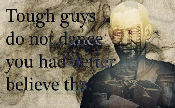
All photos taken by me in Subic Bay Philippines. Made as a design for a tee shirt rather than a wall hanging picture.
For your consideration
.
For your consideration
.
Oct 15, 2016 17:31:26 #
Frank2013
Loc: San Antonio, TX. & Milwaukee, WI.
Technically well done Mr. Spad, but artistically above my head, which ain't hard to do.
Oct 15, 2016 20:32:17 #
Frank2013 wrote:
Technically well done Mr. Spad, but artistically above my head, which ain't hard to do.
Why do you feel its artistically above your head young Frank. Just a tough looking guy with a confident smile in a quite stark and almost brutal enviroment who is saying with a half smile on his lips that it may be a good idea not to ask him to dance. And what is behind the smoke surrounding his statement?
Who said Billy does not think about his images huh.
If you meant the execution was beyond you actually its quite easy my ol' pal. Thank you for calling by I do appreciate it.
Oct 15, 2016 20:50:02 #

Billyspad wrote:
All photos taken by me in Subic Bay Philippines. Made as a design for a tee shirt rather than a wall hanging picture.
For your consideration
.
For your consideration
.
Very creative approach and a good tshirt color. This may be exactly what you want it to be but I'm not gonna buy the tshirt. I like the color and the arrangement of elements (man, words, extra graphics) seems balanced properly for display on tshirt. I find the top of his head to be too bright (that's all my eyes want to go to). I don't like the construction elements or whatever those poles are that run in front of his eyes because they make him look zombie-like. I am not a fan of the hairy stuff in the larger background. I can't read the parts of the words that are hidden in the darkest areas of the hairy stuff and the shoulder, even though you've tried to differentiate them with type-fill. So while the concept is artistic and has pleasing design elements, I guess the execution doesn't work for me. So it's a good tshirt but for someone else. . .
Oct 15, 2016 21:10:53 #
Frank2013
Loc: San Antonio, TX. & Milwaukee, WI.
Billyspad wrote:
I would never...Who said Billy does not think about his images huh.
Billyspad wrote:
No not really, I was referring to the first part.If you meant the execution was beyond you
Oct 15, 2016 22:40:05 #
minniev wrote:
Very creative approach and a good tshirt color. Th... (show quote)
I have to admit min my tee shirts are not really designed for women. I am an old fogey and hate to see women in tee shirts with sassy type comments " Boys need not apply " or similar.
The bright head will tone down in the printing process.
The print that needs a close inspection is on purpose. I like to think my tee shirts aid meeting people who want a closer look to work out a design or a part of it so always add a weird bit or an obscure bit. I shall get this printed wear it with pride over my puny chest and I guarantee the first visit to the supermarket will involve me in conversation with a stranger more often than not a woman as females pay more attention to clothing. I discovered this purely by accident but worn in the right way my tee shirts act as 100% cotton Viagra for any guy who feels the need.
I mention this fact purely for the attention of others as ol' Billy is kept on a very short leash by the delightful and enchanting Mrs Billy. She acts as repellent when Billy is besieged by women wanting a closer look at his apparel. Good looks and a cute tee shirt design is just too much for the gals hereabouts.
Just beware of buying one for the men in your life min!!!!
Oct 15, 2016 22:43:01 #
A highly interesting and imaginative composite, Billy. The letter "t" at the end of "that" is a bit difficult to read, which shouldn't be too hard to fix up. Beyond this, I like everything about the image. Pleasing tonal palette and a nice overall layout. I can see myself buying a tee shirt or coffee mug imprinted with this image for sure.
Oct 15, 2016 22:48:27 #
rook2c4 wrote:
A highly interesting and imaginative composite, Billy. The letter "t" at the end of "that" is a bit difficult to read, which shouldn't be too hard to fix up. Beyond this, I like everything about the image. Pleasing tonal palette and a nice overall layout. I can see myself buying a tee shirt or coffee mug imprinted with this image for sure.
Thank you for dropping by my friend. See my reply above to min re the difficult to read print. I shall think about it before printing but the obscurity is there for a reason.
If you want to reply, then register here. Registration is free and your account is created instantly, so you can post right away.