Contrasty Black & White
Sep 15, 2016 16:13:24 #

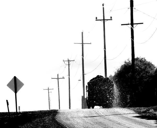
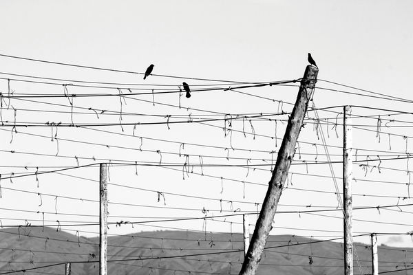
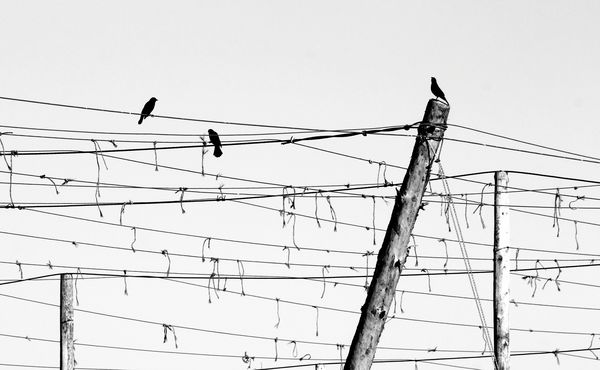
Wonder if either of these appeal, and why/why not. Suggestions and edits welcome. Thank you!
Sep 15, 2016 16:29:15 #

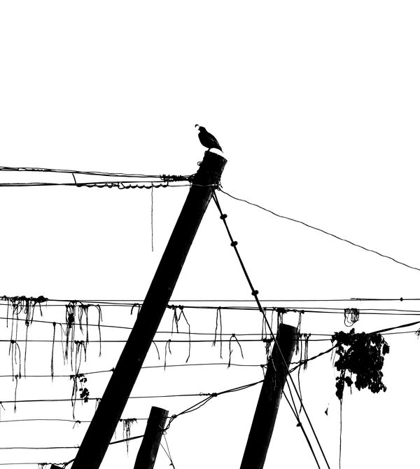
They both appeal to me, it's the kind of stuff I like. I think I would also like the top one cropped down to show just one bird and the landscape on the bottom cropped out. So all you have is lines.
Sep 15, 2016 16:36:52 #
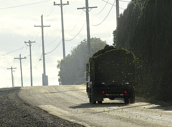
Well, you know me, Linda, I'm all over black & white, so yes, I do like them. What interests me in the first is the material spilling from the truck and catching the light (without which there would be little separation from the trees/bushes), and the preponderance of sky, which produces an effect of vastness compared to the road and the truck, and maybe a hint of loneliness in your stark presentation. In the second, I think the monochrome helps bring out the strong diagonal and how it plays against the other elements.
Sep 15, 2016 17:30:53 #
Frank2013
Loc: San Antonio, TX. & Milwaukee, WI.
I like #1 a lot when cropped. Did you know the hawk was there?
Sep 15, 2016 17:58:09 #
jim quist wrote:
They both appeal to me, it's the kind of stuff I like. I think I would also like the top one cropped down to show just one bird and the landscape on the bottom cropped out. So all you have is lines.
Thanks so much, Jim! I like the idea of cropping out the mountains. I'll put that up now, and also I'll share a little quail since you like the idea of one bird (I had posted, with a bit of color, to another thread last week):
Sep 15, 2016 18:00:25 #
cabunit wrote:
Well, you know me, Linda, I'm all over black &... (show quote)
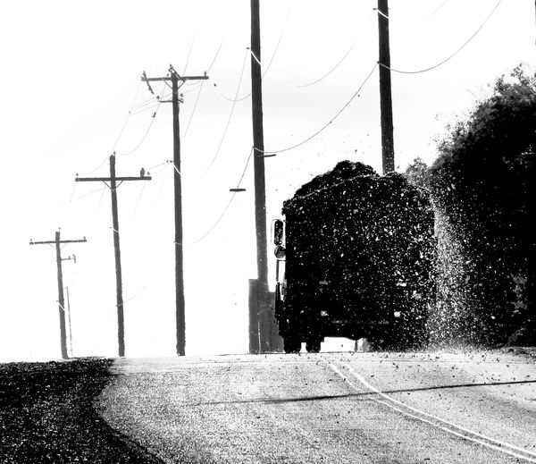
Thanks so much for your detailed feedback, cabunit. I was thrilled to get the side-lighting on the debris spilling from the truck! I'm going to post another photo below, in my comments to Frank (a bit of color in it + shot 1 second earlier).
Sep 15, 2016 18:03:16 #
Frank2013 wrote:
I like #1 a lot when cropped. Did you know the hawk was there?
Thank you, Frank! Here's a color one for a little different viewpoint - shot a second or two earlier. I put in Gallery last week as part of hops harvest series.
I didn't see the hawk for awhile in the other shot as I was so interested in that debris (hops leaves, other junk, after the initial cleaning) and the light. Fun to find it!
Sep 15, 2016 18:23:17 #
Frank2013
Loc: San Antonio, TX. & Milwaukee, WI.
Linda From Maine wrote:
Like your b/w perspective better than the color....I feel the debris is the impact, and much more prevalent in the later shot.Thank you, Frank! Here's a color one for a little different viewpoint - shot a second or two earlier. I put in Gallery last week as part of hops harvest series.
I didn't see the hawk for awhile in the other shot as I was so interested in that debris (hops leaves, other junk, after the initial cleaning) and the light. Fun to find it!
I didn't see the hawk for awhile in the other shot as I was so interested in that debris (hops leaves, other junk, after the initial cleaning) and the light. Fun to find it!
Sep 15, 2016 18:28:50 #
Frank2013 wrote:
Like your b/w perspective better than the color....I feel the debris is the impact, and much more prevalent in the later shot.
Especially cropped, as you did it. Maybe cresting the hill too? Thanks again, Frank!
Sep 15, 2016 22:16:08 #
Linda From Maine wrote:
Wonder if either of these appeal, and why/why not. Suggestions and edits welcome. Thank you!
I'm not crazy about the second image. Even with the various crops posted, it just lacks impact. I think that is because the birds are not large enough to keep my attention and my eyes keep wondering along all the lines without really ending up anywhere.
The first image is completely different. I like the first one you posted. The light on the debris, as you mentioned, is quite nice. I love the poles and the road and the truck is wonderfully positioned. I even like the sign on the left which I thought would be a distraction; but seems to not bother me at all. That first image is a fine photograph, Linda.
Sep 16, 2016 08:00:31 #
ebrunner wrote:
I'm not crazy about the second image. Even with th... (show quote)
Thank you, Erich! So glad that one caught your eye. I appreciate your detailed feedback very much.
Sep 16, 2016 08:32:22 #

Two interesting images, Linda. I like the original black and white better than the color shot of the truck. The chaff spilling from the back makes the shot, gives a sense of motion and the truck's wash to the image, and actually gives a note of humor. I'm not sure cropping really adds much, but EOTB. Only suggestion I might have would be to try leveling the image. Even if the land does in fact drop or is rolling, I'd try to flatten the road area. But your call.
The second image again powerfully recalls sheet music. My first thought was also to crop out the bottom and mountains, but looking at the result in which you did so, I think the original works better. I do think with both the monochrome is an excellent choice. Adding color really doesn't gain much.
The second image again powerfully recalls sheet music. My first thought was also to crop out the bottom and mountains, but looking at the result in which you did so, I think the original works better. I do think with both the monochrome is an excellent choice. Adding color really doesn't gain much.
Sep 16, 2016 08:48:38 #
Treepusher wrote:
Two interesting images, Linda. I like the origina... (show quote)
Thank you so much for your time and comments, Randy. As I read your mention of straightening the road, I thought "but won't that skew the telephone poles?" Apparently not if you see below
 (though I admit to preferring the quirkiness of the original)
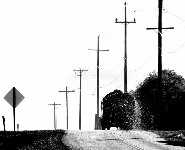
Sep 16, 2016 09:18:22 #

Linda, I think you achieved what you were attempting with the first image. The first image is a very gritty look, which fits the scene rather well. The composition is quite nice, as well. In photos, such as the top one, due to its stark contrast, one should ask the importance of every item included in the photograph, as contrast can be both tonal as well as textural. Which brings us to the second photograph. The second is a mixture of both high contrast, birds and wires, with a low contrast background, mountains. The mountains also possess a smoothness about them, which is contrasted by the linearity of the wires and posts. The mountains are also quite low in tonal contrast, as opposed to the, almost, silhouette nature of the birds and wires. Thus, contrast within contrast.
--Bob
--Bob
Linda From Maine wrote:
Wonder if either of these appeal, and why/why not. Suggestions and edits welcome. Thank you!
Sep 16, 2016 09:27:40 #
rmalarz wrote:
Linda, I think you achieved what you were attempti... (show quote)
Wonderful insights I'll read several more times and apply in future, especially regarding the importance of each item. Thanks so much, Bob!
If you want to reply, then register here. Registration is free and your account is created instantly, so you can post right away.