Tones and Angles
Aug 31, 2016 17:04:27 #
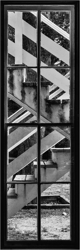
This shot combines shapes and tones in black and white to produce a photo that has high impact and is pleasing to the eye. I'd be interested in your impressions. In download you can see that I added a stroke to the edge to define the area of the photo. I was inside the building shooting an external fire escape through the window. You can see some glare caused by the glass in the window. I might want to clone out the glare spots.
Aug 31, 2016 18:46:01 #
Frank2013
Loc: San Antonio, TX. & Milwaukee, WI.
Interesting shot Erich, I like it but think you could get a touch more tonal range from this with a bit more work.
Aug 31, 2016 19:05:39 #
Frank2013 wrote:
Interesting shot Erich, I like it but think you could get a touch more tonal range from this with a bit more work.
You could well be right. I'll revisit and see what I can come up with. Thank you for the suggestion.
Aug 31, 2016 20:34:46 #

Aug 31, 2016 20:40:22 #
Frank2013 wrote:
Interesting shot Erich, I like it but think you could get a touch more tonal range from this with a bit more work.
This is why I don't post here no matter what is posted somebody always finds fault.
I bet if award winning images were posted anonymously there would still be negative comments.
Aug 31, 2016 21:24:29 #
JD750 wrote:
I love it!
Very nice composition!
Very nice composition!
Thank you. I was pleased to see the outside structure through the window, and thought it might make an interesting photo.
Aug 31, 2016 21:28:31 #
JD750 wrote:
This is why I don't post here no matter what is posted somebody always finds fault.
I bet if award winning images were posted anonymously there would still be negative comments.
I bet if award winning images were posted anonymously there would still be negative comments.
Not really a problem for me. I know that just about anything I post can be improved. That is why I welcome criticism. Sometimes I won't agree with what is posted, and I'll say so. Other times, like in this thread, I'll take the suggestions as just that. Suggestions. Maybe I can make a good image better by heeding advice proposed by others. When this is done in a respectful manner, like today, I can benefit.
Aug 31, 2016 22:42:23 #
Frank2013
Loc: San Antonio, TX. & Milwaukee, WI.
JD750 wrote:
Award winning images probably have room for improvement. When one becomes complacent with their work they've nothing more to offer. You have made a good choice by not posting here if all your after is "nice shot". I am by no means an authority on anything JD750 but give my opinion, it can be helpful or not....I mean it to be helpful but don't always hit the mark. Most that post here gather all the opinions and sift through them to their advantage and improvement....it's sorta the point to try and improve and learn from all the conversations that take place here. I hope you might reconsider at some point. Glad to at least see you are participating.This is why I don't post here no matter what is posted somebody always finds fault.
I bet if award winning images were posted anonymously there would still be negative comments.
I bet if award winning images were posted anonymously there would still be negative comments.
Sep 1, 2016 00:52:54 #
ebrunner wrote:
Not really a problem for me. I know that just about anything I post can be improved. That is why I welcome criticism. Sometimes I won't agree with what is posted, and I'll say so. Other times, like in this thread, I'll take the suggestions as just that. Suggestions. Maybe I can make a good image better by heeding advice proposed by others. When this is done in a respectful manner, like today, I can benefit.
That is a good way to look at it.
Sep 1, 2016 06:02:52 #
JD750 wrote:
That is a good way to look at it.
Nobody enjoys having their images ridiculed. This forum, for the most part, is not about that. The people who post expect that there will be civil discussion about what they have posted. When that occurs, the poster, the commenter and the folks looking and reading who have not posted, can learn something. I think it works pretty well.
Sep 1, 2016 09:24:07 #

I may be in the minority, but I think your glare spots add to the photo, giving it that "through the window" look.
Sep 1, 2016 11:46:36 #

ebrunner wrote:
This shot combines shapes and tones in black and white to produce a photo that has high impact and is pleasing to the eye. I'd be interested in your impressions. In download you can see that I added a stroke to the edge to define the area of the photo. I was inside the building shooting an external fire escape through the window. You can see some glare caused by the glass in the window. I might want to clone out the glare spots.
Erich,
that's an absolutely delightful vertical panorama and study in lines and angles and shadows and planes.
Given the options before you, I'm glad you chose to play the tonal spectrum straight and true, rather than...as I likely would have...tried for a high contrast ...or possibly even high key approach...both of which Zi'd likely have regretted.
A really nice job.
High impact with the Cosmic composition provided!
Dave
Sep 3, 2016 07:59:41 #
jaymatt wrote:
I may be in the minority, but I think your glare spots add to the photo, giving it that "through the window" look.
Thank you. For now I think I will keep them in. I'm not trying to disguise the fact that it is a window, after all. Good input and I appreciate it very much.
Sep 3, 2016 08:03:31 #
Uuglypher wrote:
Erich,
that's an absolutely delightful vertical panorama and study in lines and angles and shadows and planes.
Given the options before you, I'm glad you chose to play the tonal spectrum straight and true, rather than...as I likely would have...tried for a high contrast ...or possibly even high key approach...both of which Zi'd likely have regretted.
A really nice job.
High impact with the Cosmic composition provided!
Dave
Thank you Dave. Lately on many of my Black And White shots I've been going to NIK Silver Effex. This time I wanted to avoid the temptation and see if I could come up with a pleasing photo and not rely so heavily on presets. Not that I don't like NIK; but I find I've been in a pp rut lately. Thank you for your input.
Sep 3, 2016 08:36:59 #

ebrunner wrote:
Not really a problem for me. I know that just about anything I post can be improved. That is why I welcome criticism. Sometimes I won't agree with what is posted, and I'll say so. Other times, like in this thread, I'll take the suggestions as just that. Suggestions. Maybe I can make a good image better by heeding advice proposed by others. When this is done in a respectful manner, like today, I can benefit.
Very much the same way I feel Erich - I post to get suggestions because that's how I learn. If someone suggests something I think might work, I try it, see how I like it, and either incorporate it or not. Either way, I learn. If the suggestion is going in an entirely different direction from what I intended, I just thank the commenter and move on. I appreciate anyone who takes their time to give serious thought to an image I posted and share it. For the most part, that is what we get here, serious thought expressed respectfully.
I do like this image, thought its dimensions are out of the ordinary but I am prone to have non-standard size images too so it doesn't put me off. That's why I learned to make my own mattes. The use of the window as its own frame is effective, and the shapes and angles are well handled for proportion and balance. There is a very natural way to follow them up the frame. I'll have to differ with my pal Frank about getting more out of the tonalities -though I do agree it is possible, I kinda like the gentler approach on this one. I love geometrical compositions and this one is very cool, thanks for sharing it.
If you want to reply, then register here. Registration is free and your account is created instantly, so you can post right away.