My first effort with flowers
Aug 17, 2016 09:17:58 #

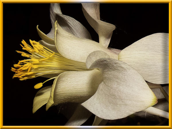
After viewing lots of images from Snapshot, I got inspired to try something new with my flower images. Just exploring and finding new ways to present flowers.
Aug 17, 2016 09:35:53 #

roder10 wrote:
Wow! I wish that every one of my "first efforts" looked as good as yours Rowedean. But then, I didn't have Bill around to teach me.After viewing lots of images from Snapshot, I got inspired to try something new with my flower images. Just exploring and finding new ways to present flowers.
Aug 17, 2016 09:41:33 #
Thanks, Bob. Working on some others. Fun to try something new and different from all the landscapes and horses.
Aug 17, 2016 10:04:31 #

Stunning first effort!!!! Bill is a wonderful teacher and you were inspired from one of the best!
Keep them coming!!
Keep them coming!!
Aug 17, 2016 10:13:31 #

Aug 17, 2016 10:28:34 #

I think this is amazing! I love what you have done with the flower and I think your choice of a small coordinating frame sets it off beautifully without detracting from the picture.
Aug 17, 2016 10:42:50 #
For what it's worth ......... the selection of color for a border, or a matte.
My ex-wife had a degree as a Fine Arts Major and she taught me that when choosing a color to matte a work of art, one should select a color that is within the painting/photograph, but not the most predominant one. She said look for one of the less-used colors. Because it's from the same image, it will probably be very well color-coordinated, but it will have the effect of drawing one's attention to the image and not the matte. In effect, while the lesser shade is complementary, it will recede to the back of one's attention so they look at the brighter colors within.
My ex-wife had a degree as a Fine Arts Major and she taught me that when choosing a color to matte a work of art, one should select a color that is within the painting/photograph, but not the most predominant one. She said look for one of the less-used colors. Because it's from the same image, it will probably be very well color-coordinated, but it will have the effect of drawing one's attention to the image and not the matte. In effect, while the lesser shade is complementary, it will recede to the back of one's attention so they look at the brighter colors within.
Aug 17, 2016 10:45:48 #
angela k wrote:
Stunning first effort!!!! Bill is a wonderful teacher and you were inspired from one of the best!
Keep them coming!!
Keep them coming!!
Absolutely - Thanks for the kind comments
Aug 17, 2016 10:46:49 #
Cwilson341 wrote:
I think this is amazing! I love what you have done with the flower and I think your choice of a small coordinating frame sets it off beautifully without detracting from the picture.
Thanks, Carol. I'm going to rework the frame using Bob's comments. But I love the side view of the flower.
Aug 17, 2016 10:47:14 #
Aug 17, 2016 10:47:55 #
Bob Yankle wrote:
For what it's worth ......... the selection of col... (show quote)
Thanks, Bob will rework the border later. Makes sense to me.
Aug 17, 2016 11:22:09 #

Aug 17, 2016 12:06:51 #

For me, this image is all about the curves and the textures. Super-lovely work, Rowedean!
Bob has addressed the border color. This image is strong, but soft at the same time, if that makes sense. So a less vibrant color for framing would be my choice, just so it doesn't compete with the beauty of the subject.
Bob has addressed the border color. This image is strong, but soft at the same time, if that makes sense. So a less vibrant color for framing would be my choice, just so it doesn't compete with the beauty of the subject.
Aug 17, 2016 12:23:45 #
about the border, I agree with Bob and Linda - as is, it grabs the eye too much. I also wish to add that I wish there was more space on the left (but if the border changes, that might not be such an issue). Anyway, should you rework the image, perhaps extend the dark background further to the left. And like everyone has said, Fantastic Work on the flower's texture and lighting.
Aug 17, 2016 12:26:03 #
Linda From Maine wrote:
For me, this image is all about the curves and the textures. Super-lovely work, Rowedean!
Bob has addressed the border color. This image is strong, but soft at the same time, if that makes sense. So a less vibrant color for framing would be my choice, just so it doesn't compete with the beauty of the subject.
Bob has addressed the border color. This image is strong, but soft at the same time, if that makes sense. So a less vibrant color for framing would be my choice, just so it doesn't compete with the beauty of the subject.
Going to change the border - thanks for the comments
If you want to reply, then register here. Registration is free and your account is created instantly, so you can post right away.