Which way to go?
Aug 15, 2016 23:07:19 #

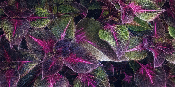
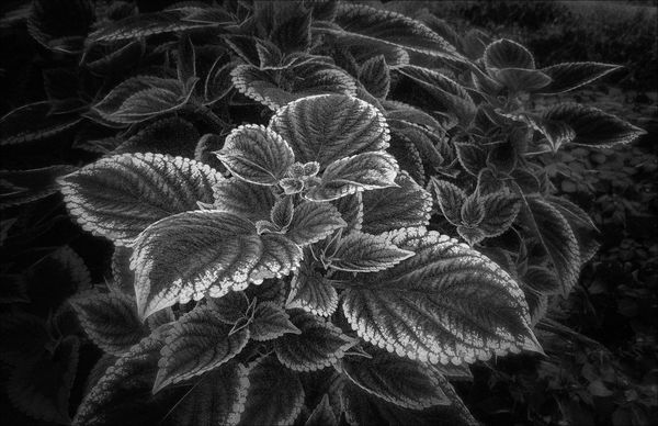
Color? or Not?
Edit: these are not the same plant - same species, same nursery, just different subjects
Edit: these are not the same plant - same species, same nursery, just different subjects
Aug 15, 2016 23:15:07 #

They are both so beautiful I think it would be very hard to eliminate either. I guess my personal taste in this particular example would be the color. The rich coloring of the coleus leaves in the first shot is almost irresistible. However, the way you lightened some of the leaves in the B & W photo adds a sense of depth that is very appealing. As I said, it is not an easy choice for me.
Aug 16, 2016 00:05:53 #

Aug 16, 2016 00:08:09 #
Snap Shot wrote:
Thanks Bill. I had an idea you were a color guy, and the colors in that particular image were borderline edgy to begin with.Bob, IMHO the color seems to bring more interest to the overall image. 

Aug 16, 2016 02:19:27 #

Both are excellent downloads Bob, but I would go with #1 beautiful detail on all of the leaves and striking colour. Thank you Sylvias. I agree, those colors were such a beautiful combination. I endeavored mightily to enhance them.
Thank you Sylvias. I agree, those colors were such a beautiful combination. I endeavored mightily to enhance them.Aug 16, 2016 05:41:09 #

Both are beautiful. I personally prefer the intricate variations in the color shot. It's very pretty and pleasing.
Aug 16, 2016 06:18:13 #

Bob Yankle wrote:
Color? or Not?
I like #2 Bob. I think it gives emphasis to form and texture.
Aug 16, 2016 06:49:18 #

I am going to have to agree with the Doc here Bob. I usually prefer color in most photos but with the two you have presented here I tend to lean towards the b&w for the texture and detail that it brings out.
Aug 16, 2016 07:16:41 #
Bob Yankle wrote:
Color? or Not?
I spent a lot of time looking at both those images because I really had a hard time picking a favourite. I like a lot of black & white images but in this case the colour wins for me. I spent so much time looking at them I finally realised they are not the same image. LoL. Doesn't matter of course - it's just that I should have noticed more quickly.

Aug 16, 2016 08:26:21 #

Both are just gorgeous, Bob! No loser in this competition!!! Great work!!!
Aug 16, 2016 08:43:28 #

Bob, like them both. But, the color image just stood out to me. I love purple, maybe that's it. It's very dramatic. Great PP, as usual.
Aug 16, 2016 09:07:44 #
I like them both, both are very, very good, but for me the B&W is the standout. The eye goes straight to the main cluster and sticks, whereas the color allows the eye to wander. I would consider the B&W a wall hanger and the color computer wallpaper. 😄
Aug 16, 2016 09:10:15 #

Bob Yankle wrote:
Color? or Not?
Both work very well Bob, but I like the B&W better for the following reason; IMHO the crop is more attractive in that one and also the DOF utilized in the B&W is very attractive in my view. Good job all around my friend.
Aug 16, 2016 10:01:12 #
I love the color for... the color of it. It would make a fantastic texture, or a print that gives a particular room a particular splash of color. I like the second image though for the structure and dimensionality that it gives. On these plants in particular, the B/W seems to give it character in the same that B/W gives character to a portrait of a very distinguished older lady or gentleman.
Aug 16, 2016 10:32:16 #
sleepydrdr wrote:
Thank you Dianne. Color palettes have always been fascinating to me, and some combinations work better than others. Nature does a very job at blending colors I've found.Both are beautiful. I personally prefer the intricate variations in the color shot. It's very pretty and pleasing.
If you want to reply, then register here. Registration is free and your account is created instantly, so you can post right away.