Almost axed it
Aug 15, 2016 16:35:49 #

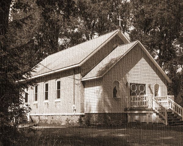
I didn't like the way this old church looked in my original photo, and I almost deleted it, but then decided to see what I could do with it by playing around.
I think it turned out pretty good!
I removed color, adjusted levels, then added a texture of an old piece of wood.
I think it turned out pretty good!
I removed color, adjusted levels, then added a texture of an old piece of wood.
Aug 15, 2016 16:44:09 #

Aug 15, 2016 17:10:27 #
I like it too! In the shaded portion of the church, on the front, I'd be tempted to mask out the texture a little. (my opinion, your mileage may vary as they say). I have become a texture fan I think, an amazing tool that somehow adds timeless character.
Aug 15, 2016 17:26:08 #

The more I become aware of textures in images, the more enthralled I am! I love what you did Wendy, including the toning.
I agree with pfrancke about perhaps just a slight masking here and there so that the texture is more integrated - not as obvious. But just depends on what you were going for, and your solution is outstanding!
I agree with pfrancke about perhaps just a slight masking here and there so that the texture is more integrated - not as obvious. But just depends on what you were going for, and your solution is outstanding!
Aug 15, 2016 18:09:30 #
This was a very quick do; I've never tried masking anything out, I'll have to figure it out and then give it a try.
Thanks for the suggestions and comments!
Thanks for the suggestions and comments!
Aug 15, 2016 18:14:15 #

wtompkins wrote:
I didn't like the way this old church looked in my original photo, and I almost deleted it, but then decided to see what I could do with it by playing around.
I think it turned out pretty good!
I removed color, adjusted levels, then added a texture of an old piece of wood.
I think it turned out pretty good!
I removed color, adjusted levels, then added a texture of an old piece of wood.
Nice job Wendy!
Aug 15, 2016 22:18:58 #

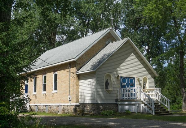
Excellent results. The church stands out much better and is very attractive. I think the reason the texture seems a little strong on the front part of the church is the horizontal lines of the siding.
Aug 16, 2016 00:29:57 #


Aug 16, 2016 08:36:33 #
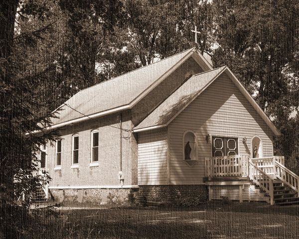
I reduced the texture effect on the front of the church quite a bit, and on the rest of the church just a tad.
Thanks for the tips, it looks even better now!
Thanks for the tips, it looks even better now!
Aug 16, 2016 09:34:38 #
wtompkins wrote:
I reduced the texture effect on the front of the church quite a bit, and on the rest of the church just a tad.
Thanks for the tips, it looks even better now!
Thanks for the tips, it looks even better now!
Neat-o!
If you want to reply, then register here. Registration is free and your account is created instantly, so you can post right away.