Painting the scene
Aug 4, 2016 08:57:35 #
Aug 4, 2016 15:10:44 #

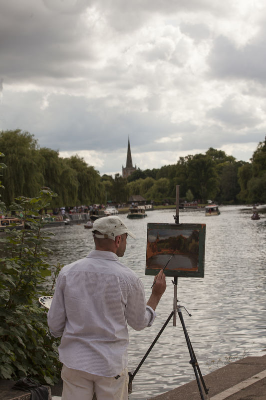
It's always fun to catch another artist in the act 
For me, the primary issue is with exposure. Downloaded and enlarged, there is sharp focus and detail on the painter and his painting, so if you are adept with pp, you should be able to adjust levels and other exposure-related elements and improve this quite a bit. I would lighten the painter and his painting, as well as the distant trees, and darken the sky and do other tweaks to bring vibrance to the scene.
Regarding composition, I would consider cropping out some of the sky as I don't believe it adds anything to the impact. It's unfortunate that the gentleman's head is merging with the boats, but unless you could have found a higher perspective, this might have been unavoidable.
Another thought is going with a lower perspective, though that would have caused more exposure challenges with your bright sky. I'm curious about your aperture choice; f/9.5 is kind of a "middle ground" - not small enough to get details in the distant elements, and not wide enough to artistically blur them.
Thanks for listening to my thoughts
Aug 5, 2016 09:37:44 #

I agree with Linda but would add that as the painting is horizontal, maybe your shot should mirror that and crop (as in the painting) just above the steeple top and maybe the painters waist. This would also help with the processing gauntlets, less sky, less balancing. Just my thoughts fwtw.
Aug 5, 2016 12:57:27 #

This is a really neat image. The painter appears to be pretty good and that's sort of like getting two images in one. I agree about the sky, and it looks like its brightness has toyed with your exposure. Unless you're in love with the clouds, I'd crop out part of the sky. I don't know that I'd crop it to horizontal, as I think the juxtaposition of a vertical shot of a horizontal painting is interesting. But I might go to square.
The darks look really dark on my screen and hard to see. If it were mine, I'd throw some fill light into the painting itself and the trees.
The darks look really dark on my screen and hard to see. If it were mine, I'd throw some fill light into the painting itself and the trees.
Aug 5, 2016 14:05:26 #

I like how you have composed this image. It would look better to me though if you lightened and brightened it up a little. It looks kind of muddy on my screen.
I agree that a square crop would help reduce some of the sky. The sky isn't your subject and takes your eye away from your painter.
I agree that a square crop would help reduce some of the sky. The sky isn't your subject and takes your eye away from your painter.
Aug 8, 2016 12:38:17 #

Lots of good suggestions here. Does anyone else feel like it's leaning to the right? I think it's because I know the post on the easel stand should be perfectly vertical and it's not. I do see that the steeple looks right though.
Aug 9, 2016 09:58:15 #
Thanks for the comments. I've tried a square crop and it does improve things a lot.
I actually put the wrong image up. The correct had the boat in the guys head removed.
I actually put the wrong image up. The correct had the boat in the guys head removed.
If you want to reply, then register here. Registration is free and your account is created instantly, so you can post right away.