Check out Photo Critique Section section of our forum.
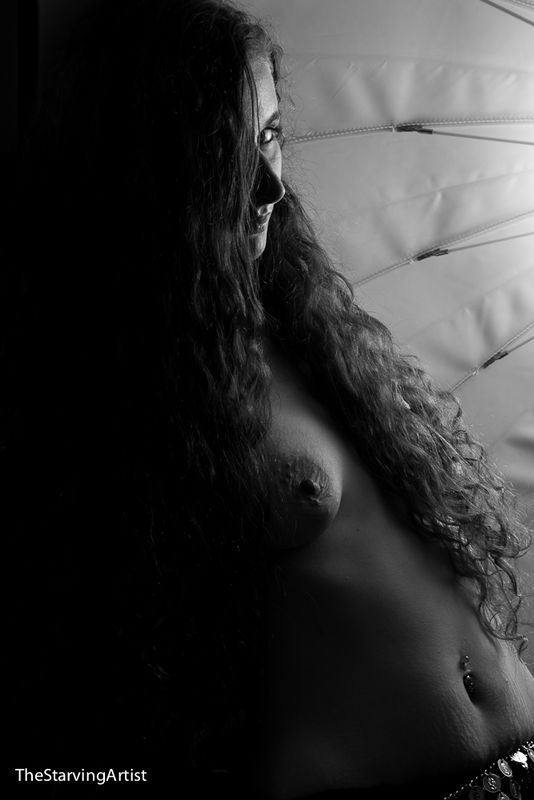
Umbrella Girl
Jul 11, 2016 11:57:48 #
She wanted to pose in the umbrella, so okay.
I like the leading lines, one that leads to her eyes.
The two that frame her breast
I like the leading lines, one that leads to her eyes.
The two that frame her breast
Jul 11, 2016 12:51:07 #
c49smith
Loc: Ohio
You're composition is lovely. I like the B&W, and agree with your assessment of the lines in the umbrella. My only critique would be for the model's face to be a few more degrees toward the camera. The umbrella does draw me toward her eye and I would like to see more of it. The nipple peeking out through the strands of hair is a nice touch.... easy to overlook....C
Jul 11, 2016 14:50:19 #
Suggest flipping this photo to see if you like the leading lines better.
Check out Photo Critique Section section of our forum.
Jul 12, 2016 09:42:55 #
TheStarvingArtist wrote:
She wanted to pose in the umbrella, so okay.
I like the leading lines, one that leads to her eyes.
The two that frame her breast
I like the leading lines, one that leads to her eyes.
The two that frame her breast
I basically agree with what C has said, except I really think there should be more light on her (camera left).
Why? Because, since it is so dark, there almost seems like there is a void in the camera left part of the frame to me, and, hence, something is lacking. There needs to be just a little more balance with the lightness of the umbrella.
Allowing the viewer to see a little more of her face and perhaps even a little light shining on her hair (an accent light, but not too intense), would make the image much more interesting and complete in my mind.
Of course, these are merely suggestions as to what I think would help make this image more interesting to the viewer. Thanks.
Best Regards,
Tom
Jul 12, 2016 10:09:25 #
I think that this image is perfect the way it is. I find myself very drawn to it and it holds my interest, especially the way her eye has a shy, petulant look and the light and shadow reveals a minimal amount of her body. Well done in my opinion.
Jul 12, 2016 17:07:50 #

Artist, welcome to the Hog! How did you find your way in here, we're you lurking and then just had to join this section, or are you completely new here?! LoL
I like this shot. I like the extreme short light and the strong shadows it's created. I love the way the light plays on her skin, hair and the glance at the viewer. Her body and breast are very sensual. That's the love affair!!!
Now what I'm not crazy about. Your leading lines are not leading in, they are leading us away, not in. The line at the eye i find distracting. Maybe it gets to close to the eye. To me the umbrella is not an integral part of the composition, it's just there. She is VERY strong and the umbrella is just there in contrast to her strong sensuality.
For me there is way to much negative black space. I'd take at least 30% of it off or add a slight hair detail to half of it.
The little charms on the belly chain are distracting me. I'd crop them off. There's not enough of them to add, so they distract.
I would smooth the stretch mark on her belly. She is to beautiful to have them so sharp.
Artist, I'm being picky because it's such a strong and wonderful image. If it were mediocre all this stuff wouldn't even matter. Just my opinions if it were my shot!
Beautiful work, keep posting and helping to make this fledgling section stronger!
Thanks for posting.
SS
Jul 12, 2016 22:33:56 #
chazz4623
Loc: Prairieville, La
I agree with the guys who say there is way to much dead black space on the left, and the belly jewels are much more a distraction that adds little or nothing to the photo. A different crop with a little more of the umbrella, more light and less black would, or might, make a better print. Take advantage of the model's face as the center and focal point (IMHO).
Check out Photo Critique Section section of our forum.
Jul 13, 2016 00:05:47 #

Jul 14, 2016 15:18:26 #
her eyes kind of draw you in, and it looks like she is calling to me. very very good shot.
Jul 16, 2016 01:17:49 #
Agree with comments about far too much shadow to her left. This can be brought up on Lightroom. The alternative would have been to use a reflector to push a bit back into that dark side. But these kind of situational shots are easy to armchair quarterback; often you are just trying to grab a shot while you can :-) Nice work...
Jul 16, 2016 20:34:32 #

Great Texture and composition.Perfect image as is. Great in Black and White
TheStarvingArtist wrote:
She wanted to pose in the umbrella, so okay.
I like the leading lines, one that leads to her eyes.
The two that frame her breast
I like the leading lines, one that leads to her eyes.
The two that frame her breast
Check out Panorama section of our forum.
Jul 19, 2016 22:39:55 #
sharpshooter and photoshack
I couldn't agree with you guys more.
I look at the black space that leads into the model, and her body comes out of the darkness and transitions into the light. I hadn't thought about the lines leading away from her. I see the lines in pairs, where they open up as they come toward her from the right side.
Those stretch marks
I took this one several years ago, I didn't know anything about lightroom, and all I knew of photoshop was cropping and very minor things, I didn't know what a layer was or brushes, cropping and toning was about it. The only option for fixing stretch marks was to crop them out. So I did it like in film days, do what you are going got do in the camera. I did my best at hiding the stretch marks that run across her stomach from one hip to the other. they are greatly minimized here.
Come to think of it, I believe this is the first model I photographed, but probably our third shoot together.
Jul 19, 2016 22:48:07 #
trc
I agree with you.
Her face is much more pleasing to me as a profile shot, I didn't want her facing any more to the camera. I love the shape of her nose so much that I was even willing to break the cardinal rule about the nose not breaking outside of the line of the cheek. The darkness on the left hides some major imperfections where the stretch marks are. I also tend to like darks and deep shadow areas. I know its not for everyone.
Jul 22, 2016 21:59:37 #
twr25
Loc: New Jersey
The model is pretty enough to pull this off ... love the lighting. The darkness to the left seems excessive and I would have cropped a little off to take her face / nipple off center more. I wish I had the artist eye as opposed to a post critique ... very nice ... I'd like to hear the settings and lighting used. Thanks for a great shot
Jul 24, 2016 00:42:23 #
twr25: The only light was the umbrella. The exif data isn't on the image. I normally stay at iso 100 for studio lighting, and I believe this was f 11/16. I did crop it a couple of ways, but kept coming back to this one. Not sure why but I just like it this way.
If you want to reply, then register here. Registration is free and your account is created instantly, so you can post right away.
Check out Printers and Color Printing Forum section of our forum.