Downhill Racer
Jun 21, 2016 18:30:55 #

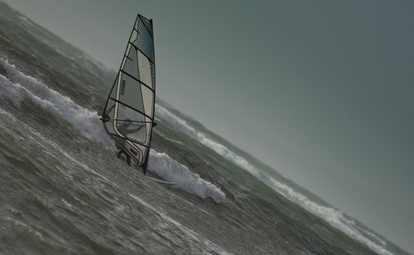
Suitable courses take some finding. How do like it - no Irish jokes please!
Jun 21, 2016 22:16:06 #
Concerning composition, it is well thought out. I love the color tones. Some folks will undoubtedly have an issue with the tilt perspective, but I'm not one of them. In fact, the perspective makes me feel like I'm also a windsurfer, glancing over to my fellow surfer.
Jun 21, 2016 22:31:28 #
magnetoman wrote:
Suitable courses take some finding. How do like it - no Irish jokes please!
The tilt makes this interesting. Without the tilt it is a nicely composed and exposed shot. I think it could use some more contrast. It seems a bit flat to me. Could be the light.
Jun 21, 2016 23:06:03 #
Frank2013
Loc: San Antonio, TX. & Milwaukee, WI.
I'll go with more contrast......and I'll tell ya straight magnetoman, the horizon seems a degree or to off level.
Jun 22, 2016 04:22:19 #
rook2c4 wrote:
Concerning composition, it is well thought out. I love the color tones. Some folks will undoubtedly have an issue with the tilt perspective, but I'm not one of them. In fact, the perspective makes me feel like I'm also a windsurfer, glancing over to my fellow surfer.
Glad you like it rook and thanks for commenting.
Jun 22, 2016 04:24:42 #
ebrunner wrote:
The tilt makes this interesting. Without the tilt it is a nicely composed and exposed shot. I think it could use some more contrast. It seems a bit flat to me. Could be the light.
Does look a bit flat, and dark, now you mention it! I'll have a look at pepping it up a bit but I'm not expecting to print it, it's just for fun. Many thanks for looking.
Jun 22, 2016 04:27:04 #
Frank2013 wrote:
I'll go with more contrast......and I'll tell ya straight magnetoman, the horizon seems a degree or to off level.
Yeah, I don't always notice that until I've posted it Frank, good of you to let me know 😎.
Jun 22, 2016 07:52:21 #

magnetoman wrote:
Suitable courses take some finding. How do like it - no Irish jokes please!
I don't usually like tilt in images but for this one it really works and the tilt becomes key to the composition and the geometry/balance of it. It's sharp, it's got impact because of what you've done with it, but it seems too dark. A trip through the Curves adjustment to brighten and add contrast might be worth a shot.
Nice image and well executed concept.
Jun 22, 2016 09:43:44 #

I would definitely like to see a bit more white in the tops of the waves. Regarding composition, Minnie mentions geometry and balance, and I think those are the key to the success here.
With all the visual weight on the left side and a clean clear sky on the upper right as the balancing negative space, I think the composition works to great effect.
Something that could easily be a gimmick is, instead, a visual and unexpected delight. Great impact for me!
With all the visual weight on the left side and a clean clear sky on the upper right as the balancing negative space, I think the composition works to great effect.
Something that could easily be a gimmick is, instead, a visual and unexpected delight. Great impact for me!
Jun 22, 2016 09:50:10 #
minniev wrote:
I don't usually like tilt in images but for this one it really works and the tilt becomes key to the composition and the geometry/balance of it. It's sharp, it's got impact because of what you've done with it, but it seems too dark. A trip through the Curves adjustment to brighten and add contrast might be worth a shot.
Nice image and well executed concept.
Nice image and well executed concept.
Thanks Min, I'm not sure why it's so dark - can only say, it was rather late last night when I posted!
Jun 22, 2016 09:52:16 #
dag gone, this was a troublesome image. I had to tilt my monitor to see how much the man was leaning and the coffee almost went spilling. Ah - to be young and near water! My complaint is one of symmetry. The diagonal of the water cuts precisely through the corners, my disorganized brain doesn't like that touch of OCD!!!
Jun 22, 2016 09:52:21 #
Linda From Maine wrote:
I would definitely like to see a bit more white in the tops of the waves. Regarding composition, Minnie mentions geometry and balance, and I think those are the key to the success here.
With all the visual weight on the left side and a clean clear sky on the upper right as the balancing negative space, I think the composition works to great effect.
Something that could easily be a gimmick is, instead, a visual and unexpected delight. Great impact for me!
With all the visual weight on the left side and a clean clear sky on the upper right as the balancing negative space, I think the composition works to great effect.
Something that could easily be a gimmick is, instead, a visual and unexpected delight. Great impact for me!
Many thanks for your usual succinct critique Linda, much appreciated, as you know.
Jun 22, 2016 09:54:10 #
pfrancke wrote:
dag gone, this was a troublesome image. I had to tilt my monitor to see how much the man was leaning and the coffee almost went spilling. Ah - to be young and near water! My complaint is one of symmetry. The diagonal of the water cuts precisely through the corners, my disorganized brain doesn't like that touch of OCD!!!
.....and all that trouble I went to to get the corners spot on!
Jun 22, 2016 10:05:35 #
magnetoman wrote:
.....and all that trouble I went to to get the corners spot on!
LOL - I KNEW it was OCD!
Jun 22, 2016 20:55:42 #

magnetoman wrote:
Suitable courses take some finding. How do like it - no Irish jokes please!
I like the angle, I do it all the time shooting music. I thinks it adds a bit more drama to what might otherwise be a typical windsurfing shot.
If you want to reply, then register here. Registration is free and your account is created instantly, so you can post right away.