Ophelia's Child 2 - (Still not for those with a delicate nature!)
Jun 16, 2016 17:39:15 #

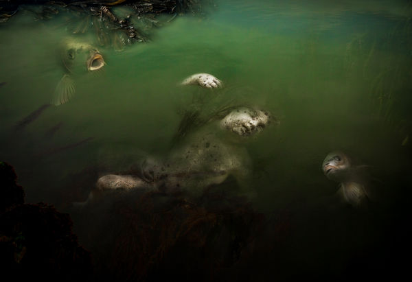
For those interested the first time round and those who offered suggestions for improvement, I offer this version. I have struggled, dumped layers after much work and gone back for another crack and now, rather tired, I'm calling it a day on this image. I still like the concept and may come back to it another time. For now, I would appreciated your thoughts on the result.
Looks a little dark here think?
Looks a little dark here think?
Jun 16, 2016 18:40:21 #

magnetoman wrote:
For those interested the first time round and those who offered suggestions for improvement, I offer this version. I have struggled, dumped layers after much work and gone back for another crack and now, rather tired, I'm calling it a day on this image. I still like the concept and may come back to it another time. For now, I would appreciated your thoughts on the result.
Looks a little dark here think?
Looks a little dark here think?
On download it isn't too dark. I think youve done a masterful job with this project. I still like the one with the broad view best of the two, though the fish is pretty remarkable. The broad view, while now entirely realistic, is strange and fantastical thing that still belongs on the front of a gothic mystery novel. I applaud you for one of the most creative and daring "dark" images we've seen here.
Jun 16, 2016 23:52:42 #
Mark7829
Loc: Calfornia
This shot is just filled with lots of stirring emotions. I got a chill up my spine when I opened it. Colors are toxic, the fish are so appropriate. I am not sure about their placement but a wonderful addition. This is good work. The tonal values are simply wonderful and pleasing, subtle highlights really add to the image. The bottom border may be too dark and it creates a void without substance and the top a bit too light and it competes with the subject. But this is outstanding work if you can keep down the noise.
Jun 17, 2016 00:39:23 #
Frank2013
Loc: San Antonio, TX. & Milwaukee, WI.
I believe with more time and study you will get this where it needs to be. Your brush work and blending need some more patience magnetoman. You are perfectly capable and I feel sure you understand my thoughts. Your creativity is shinning.
Jun 17, 2016 12:20:48 #
I like how you maintained the color scheme. The perspective looks good - where the surface plane of water and floating body work together. I like the dark detail upper left, but it needs (in my mind) blurring. The sharpness there grabs the eye too much - yet on the other hand, it clearly marks the surface plane. Perhaps just darker and have it encroach more into the image.
I think the fish are good, but they don't seem to be "in" the water enough. I like the idea of the one on top left touching the surface, I can't pin down why it seems disconnected. The bottom right fish is better deeper in the water.
It may be that they just need to be darkened more (and perhaps lightly rippled, blurred) to make them deeper. I agree with Mark's point about the foreground being too dark. I like the weed feeling on bottom left. Bottom needs something, perhaps dark weeds "reaching" - keep it blurred though, just a suggestion of weeds reaching and tangling in.
Sorry for the wild rambling, I hope you revisit this again after a time. Strong Gothic surreal tragic. I wish I had your skill. Massive impact.
Jun 17, 2016 12:29:36 #

Jun 17, 2016 12:37:26 #
magnetoman wrote:
For those interested the first time round and those who offered suggestions for improvement, I offer this version. I have struggled, dumped layers after much work and gone back for another crack and now, rather tired, I'm calling it a day on this image. I still like the concept and may come back to it another time. For now, I would appreciated your thoughts on the result.
Looks a little dark here think?
Looks a little dark here think?
Outstanding magnetoman !!! Its not to dark on my end. This one needs to be downloaded to get the full effect. Although, I do like your first one, I'm torn between the two but I'm leaning to this one. Both are masterpieces in their own right. I would be interested in your final results if there happens to be one. This is very creative and a learning experience for me because when I see something different from the norm it accelerates my imagination.
Dave
Jun 17, 2016 13:51:53 #
minniev wrote:
On download it isn't too dark. I think youve done a masterful job with this project. I still like the one with the broad view best of the two, though the fish is pretty remarkable. The broad view, while now entirely realistic, is strange and fantastical thing that still belongs on the front of a gothic mystery novel. I applaud you for one of the most creative and daring "dark" images we've seen here.
Thanks for your comments Min, I must admit I went for the closer view as it made perspective and scale easier. Not sure which version I prefer now. Perhaps it might persuade others to post from the 'dark' side, if so, I hope they keep it tasteful - my attempt is based on classical art (in concept, not achievement!), and I shall be trying to improve my Ps skills using this theme.
Jun 17, 2016 13:56:49 #
Mark7829 wrote:
This shot is just filled with lots of stirring emo... (show quote)
I made this final post late last night, then grabbed it back in edit and extended the bottom margin using content aware as I felt the body was too close to the edge. I take your point though and will look at it again, but not immediately, I need a rest from it! Many thanks for commenting Mark, it helps and I'm grateful.
Jun 17, 2016 14:00:01 #
Frank2013 wrote:
I believe with more time and study you will get this where it needs to be. Your brush work and blending need some more patience magnetoman. You are perfectly capable and I feel sure you understand my thoughts. Your creativity is shinning.
Yep, with you entirely Frank, practice, practice, practice. I think I knew I was being impatient, it's part of the process I struggle with - wanting to get there too quickly. My thanks for keeping me on the straight and narrow.
Jun 17, 2016 14:06:57 #
pfrancke wrote:
I like how you maintained the color scheme. The ... (show quote)
I think you have accurately spotted most of the faults and weaknesses Piet. It currently relies mainly on the 'impact' value, and in fact requires more skill than I currently possess - but I will keep practicing as time permits and will return to it sometime. Many thanks for commenting, I really do find it helpful.
Jun 17, 2016 14:11:13 #
Dave Chinn wrote:
Outstanding magnetoman !!! Its not to dark on my end. This one needs to be downloaded to get the full effect. Although, I do like your first one, I'm torn between the two but I'm leaning to this one. Both are masterpieces in their own right. I would be interested in your final results if there happens to be one. This is very creative and a learning experience for me because when I see something different from the norm it accelerates my imagination.
Dave
Dave
As I've said to others Dave, I will return to it but not just now. I'm humbled by your comments as I am in awe of your own work, so very grateful for you kind remarks. Will we be seeing something darker than normal from you? Can't wait!
If you want to reply, then register here. Registration is free and your account is created instantly, so you can post right away.