and another stab from the newbie. please let me know what you think
Sep 30, 2011 21:02:18 #

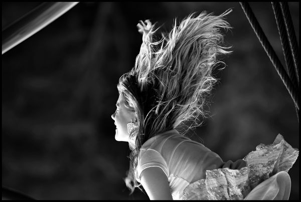
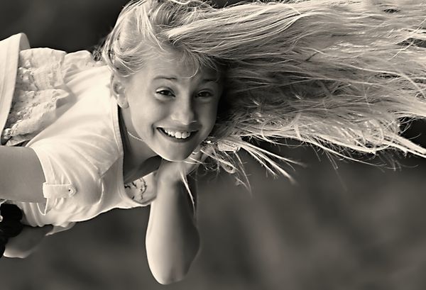
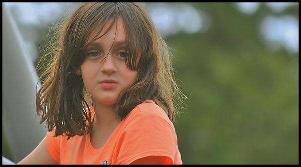
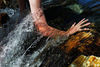
Here are a couple of interesting photos that I took the other day. I am playing around with trying to find the uniqueness of my subjects in ways a bit out of the ordinary.
These were some of the first photos taken with my new lens that is much heavier than my old one so I need to get used to it
These were some of the first photos taken with my new lens that is much heavier than my old one so I need to get used to it
Flying
The introduction
The Stare
Sep 30, 2011 21:04:00 #
Sep 30, 2011 21:12:02 #
Sep 30, 2011 21:22:34 #

Sep 30, 2011 21:29:31 #
Something about #2 just grabs me. Your b/w conversations are to die for. I wish I could get mine to look this crisp.
Sep 30, 2011 21:32:07 #

Awesome!!! The second one is my favorite. What kind of lens did you get?
Sep 30, 2011 21:44:28 #
MWAC wrote:
Something about #2 just grabs me. Your b/w conversations are to die for. I wish I could get mine to look this crisp.
wow, thanks that is an amazing compliment. I did spend some time adjusting them but I am never sure if they look ok because I have a "color descrepincy " in my vision. not color blind but according to the eye doc I see colors differently, which is maybe why I love black and whites so much.. ha ha.
Sep 30, 2011 21:47:04 #
Doe wrote:
Awesome!!! The second one is my favorite. What kind of lens did you get?
Thanks, I got my D3000 about a year ago and a few days ago I got a :
AF-s DXNikkor 55-300 mm f/4.5-5.6 G ED VR
Big purchase for my budget. :-)
Not sure what to put on my wish list next :?:
Sep 30, 2011 21:48:00 #

Oct 1, 2011 00:19:48 #
TraceyG wrote:
Very nice, I too, like 2.
thanks... seems like number two is a favorite. I like number one ... this often happens to me.
I put number two in last min as it was my least favorite.
I am trying to figure out why people always like the ones that I like the least ... do I have bad taste? lol... but thank you for the compliments . Number one looks much better larger as you can see her face more.
Oct 1, 2011 00:46:35 #

Oct 1, 2011 00:51:36 #
#2 it's the hair. I like 1 also but I would have liked to see a bit more of her face. 3 seems a bit dark and un sharp but I think you could bring that out with some selective adjustments.
Oct 1, 2011 01:11:18 #
DanielB wrote:
#2 it's the hair. I like 1 also but I would have liked to see a bit more of her face. 3 seems a bit dark and un sharp but I think you could bring that out with some selective adjustments.
thanks for the insight. ... actually I unsharpend or blurred number 3 ... I wanted a hazy quality to it. almost like fog. I could brighten it a bit maybe?
Oct 1, 2011 01:29:34 #
trueblue wrote:
thanks for the insight. ... actually I unsharpend or blurred number 3 ... I wanted a hazy quality to it. almost like fog. I could brighten it a bit maybe?
DanielB wrote:
#2 it's the hair. I like 1 also but I would have liked to see a bit more of her face. 3 seems a bit dark and un sharp but I think you could bring that out with some selective adjustments.
thanks for the insight. ... actually I unsharpend or blurred number 3 ... I wanted a hazy quality to it. almost like fog. I could brighten it a bit maybe?
I think what I'm seeing is that the subject light is too close to the background lighting. Try brightening the face a bit to draw the eye to her.
Oct 1, 2011 09:35:45 #
Since you have a color problem with your eyes, it's probably hard for you to tell that #3 is a bit too magenta. It's especially noticable under her eye where the hair is on her face. Try using the color balance on ps5 and reduce the magenta and/or red, then lighten using curves.
If you want to reply, then register here. Registration is free and your account is created instantly, so you can post right away.