dreamy shallow DOF
May 21, 2016 10:43:35 #

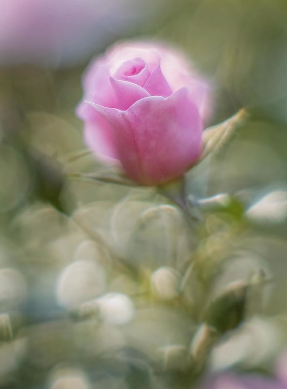
Here are the best two (I think) from a visit to my local rose garden. I feel I'm getting better at creating images that take one a step away from the bustle of daily life. And this is why I love full frame and a large aperture (in this case a 55mm lens at f1.2 on an extension tube). I like the way the sharp areas draw my eye, and once I look away from them the tension diffuses into the softness of the background. I just liked these and wanted to share here.

May 21, 2016 10:49:22 #

Thanks so much for sharing these, Toby. I don't recall previously seeing a look with the extreme contrast between sharp and soft that you presented here. It might take a bit of time to digest the idea - great food for thought and creative expression!
May 21, 2016 11:16:39 #

I think #2 is a better demonstration of what you're trying to achieve. In #1, the unsharp bit of the blossom out front on the left looks just a bit too messy. The softness looks more deliberate and controlled in #2.
I've no doubt the jury will be out as to whether it's better to use a wide aperture for the shallow DOF or try to achieve a similar effect in post processing. My expectation is that the bokeh will be more convincing and more pleasant using a wide aperture, but it has the disadvantage that it can't be applied as selectively as PP.
I've no doubt the jury will be out as to whether it's better to use a wide aperture for the shallow DOF or try to achieve a similar effect in post processing. My expectation is that the bokeh will be more convincing and more pleasant using a wide aperture, but it has the disadvantage that it can't be applied as selectively as PP.
May 21, 2016 11:41:45 #

kymarto wrote:
Here are the best two (I think) from a visit to my local rose garden. I feel I'm getting better at creating images that take one a step away from the bustle of daily life. And this is why I love full frame and a large aperture (in this case a 55mm lens at f1.2 on an extension tube). I like the way the sharp areas draw my eye, and once I look away from them the tension diffuses into the softness of the background. I just liked these and wanted to share here.
Kymarto, it is always fun to try new things in photography. Keeping the brain sharp. Personally I like the first one. The second one is too soft for my taste. But keep them coming.
May 21, 2016 11:56:25 #
R.G. wrote:
I think #2 is a better demonstration of what you'r... (show quote)
For me it would not be the same to try to soften in post. One of the charms of this is using all the aberrations of the lens, such as the spherical and chromatic aberration and the coma to good effect. Nor would it be easy to achieve the gradual sharpening as the circle of confusion lessens as the subject approaches the plane of focus. The effect on the leaves in #1 is an example of what I mean.
May 21, 2016 12:07:51 #
kymarto wrote:
For me it would not be the same to try to soften in post. One of the charms of this is using all the aberrations of the lens, such as the spherical and chromatic aberration and the coma to good effect. Nor would it be easy to achieve the gradual sharpening as the circle of confusion lessens as the subject approaches the plane of focus. The effect on the leaves in #1 is an example of what I mean.
You're right. Graduated, distance-related effects are difficult or impossible to replicate convincingly in PP. I get the impression that the effect will work best if the stuff out front is sharp and the softness increases with increasing distance. I still think the soft bit of the blossom out front in #1 is too eye-catching because it's too close.
May 21, 2016 12:33:59 #
the first is magic to me, I particularly like the bottom two thirds. The prize on top though lacks color punch (my opinion). I would have like that part with a hair more saturation and light. And I wish that the center top of it got the better focus. I am liking the style of this very, very much. Thanks for posting this!
May 21, 2016 13:25:18 #
Frank2013
Loc: San Antonio, TX. & Milwaukee, WI.
So good to see posting here again. Both stunning works to appreciate. Well done.
May 21, 2016 19:18:36 #
pfrancke wrote:
the first is magic to me, I particularly like the bottom two thirds. The prize on top though lacks color punch (my opinion). I would have like that part with a hair more saturation and light. And I wish that the center top of it got the better focus. I am liking the style of this very, very much. Thanks for posting this!
If you didn't please download. The UHH previews use a different color space, which is disappointingly unsaturated. Also, check #1 at full posted size. You won't be able to see the whole thing, but for me at least, viewing large gives much more joy in terms of the impression of focus on the center rose.
May 21, 2016 20:05:31 #

Beautiful work Toby and they do need downloading to be properly appreciated. Number 2 I found just amazing as presented here and it also makes an interesting BW with a totally different feel for some reason. Lack of the right lens will hold most back from getting results as good as these or even trying. I have a 35mm 1.8 and thought the bokeh was pretty cool but the result here from a a pro lens has blown that theory out of the water!
May 21, 2016 20:53:34 #
kymarto wrote:
If you didn't please download. The UHH previews use a different color space, which is disappointingly unsaturated. Also, check #1 at full posted size. You won't be able to see the whole thing, but for me at least, viewing large gives much more joy in terms of the impression of focus on the center rose.
LOL - I DID download. I failed to supersize it however. I could only look at about half of it at a time - I need two monitors stacked on each other. Yes - I stand corrected, the full size is exactly how I wanted to see it, though I had to look at it from 5 feet or so. Thank you for this lesson, every day I become more humble (an easy thing to do when I have a million miles to go!)
May 21, 2016 21:56:07 #
Thanks for the nice comments. I feel fortunate to have found a niche where I can pay the bills with a camera, but that is unfortunately video, which I do not find anywhere as aesthetically satisfying as stills.
Still photography is more a hobby. I do love experimenting, and digital makes that so much more possible (and affordable) than film.
Still photography is more a hobby. I do love experimenting, and digital makes that so much more possible (and affordable) than film.
May 22, 2016 11:51:39 #
The pink rose is particularly lovely. Really am liking the sharp petals coming through the soft, diffused background. Very artistic of you, especially being done with your camera settings rather than pp...
May 22, 2016 19:57:11 #

kymarto wrote:
Here are the best two (I think) from a visit to my local rose garden. I feel I'm getting better at creating images that take one a step away from the bustle of daily life. And this is why I love full frame and a large aperture (in this case a 55mm lens at f1.2 on an extension tube). I like the way the sharp areas draw my eye, and once I look away from them the tension diffuses into the softness of the background. I just liked these and wanted to share here.
These are intriguing and very creative. They are rather puzzling to try and figure out so that is much of they charm. I like that the sharp part is in the central/front part of the flower, which sort of nails down my eye, I know what I'm looking at, and I can explore. They kinda remind me of some of Freeman Patterson's work. Very nice, and thank you for letting us enjoy them.
If you want to reply, then register here. Registration is free and your account is created instantly, so you can post right away.