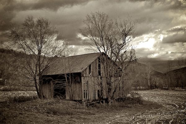
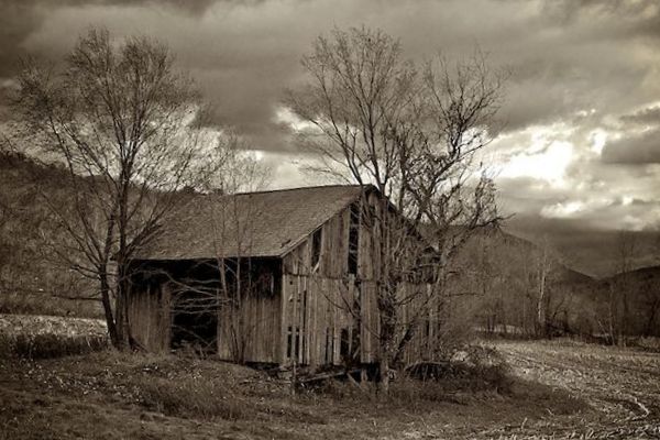
Pros and cons on this barn
May 6, 2012 21:31:57 #
Everyone loves it if someone compliments your photo but you get better by paying attention to the suggestions of others. Suggest away. Thanks
May 6, 2012 21:34:28 #
nothing needs improvement. the b/w emphasizes the age of the old barn, the hint of green makes the photo look like it was hand tinted. nice cloudy sky. great photo, i would hang this one in the living room.
May 6, 2012 21:36:39 #
May 6, 2012 21:43:32 #

LColt wrote:
This an absolutely amazing photo! I love everything about it! Great Job!
I agree. The older barns are disappearing rapidly; keep it up, get all the shots you can.
May 7, 2012 09:38:50 #

ssscomp wrote:
Everyone loves it if someone compliments your photo but you get better by paying attention to the suggestions of others. Suggest away. Thanks
:P - Good choice B&W - Bright patch of sky draws eye away from subject. (Could crop out to where edge of barn and a little field shows). By cropping to where the entrance road to the barn is the leading line, better impact. A touch more contrast for effect.
Good capture.
Second look second view, crop from top down and from bottom up - more of a panorama.
May 7, 2012 09:43:54 #

did it have a lean to it, or is that just in the picture, the trees look a little leaning to the same way, I would try straightening off the closest corner of the barn and see how that looks....Great Picture...... it's sepia not black and white... would look good either way.. :thumbup:
I downloaded it and straightened it up with my picasa program, I thought it helped it a lot..... the ground fall off the right side was more apparent and the trees looked more natural.. it makes more of a serene photo to look at ( eye and brain,not trying to straighten it out) kinda like an uneven sea....
I downloaded it and straightened it up with my picasa program, I thought it helped it a lot..... the ground fall off the right side was more apparent and the trees looked more natural.. it makes more of a serene photo to look at ( eye and brain,not trying to straighten it out) kinda like an uneven sea....
May 7, 2012 11:24:03 #

Other than the blown out parts in the clouds, I love it. I'd love to see this one full size.
The overall tone of this photo seems foreboding--I love that!
The overall tone of this photo seems foreboding--I love that!
May 7, 2012 11:40:48 #

I like it. You might experiment with cropping a little off the left edge and adding a tad of contrast, but its a good picture as it stands. If you add contrast, keep it local to the barn
May 7, 2012 12:16:58 #

Don't crop a thing. My guess is that the "blown out" part in the clouds is the sun trying to shine through. Great contrast. This is a great photo. Gallery worthy as far as I'm concerned. As is.
May 7, 2012 12:37:33 #

I agree it is a good shot but something keeps telling me it is not straight level. See it that would not help.
May 8, 2012 07:08:39 #
When I first took the picture I thought there was something little strange about the scene. Then when I played with it I tried straightening it in many different directions and possibilities. Bottom line: I think the whole damn barn's crooked!!!
Thanks for all the replies.
Thanks for all the replies.
May 8, 2012 07:14:05 #
One second thought. I should not have cropped this quite as closely in the camera. Cameras nowadays have such great resolution that one can afford to widene out a bit and then have various crop options when playing with it in post production. I think I'm going to try that for the next week or two. Particularly with static shots. Set everything up, get ready to take the photo, and then widen out a bit to give myself some additional cropping room.
May 9, 2012 09:19:49 #
this is what I was talking about....the whole picture dosen't look like it is in a recliner... :-)
May 9, 2012 09:53:19 #
May 10, 2012 10:46:47 #
jdeanb wrote:
I agree it is a good shot but something keeps telling me it is not straight level. See it that would not help.
We tend to try to make the horizon level, but sometimes it just isn't.
The verticals look right so I guess that's the case here.
If you want to reply, then register here. Registration is free and your account is created instantly, so you can post right away.