What did I do?
May 11, 2016 00:17:23 #
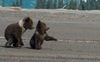
I'm attaching 3 versions of a photo I posted in the Critique Section.
The first one was a little light, with some almost blown highlights. So I edited it and lowered the exposure and brought down the highlights. I was pretty pleased with the results.
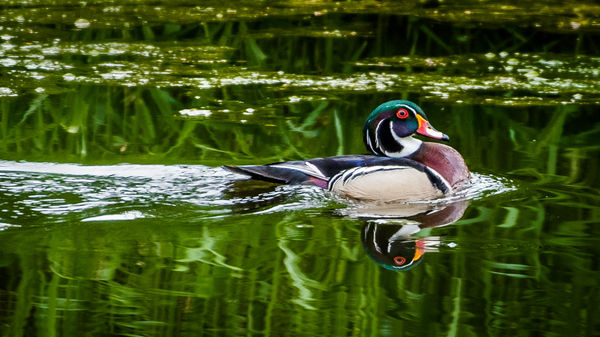
But then, I happened to linger at the part of Lightroom called the "Tone Curve." I've occasionally used it, and decided to give it a try. I basically pulled down the bottom/left end of the curve line and all of a sudden these luscious black and green waves appeared. I really like it.
But, from you experts: What did I actually do? And how often should a person play with the curves adjustment?
The first one was a little light, with some almost blown highlights. So I edited it and lowered the exposure and brought down the highlights. I was pretty pleased with the results.
But then, I happened to linger at the part of Lightroom called the "Tone Curve." I've occasionally used it, and decided to give it a try. I basically pulled down the bottom/left end of the curve line and all of a sudden these luscious black and green waves appeared. I really like it.
But, from you experts: What did I actually do? And how often should a person play with the curves adjustment?
My first effort
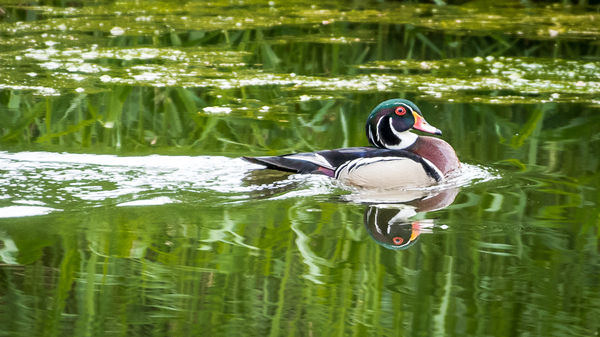
(Download)
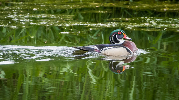
Adjusted based on useful critiques
(Download)
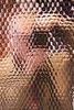
Wow, I like the Tone Curve adjustment tool
(Download)
May 11, 2016 11:59:32 #

GregWCIL wrote:
......What did I actually do? And how often should a person play with the curves adjustment?
For me it was a toss-up between the Curves tool and using the Blacks, Shadows, Highlights, Whites and Brightness sliders. I felt more at home with the sliders but concede that the Curves tool gives you more control over contrast - it allows you to place the contrast in specific parts of the luminosity spectrum. The sliders allow you to do that up to a point, but it's not obvious how to do it and it's more limited. I can imagine the Curves tool being popular amongst people who do a lot of conversions to B&W.
So what did you do? You did the equivalent of darkening the Shadows (possibly with a bit of lowering the Blacks). And since the steepness of the line will have increased just to the right of where you lowered the line, the contrast will have been increased in the part of the luminosity spectrum just above the darks and possibly through to the mid-tones. That increase in contrast would correspond roughly to a partial* increase in Clarity ( *partial in that it would affect only the dark end of the mid-tones, whereas Clarity affects the contrast in the whole mid-tone region. As I said, Curves gives you more targeted control over contrast).
May 12, 2016 07:39:31 #
R.G. wrote:
For me it was a toss-up between the Curves tool an... (show quote)
Thank you R.G. for that detailed explanation. Not only detailed but very easy to understand. Like I said, I've occasionally used Curves in the past, but will use it more in the future. I usually set the sliders according to some advice I read from Scott Kelby. But the curves seems to intensify the blacks in this case which is sometimes very appealing. Another thing that surprised me when I used it: I thought I would see the light/dark sliders up above move as I adjusted the curves but they didn't.
May 12, 2016 10:00:36 #

Very nice edit on number 3. A gorgeous bird. Sharp and colorful. My only suggestion is to get the duck to pop more. Two simple ways. Increase the overall exposure 1/3 or 2/3 stop and then add a negative vignette. Or use the radial filter. Select the duck and lighten it slightly and then reverse the selection and darken.
R.G. got me curious about clarity and I found this. https://helpx.adobe.com/lightroom/how-to/lightroom-clarity-vibrance-saturation.html
R.G. got me curious about clarity and I found this. https://helpx.adobe.com/lightroom/how-to/lightroom-clarity-vibrance-saturation.html
May 12, 2016 11:45:35 #

Greg, you started with a really nice photo. Just want to say that your PP made it exceptional. Great job.
May 12, 2016 12:01:43 #
GregWCIL wrote:
......Another thing that surprised me when I used it: I thought I would see the light/dark sliders up above move as I adjusted the curves but they didn't.
You've probably noticed that the graph is divided into quarters by faint vertical lines. Each of those quarters has a slider associated with it (Shadows, Darks, Lights, Highlights),and depending on which quarter you make your adjustments in (i.e. in which quarter the circle on the line is in), the corresponding slider responds to you using the circle to drag the graph line up or down. Your circle must have been in the extreme left quarter and the Shadows slider will have moved. (Have you noticed that you can adjust the range that each slider adjusts by dragging the pointers on the y axis).
May 12, 2016 13:01:39 #
Still love the image and this post has stimulated a most informative discussion. Thanks
May 12, 2016 14:06:29 #
R.G. wrote:
You've probably noticed that the graph is divided ... (show quote)
This is very important for people to understand. In LR CC 2016, exposure corresponds to the middle quadrants and the quadrants are no long all the same size.
May 13, 2016 20:43:02 #
R.G. wrote:
You've probably noticed that the graph is divided ... (show quote)
Thank you so much for the added information on the curves adjustment. I think you could use LR for years and never learn all its tricks. (Come to think of it, I guess I have, lol.)
May 13, 2016 20:44:13 #
If you want to reply, then register here. Registration is free and your account is created instantly, so you can post right away.