Black & white with a hint of color
May 1, 2016 10:12:37 #
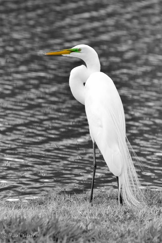
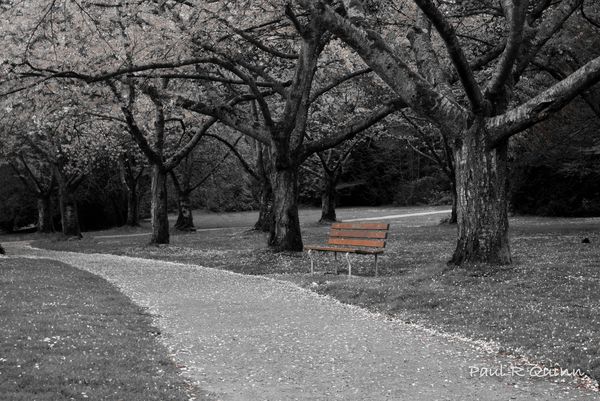
I have been going over many of the files I have processed with Lightroom and challenged myself to process a few of them differently just to see how they would turn out. I decided these 2 looked interesting with just a hint of color so I left just a touch in them. What do you think about that?
Great white Egret looking for lunch
The park bench
May 1, 2016 10:23:05 #

346pak wrote:
I have been going over many of the files I have processed with Lightroom and challenged myself to process a few of them differently just to see how they would turn out. I decided these 2 looked interesting with just a hint of color so I left just a touch in them. What do you think about that?
MOST interesting 346pak:
May 1, 2016 10:36:39 #

May 1, 2016 10:40:39 #
I like them both but wonder how you did it. Was it from Photoshop?
Dennis
Dennis
May 1, 2016 10:53:43 #
346pak wrote:
I have been going over many of the files I have processed with Lightroom and challenged myself to process a few of them differently just to see how they would turn out. I decided these 2 looked interesting with just a hint of color so I left just a touch in them. What do you think about that?
Good job. These and similar are to my liking.
May 1, 2016 10:55:56 #
346pak wrote:
I have been going over many of the files I have processed with Lightroom and challenged myself to process a few of them differently just to see how they would turn out. I decided these 2 looked interesting with just a hint of color so I left just a touch in them. What do you think about that?
Good job. These and similar, are to my liking.
May 1, 2016 11:04:42 #
dennis2146 wrote:
I like them both but wonder how you did it. Was it from Photoshop?
Dennis
Dennis
Thanks Dennis, I processed both in Lightroom and concentrated on desaturating each color individually except for the colors I wanted to keep.
May 1, 2016 11:06:20 #
neilds37 wrote:
It was worth the effort... No. 1 especially nice.
Thanks. This was one of my first outings with my new Sigma 150-600 zoom and I have to say I am impressed with this lens. I had this zoomed right to 600mm on this shot.
May 1, 2016 11:07:44 #
MontanaTrace wrote:
Good job. These and similar, are to my liking.
Thanks Montana, I really enjoy B&W images and have selectively used this process to create a different effect.
May 1, 2016 11:08:23 #
May 2, 2016 22:54:30 #

346pak wrote:
I have been going over many of the files I have processed with Lightroom and challenged myself to process a few of them differently just to see how they would turn out. I decided these 2 looked interesting with just a hint of color so I left just a touch in them. What do you think about that?
No. 2 is very good. No. 1 may I suggest darken the highlights & see what happens. Just a thought.
May 3, 2016 00:57:38 #
Like them both. Valley4photo has a point. If you bring down the highlights maybe the feathers will show more detail. Still like both images tho.
May 3, 2016 01:23:14 #

May 3, 2016 09:21:13 #
valley4photo wrote:
No. 2 is very good. No. 1 may I suggest darken the highlights & see what happens. Just a thought.
Thanks for the feedback. I will try that.
If you want to reply, then register here. Registration is free and your account is created instantly, so you can post right away.