Candy in the Old Store
Apr 27, 2012 11:58:12 #

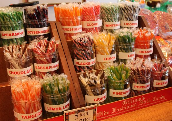
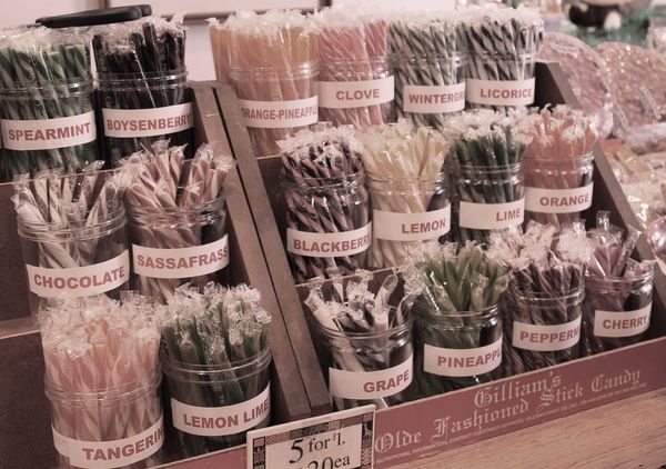
In the old-fashioned grocery store from the cirra 1920.
First is in color, no adjustments, taken with the flash.
Second is with color adjustment made post processing.
Tell me which one you like better and why....
First is in color, no adjustments, taken with the flash.
Second is with color adjustment made post processing.
Tell me which one you like better and why....
#1
#2
Apr 27, 2012 12:04:47 #

1st one does it for me as the color adds a "pop" to it aand well focused. The second is rather dull and does nothing for me
Apr 27, 2012 13:16:57 #

sherryb7 wrote:
In the old-fashioned grocery store from the cirra 1920.
First is in color, no adjustments, taken with the flash.
Second is with color adjustment made post processing.
Tell me which one you like better and why....
First is in color, no adjustments, taken with the flash.
Second is with color adjustment made post processing.
Tell me which one you like better and why....
The first one for sure. The bright colors were the attraction of these candy counters! The second one is toned down too much. Rbo36
Apr 27, 2012 15:03:11 #
Apr 27, 2012 15:10:23 #
i prefer unprocessed, the orange tint provides warmth, and a feeling of yeasteryear, and makes the candy really stand out and look more apetizing. the processed is too blue and cold. perhaps less processing wouldhelp
Apr 27, 2012 15:14:13 #

Apr 27, 2012 15:58:45 #
Apr 27, 2012 16:02:50 #
I like the first one, with all the yummy colors.
The second one everything looks pink-ish, and does not appeal to me at all.
The second one everything looks pink-ish, and does not appeal to me at all.
Apr 27, 2012 18:54:56 #
Thanks y'all. The 1st is the way the camera saw it, no processing. Guess ya gotta love Cannon.
Apr 27, 2012 23:40:20 #
Apr 28, 2012 15:08:43 #

I like the 1st one if you'd step down the saturation just a bit. The colors are what make this shot and they disappeared in your 2nd shot, SOooo don't desaturate to the point of looking like #2.............
Apr 28, 2012 19:31:21 #
docrob
Loc: Durango, Colorado
sherryb7 wrote:
Thanks y'all. The 1st is the way the camera saw it, no processing. Guess ya gotta love Cannon.
when you go back for a lolipop change and play with the WB - a different color cast would be even neater.
May 1, 2012 07:39:06 #
If you want to reply, then register here. Registration is free and your account is created instantly, so you can post right away.