Opinions solicited on best composition to tll the story
Feb 28, 2016 22:01:33 #
Silvermeteor
Loc: South Carolina, USA
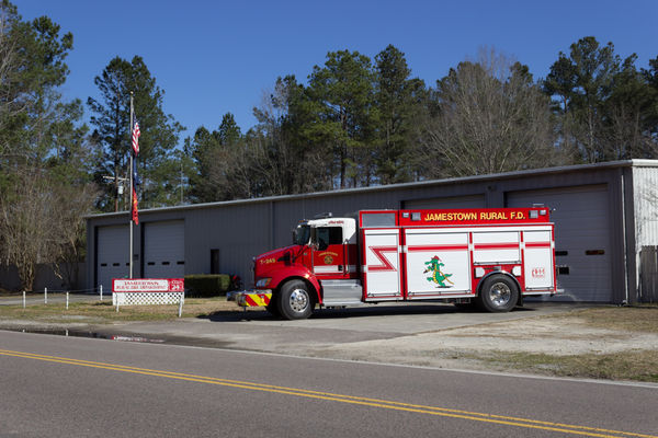
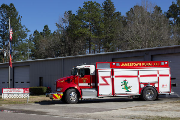
Over the weekend I took a number of pictures of the fire trucks from a local volunteer Rural Fire Department (RFD).
The original intent was to create a portfolio of the engines to be used in a future web site. Just the same it seems to me that a story can and should be told with each image when possible.
I am only concerned with composition. Nothing has been done in post other than creating jpgs so I have not included originals.
So! If you are only doing one image per engine which one of the three presented would you utilize?
Original image
Moderate crop
Tight crop
Feb 28, 2016 22:18:56 #

Silvermeteor wrote:
Over the weekend I took a number of pictures of th... (show quote)
The moderate one. It shows a lot of detail, more so than the first one. The inclusion of the surroundings locates the fire engine, unlike the last image, which has it rather isolated. One has to guess at what the building is, in the background.
--Bob
Feb 28, 2016 22:31:02 #

I would go somewhere between 1 & 2. I agree with Bob, but don't like the far garage door cut off.
--
--
Feb 28, 2016 22:36:40 #
Since you say you want to show the engines - then, SHOW THEM . . . the tight crop.
On the other hand, IF you really want to show the fire department, fire station, fire house - use the moderate crop.
IMHO, of course
On the other hand, IF you really want to show the fire department, fire station, fire house - use the moderate crop.
IMHO, of course
Feb 28, 2016 22:39:08 #
Silvermeteor
Loc: South Carolina, USA
rmalarz wrote:
The moderate one. It shows a lot of detail, more so than the first one. The inclusion of the surroundings locates the fire engine, unlike the last image, which has it rather isolated. One has to guess at what the building is, in the background.
--Bob
--Bob
Thanks for your opinion Bob.
Feb 28, 2016 22:41:13 #
Silvermeteor
Loc: South Carolina, USA
Bill_de wrote:
I would go somewhere between 1 & 2. I agree with Bob, but don't like the far garage door cut off.
--
--
Thanks for your opinion Bill. One of my original reasons for the crop was to minimize the road in front of the station. It is a very large area of dead space that contributes little to the image. I will consider revising the crop and making it a little less tight.
Feb 28, 2016 22:42:40 #
Silvermeteor
Loc: South Carolina, USA
twowindsbear wrote:
Since you say you want to show the engines - then, SHOW THEM . . . the tight crop.
On the other hand, IF you really want to show the fire department, fire station, fire house - use the moderate crop.
IMHO, of course
On the other hand, IF you really want to show the fire department, fire station, fire house - use the moderate crop.
IMHO, of course
Oh boy! Three replies and one for each. lol This may not be as easy as I thought. lol Thanks for your reply.
Feb 29, 2016 00:48:38 #

Silvermeteor wrote:
Oh boy! Three replies and one for each. lol This may not be as easy as I thought. lol Thanks for your reply.
True, but twowindsbear nailed it.
Feb 29, 2016 00:51:23 #
The web site will identify the station. I would go with the tighter crop because it draws your attention right to the truck. The building doesn't seem that important to me because it doesn't look like a typical fire house, it could be any building. and the sign is difficult to read.
Feb 29, 2016 08:07:49 #

The moderate crop for sense of place. I like the flags and the sign, even if difficult to read. The cut-off door won't be noticed by anyone but a photographer :)
Feb 29, 2016 08:47:49 #
Silvermeteor
Loc: South Carolina, USA
jim quist wrote:
The web site will identify the station. I would go with the tighter crop because it draws your attention right to the truck. The building doesn't seem that important to me because it doesn't look like a typical fire house, it could be any building. and the sign is difficult to read.
Thanks for your reply.
Feb 29, 2016 08:49:44 #
Silvermeteor
Loc: South Carolina, USA
Linda From Maine wrote:
The moderate crop for sense of place. I like the flags and the sign, even if difficult to read. The cut-off door won't be noticed by anyone but a photographer :)
I'm leaning towards the moderate crop. I believe that it gives a pretty good view of the truck but the inclusion of the sign and flag provide some balance, extra interest and a sense of space.
Thanks for your input.
If you want to reply, then register here. Registration is free and your account is created instantly, so you can post right away.