The HandHand
Feb 28, 2016 14:31:38 #

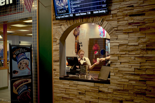
Taken at the local theater in the mall.
ISO 400
F/2.8
1/30 second exposure
I am very much in the learning stages with this camera.
ISO 400
F/2.8
1/30 second exposure
I am very much in the learning stages with this camera.
Feb 28, 2016 16:59:42 #
Nightski wrote:
Taken at the local theater in the mall.
ISO 400
F/2.8
1/30 second exposure
I am very much in the learning stages with this camera.
ISO 400
F/2.8
1/30 second exposure
I am very much in the learning stages with this camera.
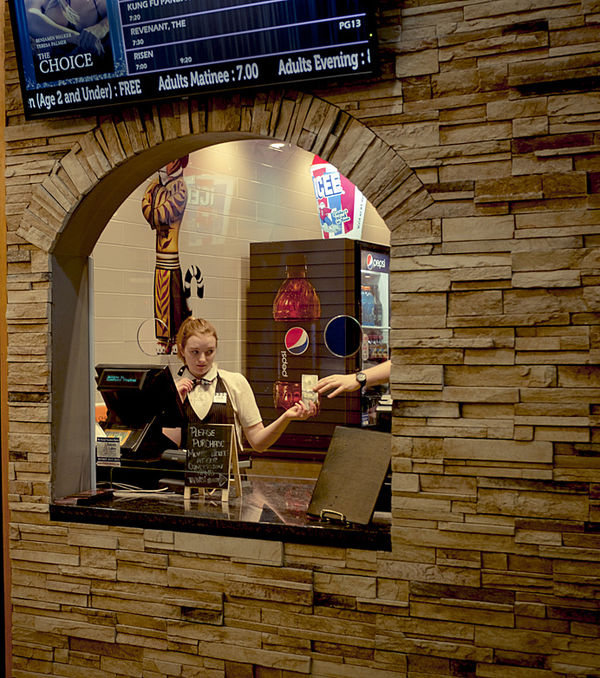
Sandra, now it's my turn. :D I like the general concept of the photo. One thing that stands out immediately is that the girl seems out of focus. With a choice between her and the wall, I'd have gone with her. My other thought "depends." For this forum, I guess it's good as it stands. For my personal collection, I'd crop on the left immediately at the green wall, leaving the orange stripe in the photo. I'd take enough off the right to put the girl at the 1/3 line. I'd also burn in the blue signboard to reduce its tendency to attract attention. And I'd also sharpen it a little. (If you want, I can send you what I did with it. Can do it by PM.) Really, though, I do like the photo.
Feb 28, 2016 17:02:23 #
Please do it and post it so everyone can see. I am very much in the learning process on this and I would like others to benefit from my mistakes.
Feb 28, 2016 18:16:31 #
Nightski wrote:
Please do it and post it so everyone can see. I am very much in the learning process on this and I would like others to benefit from my mistakes.
I'm not that far along in the learning process, myself. I'm learning a lot from this forum and from people's comments and criticisms. But here's my take on your photo. Feel free to criticize it.
Feb 28, 2016 18:20:54 #
Mar 14, 2016 18:17:50 #
jim hill
Loc: Springfield, IL
Nightski wrote:
Yep .. that takes the eye right where it's supposed to go. Thank you, Voss. :-)
Thanks for permission to post this version. I like what Voss did also. But since being a more complicated fellow, at least in my own mind, I tried to bring together the disparate parts.
The left side has been moved closer to the main subject and there has been some manipulation of light densities. Some cropping has also been set around the periphery. I don't claim it to be any better - just a different idea.
(Edit: For the subject, "HandHand" I feel that Voss' rendition is more what you were looking for. If I were to do it again I would forgo the lightening in the middle as it's a little too much and I would increase contrast slightly thus bringing the saturation level up somewhat.)
Mar 14, 2016 18:20:08 #
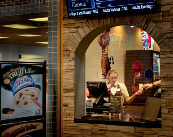
Thank you, Jim. I like the crop that includes the Dairy Queen ad. Movie and an ice cream. I like the exposure adjustment you made as well. Mine is a little dark. Thank you.
btw .. Jim did ask me first.
btw .. Jim did ask me first.
Mar 14, 2016 18:33:27 #
jim hill
Loc: Springfield, IL
Nightski wrote:
Thank you, Jim. I like the crop that includes the Dairy Queen ad. Movie and an ice cream. I like the exposure adjustment you made as well. Mine is a little dark. Thank you.
btw .. Jim did ask me first.
btw .. Jim did ask me first.
I did go back but you got there before me. I made the changes anyway - hope that's alright???
If you want to reply, then register here. Registration is free and your account is created instantly, so you can post right away.