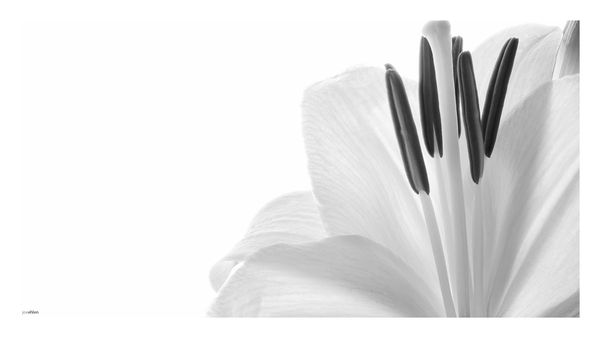
Flower in Mono
Feb 25, 2016 02:17:06 #
Never really thought of flowers in mono, still unsure if it suits simple basic leaf flowers.... Maybe time for me to study flowers in B&W
Feb 25, 2016 02:38:33 #

Could this work? Yes in my opinion it could. The range of toning is delicate and there is a nice level of detail. But a couple of things don't work for me.
1) You have cut the stigma off the top of the style with your border. Because the border is exactly the same colour as your background i.e. white, that then looks as if it actually was truncated, it just doesn't look right.
2) The smudge on the left which turned out to be your name is so distracting. It isn't necessary to put your name on, anyone wanting to steal your work and clone out your name can do so with ease, putting your name on gains nothing and detracts from what otherwise would have been a nice clean image. 3) Unless carefully thought through, borders can make a mess of what otherwise would have been a successful pic. In my opinion this is just such a case. The border and background both being white means that only two sides of the border are visible and the other two are I suppose implied. Why? To me it achieves no purpose.
I would love to see this pic reworked without the border, with the stigma intact and without the distraction of the name because as I said at the start I think this pic really could work. All of this of course is only my opinion, others may disagree. But are flowers in black and white worth exploring? Absolutely, as is clearly evident in this pic.
I hope this helps.
Peter
Feb 25, 2016 08:08:13 #

Your processing brought out the textures beautifully. I can really feel how delicate the flower is.
Black & white flowers would make a great "Thinking in Black and White" topic, methinks :) Maybe in a few months when more folks have access to them.
Also, UHH user IanBarber has a set on his website:
http://www.ianbarberphotography.co.uk/project/flowers/
Thanks so much for posting here, JoeJoe!
Black & white flowers would make a great "Thinking in Black and White" topic, methinks :) Maybe in a few months when more folks have access to them.
Also, UHH user IanBarber has a set on his website:
http://www.ianbarberphotography.co.uk/project/flowers/
Thanks so much for posting here, JoeJoe!
Feb 25, 2016 08:15:54 #
Frank2013
Loc: San Antonio, TX. & Milwaukee, WI.
Welcome to the section JoeJoe. While I see good intent here I must agree with Peter. If peter gets to a post first there is usually nothing left to say. Such is the case here. Looking forward to more of your posts.
Feb 25, 2016 10:59:35 #

conkerwood wrote:
Could this work? Yes in my opinion it could. The r... (show quote)
To agree with and emphasize Peter's point, this is a good candidate for a gray or black border....
Feb 25, 2016 15:11:43 #
conkerwood wrote:
Could this work? Yes in my opinion it could. The r... (show quote)
Thanks Peter
The crop was deliberate by use of a plain white border which in turn blended into the negative space....the purpose to this was the Anther and not the stigma detail.... As to the name this reinforces the copyright intention of the photographer in so much as artistic ownership..... which has been breached a bit further down the page....lol
Just to refresh individuals if your going to change something permission of the owner is clearly needed before you change or tamper with... .....
Regards
Joe
Feb 25, 2016 15:14:01 #
Linda From Maine wrote:
Your processing brought out the textures beautifully. I can really feel how delicate the flower is.
Black & white flowers would make a great "Thinking in Black and White" topic, methinks :) Maybe in a few months when more folks have access to them.
Also, UHH user IanBarber has a set on his website:
http://www.ianbarberphotography.co.uk/project/flowers/
Thanks so much for posting here, JoeJoe!
Black & white flowers would make a great "Thinking in Black and White" topic, methinks :) Maybe in a few months when more folks have access to them.
Also, UHH user IanBarber has a set on his website:
http://www.ianbarberphotography.co.uk/project/flowers/
Thanks so much for posting here, JoeJoe!
Thanks Linda
I find it hard just thinking... lol
Thanks for the link too ... it has fuelled a bit of a project over the coming months
Joe
Feb 25, 2016 15:16:28 #
Uuglypher wrote:
To agree with and emphasize Peter's point, this is a good candidate for a gray or black border....
Thanks David
But I prefer the white border and COPYRIGHT signature.... (take with a pinch of salt) but I would advise you to ask before you change someone else's photo in future...
Feb 25, 2016 15:31:14 #

JoeJoe wrote:
Never really thought of flowers in mono, still unsure if it suits simple basic leaf flowers.... Maybe time for me to study flowers in B&W
I think this is your first visit to FYC so most of all I want to say Welcome, and hope you'll hang around and share your images and talk with us a while.
I like this a lot, except for two things that I think are easily fixed. The white edging nipped off an essential part of the flower's anatomy on top, and the little signature line on the bottom left is a bother. As for cropping the right side, that's a fine artistic choice. Your conversion is very pleasing, soft and soothing, with plenty of tonal variation even though the flower is a very light color.
The black and white versions of flowers are challenging sometimes and stunning sometimes. I hope you'll share more of your journey and maybe we will start a new interest here. My interest in monochrome interpretations of flowers started when once ran into Vincent Versace in Seattle photographing flowers in the market. If you want to look at some of them, the monochrome are mixed in with the color, just click through till you find them. http://versacephotography.com/portfolio/flora/
Thanks for sharing!
Feb 25, 2016 15:38:50 #
minniev wrote:
I think this is your first visit to FYC so most of... (show quote)
Thanks MinnieV for the lovely welcome
Thank you very much for the link ...exactly what I'm looking for as I'm new to flower photography in any form... This was my first deliberate attempt and something I will be pursuing more in the coming year
I normally shoot portraits and cropping off the top of a head is natural for me lol.... I was drawn to the anther so off with the sigma...
Regards
Joe
Feb 25, 2016 18:24:18 #

I can only echo everything Peter has said and reiterate the signature is just a bothersome image killer for me.
Nice shot but a tad more contrast needed maybe? Its lovely but a little lost in the background.
Welcome aboard the FYC express and hope you enjoy the journey.
Nice shot but a tad more contrast needed maybe? Its lovely but a little lost in the background.
Welcome aboard the FYC express and hope you enjoy the journey.
Feb 25, 2016 19:12:02 #
JoeJoe wrote:
Thanks Peter br br The crop was deliberate by use... (show quote)
Joe, You have my sincere apology...just didn't think...just did it...never will again!
Dave
Feb 26, 2016 04:27:29 #
Uuglypher wrote:
Joe, You have my sincere apology...just didn't think...just did it...never will again!
Dave
Dave
Sorry Dave you have nothing to apologise about.... Just me having a bit of fun with Peters excellent scathing critique.. that's why I added "take with a pinch of salt"... on your reply ..you have to read across the two .lol.. it was the comment regarding the small name at the bottom of the pic..... Didn't know this really upsets serious photographers..... lol... have to do it more now.
I take it with the intention that was meant ...to help .and I am grateful...thanks ;)
Regards
Joe
Feb 27, 2016 04:35:41 #

JoeJoe wrote:
Thanks Peter br br The crop was deliberate by use... (show quote)
Joe, I love your photo the way it is with the white border. The photo is way too delicate for a harsh border. Just my opinion. The white makes the edges of the photo seem "limitless." And, the focus is on the flower not the border. A nice signature of reasonable size, blended into the background color, should be acceptable most anywhere. JMHO
Feb 29, 2016 18:02:43 #
TheeGambler wrote:
Joe, I love your photo the way it is with the white border. The photo is way too delicate for a harsh border. Just my opinion. The white makes the edges of the photo seem "limitless." And, the focus is on the flower not the border. A nice signature of reasonable size, blended into the background color, should be acceptable most anywhere. JMHO
Thanks TheeGambler
I wouldn't change the border in any way myself as I think the flower dictates the border in the tonal ranges and colour, I like the mind to work when looking at an image to fill in the blanks....
Joe
If you want to reply, then register here. Registration is free and your account is created instantly, so you can post right away.