Please check this pic & critique
Feb 21, 2016 08:34:01 #

Revet wrote:
Sharpness is excellent to me. I think the first one is too dark and the second to light. I would go in between the two. Nice shot!!
:thumbup:
Feb 21, 2016 11:05:26 #

MiroFoto wrote:
First of all - I am not trying to indirectly brag. I am asking you for a favor to answer 2 questions - just technical !!
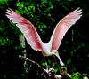
1. Is it sharp enough to your standard? look at the brown feathers . I do not see the structure. Is it a way to improve it ?
2. Is it dark or OK? It looks fine on my computer , but my friend said it is too dark and fixed it (now it is bleached - to me)
Thank you Miro
1. Is it sharp enough to your standard? look at the brown feathers . I do not see the structure. Is it a way to improve it ?
2. Is it dark or OK? It looks fine on my computer , but my friend said it is too dark and fixed it (now it is bleached - to me)
Thank you Miro
No, it is not really sharp. The eye, and a couple of feathers half way down the neck are close. But, with a shallow depth of field, if the eye isn't perfect the image isn't sharp. It might have something to do with post processing.
As others have said, you have too dark and too light. I think the head also has a slight color cast. It could be that the second one was over lightened in an attempt to get it white. I think it can be corrected in pp.
--
Feb 21, 2016 16:20:57 #

MiroFoto wrote:
First of all - I am not trying to indirectly brag. I am asking you for a favor to answer 2 questions - just technical !!
1. Is it sharp enough to your standard? look at the brown feathers . I do not see the structure. Is it a way to improve it ?
2. Is it dark or OK? It looks fine on my computer , but my friend said it is too dark and fixed it (now it is bleached - to me)
Thank you Miro
1. Is it sharp enough to your standard? look at the brown feathers . I do not see the structure. Is it a way to improve it ?
2. Is it dark or OK? It looks fine on my computer , but my friend said it is too dark and fixed it (now it is bleached - to me)
Thank you Miro
Good shot, lots of fine detail including the barbules on the white head feathers.
First image is too dark. Second image is too light, and the colors are wrong. White feathers are tinged in pink and the beak looks like neon.
I suggest you get a profiling tool like an Xrite i1 Display Pro, and set your black and white levels to .4 cda/m^2 and 80 cda/m^2 respectively. if the image seems too light when printed or viewed on another display, then raise the white point level.
Feb 21, 2016 16:48:23 #

The first photo seems to capture an intense look, it displays a character in the bird that really draws one in. The detail is sharp, though I thought perhaps it could be just a bit lighter. The second photo doesn't have the intensity in the birds character though it displays more detail because it is brighter. So, lighten the first, bring out more detail, (beautiful shot) but don't lose that . . . . intense character. Really great shot worth displaying! Something in that bird is just amazing.
Feb 21, 2016 16:58:06 #
Feb 21, 2016 17:12:25 #

MiroFoto wrote:
First of all - I am not trying to indirectly brag. I am asking you for a favor to answer 2 questions - just technical !!
1. Is it sharp enough to your standard? look at the brown feathers . I do not see the structure. Is it a way to improve it ?
2. Is it dark or OK? It looks fine on my computer , but my friend said it is too dark and fixed it (now it is bleached - to me)
Thank you Miro
1. Is it sharp enough to your standard? look at the brown feathers . I do not see the structure. Is it a way to improve it ?
2. Is it dark or OK? It looks fine on my computer , but my friend said it is too dark and fixed it (now it is bleached - to me)
Thank you Miro
The first image is under exposed. All your friend did is increase the exposure in the computer, and over did it. What is needed is to selectively lighten the shadows to avoid blowing out the bright spots in the original. The original underexposure has generated considerable noise in the darkest parts of the image so lightening the whole image just brings out the noise - better to leave it dark. There is also a slight yellow colour cast as well. This version was corrected in DXO Optics Pro 10: Clear View filter at 20; Shadows +30; and slight lens correction (sharpening). Then the colour cast was corrected in Lightroom.
I didn't bother trying to fix the hot spots in the background.
And, yes. The picture is plenty sharp where it counts.

Feb 21, 2016 17:16:21 #
MiroFoto wrote:
Robert R - I have a Nikon 7100 and Tamron 16-300
John Swanda - thank you for the direction . In fact, you have helped me to understand something. I have been avoiding to play with PP . I guess my Elements are too weak for it.
Thanks Miro
John Swanda - thank you for the direction . In fact, you have helped me to understand something. I have been avoiding to play with PP . I guess my Elements are too weak for it.
Thanks Miro
I also have that lens. Like it a lot.
Feb 21, 2016 17:34:40 #
mcveed wrote:
The first image is under exposed. All your friend ... (show quote)
Great job on the post processing. :thumbup:
That is a fine looking image!
Feb 21, 2016 19:54:32 #

MiroFoto wrote:
First of all - I am not trying to indirectly brag. I am asking you for a favor to answer 2 questions - just technical !!
1. Is it sharp enough to your standard? look at the brown feathers . I do not see the structure. Is it a way to improve it ?
2. Is it dark or OK? It looks fine on my computer , but my friend said it is too dark and fixed it (now it is bleached - to me)
Thank you Miro
1. Is it sharp enough to your standard? look at the brown feathers . I do not see the structure. Is it a way to improve it ?
2. Is it dark or OK? It looks fine on my computer , but my friend said it is too dark and fixed it (now it is bleached - to me)
Thank you Miro
I agree with what others have said here, Your image is too dark, but on your monitor it looks fine to you. It is very common for monitors to be adjusted with the brightness level too high, even straight out of the box. To get the best possible monitor settings you really need a monitor calibration tool, which of coarse will cost some amount of $$. Depends on how concerned you are about having the best possible display.
Feb 22, 2016 08:25:04 #
Woodworm65
Loc: Lombard, IL
The second shot to me is better but may be just a tad to light, again it is in the eye of the person viewing it. One thing I learned from taking a photography class is the the human brain and eye reads a photo from lower left to upper right and will for the most part go to the focal point of the photo, which in your case is the head no one will pay attention to the brown feathers except a fellow photographer. Good pics hope this helps.
Feb 22, 2016 08:27:09 #

Feb 22, 2016 09:04:31 #

MiroFoto wrote:
First of all - I am not trying to indirectly brag. I am asking you for a favor to answer 2 questions - just technical !!
1. Is it sharp enough to your standard? look at the brown feathers . I do not see the structure. Is it a way to improve it ?
2. Is it dark or OK? It looks fine on my computer , but my friend said it is too dark and fixed it (now it is bleached - to me)
Thank you Miro
1. Is it sharp enough to your standard? look at the brown feathers . I do not see the structure. Is it a way to improve it ?
2. Is it dark or OK? It looks fine on my computer , but my friend said it is too dark and fixed it (now it is bleached - to me)
Thank you Miro
You made a fine photo Miro, took the liberity to adjust your photo to my viewing corrections. Check two photos and decide which is more natural looking. You don't want to over power any corrections to the viewer, they will know something is still not right! AP

My MAC iPhoto addjustments from your underexposed photo
Feb 22, 2016 09:18:41 #
AP wrote:
You made a fine photo Miro, took the liberity to adjust your photo to my viewing corrections. Check two photos and decide which is more natural looking. You don't want to over power any corrections to the viewer, they will know something is still not right! AP
The highlights in the background look a little blown. I still think selectively lightening the bird and leaving the background as it was in the original is the way to go.
Feb 22, 2016 10:16:48 #

I like number 2 a lot. Maybe could use a tiny bit of sharpness on the white feather edge
Feb 22, 2016 10:20:31 #

The first one is a little to dark but better than #2, the white
balance is off on #2 and just a little to bright.
balance is off on #2 and just a little to bright.
If you want to reply, then register here. Registration is free and your account is created instantly, so you can post right away.