Bop
Feb 18, 2016 00:13:19 #

As does music, this speaks for it's self---or doesn't.
Feb 18, 2016 14:07:23 #

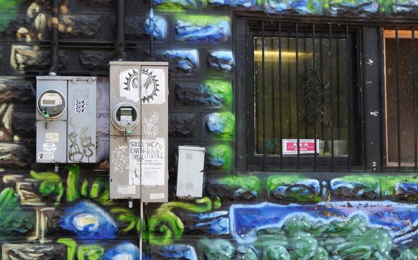
I looked at this .. there was something i liked .. but something that seemed over the top. At first I thought you had over done the post work on the colour. Then I did the download and changed my mind. No . this is a couple of electric boxes on a wall that's been painted grafitti style. I like that .. then I covered the windows with an envelope .. that was it! I would lose the windows. Crop right at the edge to keep as much stone wall as possible, but I think you will see a much stronger image if you do that.
Feb 18, 2016 16:13:54 #
Nightski wrote:
I looked at this .. there was something i liked ..... (show quote)
Thanks Sandra. Good suggestions---but I'm troubled with having the one meter almost smack-dab in the middle of an almost square format---and that one vertical line ?? How about splitting the difference and taking out the window on the right----? I'll give it a try. Stay tuned. Bob
Feb 18, 2016 16:30:39 #
Feb 19, 2016 04:19:42 #

Pilot 6 wrote:
As does music, this speaks for it's self---or doesn't.
Although I agree with Sandra's suggested crop, your less severe crop is a bit of an improvement.
Dave
If you want to reply, then register here. Registration is free and your account is created instantly, so you can post right away.