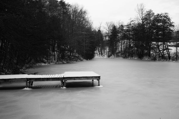
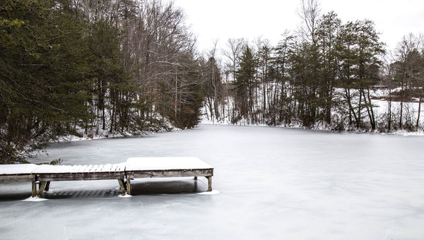
Iced in pier....
Feb 1, 2016 18:48:29 #
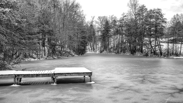
from my walk around the farm in the snow. I originally processed this one in color but decided to play with it in B&W. I have actually processed it two ways, one with the shadows deeper and not much detail in them and another with the shadows lifted. I am only going to present the darker one for now. What more can I do to make this a better image? I am not used to processing B&W so I am trying to learn.
FYC
FYC
Feb 1, 2016 19:30:14 #

Excellent timing on this one, Andrea, as we're going to start a discussion/photo share topic on Wednesday called "Thinking in black and white!"
I like the composition a lot here. There is a nice balance with the placement of the rectangle shapes of the wharf in the framing of trees on both sides that angle back to a point. The white sky adds to a cold, stark mood.
There are often many ways to process a b&w image; it's really just personal preference and what mood you're trying to convey or what details you want to emphasize.
If this is your preferred pp, can you talk about what appeals to you more than the other you mentioned?
Feb 1, 2016 19:54:09 #
Linda From Maine wrote:
Excellent timing on this one, Andrea, as we're goi... (show quote)
Thank you Linda for your thoughts on this one. I liked this processing better than the other one because I felt like it conveyed the cold bleary mood of the day. It was very cold and the wind was blowing pretty hard. This was in the middle of our snow storm last weekend.
Feb 1, 2016 20:00:23 #
Andrea.Jarrell wrote:
Thank you Linda for your thoughts on this one. I liked this processing better than the other one because I felt like it conveyed the cold bleary mood of the day. It was very cold and the wind was blowing pretty hard. This was in the middle of our snow storm last weekend.
Thanks!
Feb 1, 2016 22:09:38 #
Frank2013
Loc: San Antonio, TX. & Milwaukee, WI.
Andrea.Jarrell wrote:
What more can I do to make this a better image
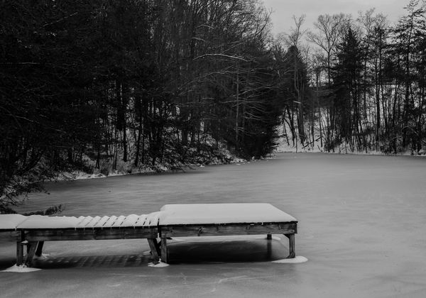
Since I find the dock to be the subject I think a crop is in order for a bit more impact and focus of it. I also added some contrast and clarity, took down the highlights and whites, and added some black to try to make it a touch more cold and bleary as that was your intent. Not sure I succeeded.
Feb 1, 2016 22:56:49 #
What editing programs do you have?
One thing that many, including me, do is make the image as good as can be done in color and then convert and tweak for the final image.
I find it a little flat to my taste, it is snow and ice, but to me they look like dirty white laundry.
One thing that many, including me, do is make the image as good as can be done in color and then convert and tweak for the final image.
I find it a little flat to my taste, it is snow and ice, but to me they look like dirty white laundry.
Feb 1, 2016 23:22:32 #

I like your composition but I would have brought out the detail in the shadows and the highlights............forgive my impertinence.
Respectfully
Respectfully
Feb 2, 2016 08:49:49 #
Frank2013 wrote:
Since I find the dock to be the subject I think a crop is in order for a bit more impact and focus of it. I also added some contrast and clarity, took down the highlights and whites, and added some black to try to make it a touch more cold and bleary as that was your intent. Not sure I succeeded.
Thank you Frank for your comments and suggestions. I do agree with the crop to bring the dock more in line with the rule of thirds. I don't know that I want to take the whites as grey as this version does, it was newly fallen snow after all so it really was very white out. I think the second altered version may be closer to what I want.
Feb 2, 2016 08:55:05 #
robertjerl wrote:
What editing programs do you have?
One thing that many, including me, do is make the image as good as can be done in color and then convert and tweak for the final image.
I find it a little flat to my taste, it is snow and ice, but to me they look like dirty white laundry.
One thing that many, including me, do is make the image as good as can be done in color and then convert and tweak for the final image.
I find it a little flat to my taste, it is snow and ice, but to me they look like dirty white laundry.
Thank you Robert for your comments and critique. I processed this in Lightroom but I also have Photoshop which I am just beginning to learn. I have been processing in Print Shop until recently. I did process another similar shot in color first but this one I took straight to B&W before I processed it.
Feb 2, 2016 08:59:17 #
photosbytw wrote:
I like your composition but I would have brought out the detail in the shadows and the highlights............forgive my impertinence.
Respectfully
Respectfully
Thank you photosbytw for your comments and I will forgive you. I agree that the whites need to be brought up and maybe some of the shadows as well, however, I think this may have been a bit too much. I think I may go back and process the image in color and then convert it again.
Feb 3, 2016 04:24:06 #

Number 1 invest in some BW conversion software such as Silver Efex or Topaz. Photoshop or Lightroom etc make a poor job of mono conversion.
Number 2 Get your color image as good as it can be then convert. Never try and hide a bad picture behind a BW conversion. It does not work.
Number 3 Convert to improve an image not just because you can. You will read lots of rubbish printed here about images speaking to you and emotion and mood expressed in an image. Pure and complete bunkum to cover up lack of knowledge in the commentor. BW generally just simplifies an image bringing to the fore the object or subject you wish to show. This image I suspect would be better in color so examine your reasons for conversion. The white sky here adds nothing it looks blown. Would be nice to see your color image after you have worked on it. I have a feeling it is rather nice.
Feb 6, 2016 10:26:52 #
Billyspad wrote:
Number 1 invest in some BW conversion software suc... (show quote)
Okay, after reading your comments which do make a lot sense, I went back and processed this image in color and brought it to what I feel is the best it can be. I am posting it here for your consideration and the consideration of others. I think it does look good in color as you suspected. Thank you for taking the time to consider this image.
Feb 6, 2016 15:33:15 #

Andrea.Jarrell wrote:
Okay, after reading your comments which do make a lot sense, I went back and processed this image in color and brought it to what I feel is the best it can be. I am posting it here for your consideration and the consideration of others. I think it does look good in color as you suspected. Thank you for taking the time to consider this image.
I like the color version better. It has more detail discernible everywhere. If you still want a black and white version, this one should convert better than what you had the first round. If you've been dealing with your photos in Print Shop, you should have the whole wide world open to you now with the CC suite, with the only limit being how fast you can learn all the intricacies. I learn something new every day and feel like I've barely scratched the surface! It is so much fun to learn all the different ways it is possible to go with a single scene, depending on how we capture and develop it.
Thank you for being willing to share your journey with this particular image and I hope you'll continue to do so. A single image can have a rather interesting journey within a single thread!
Feb 7, 2016 19:08:36 #
minniev wrote:
I like the color version better. It has more detai... (show quote)
Thank you minnie for your thoughts and comments on the development of this image. I do like the color version with the further processing. I may go back and look at a B&W conversion when I have the time to play with it some more. I have been trying to follow the B&W topic that Linda started and I am really learning a lot about what makes a good B&W image. I can see where an image processed to its best in color will make a better conversion.
Feb 7, 2016 21:07:52 #
Andrea.Jarrell wrote:
Thank you minnie for your thoughts and comments on the development of this image. I do like the color version with the further processing. I may go back and look at a B&W conversion when I have the time to play with it some more. I have been trying to follow the B&W topic that Linda started and I am really learning a lot about what makes a good B&W image. I can see where an image processed to its best in color will make a better conversion.
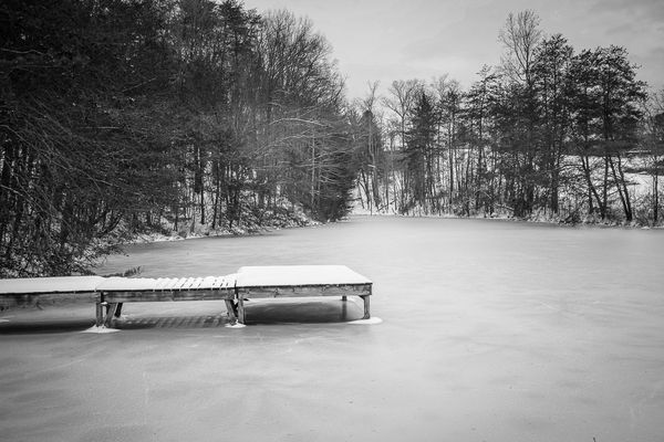
Just to go full circle with this one, note my b&w conversion below. Compare the details in the trees with your first posted shot.
There is more that could be done with this one, re the sky or even toning down the snow on dock (though I personally love the pop of white), but just wanted to show you a different look.
The "Thinking in black and white" thread was a collaboration with MinnieV, Dave Chinn and others. I'm extremely grateful for the interest and participation, and hope we have much more to talk about and learn with regards to black & white photography!
Nik Silver Efex, from your edited color shot. I still love your original composition (the wider view), and as far as color vs. b&w, your color brings a bit of warmth to the scene, more inviting perhaps. Both tell their stories :)
(Download)
If you want to reply, then register here. Registration is free and your account is created instantly, so you can post right away.