Street - Young mother
Jan 26, 2016 03:50:03 #

Jan 26, 2016 05:44:01 #
Billyspad wrote:
For your consideration
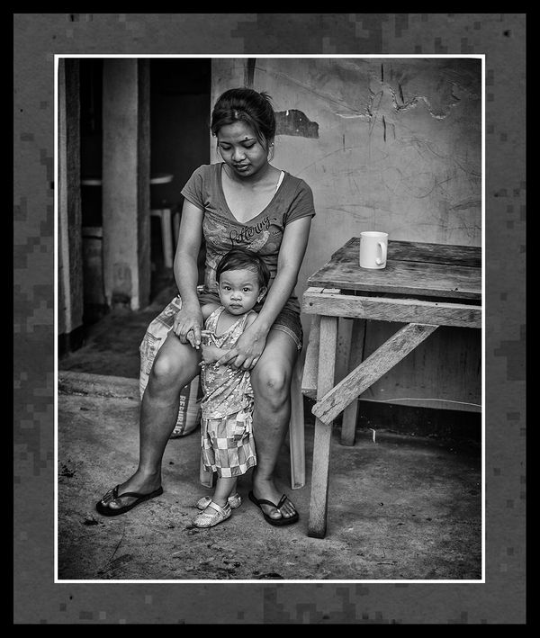
I'm not crazy about the frame but that is purely personal preference. On the wall to the right of the woman is a missing peace of plaster that created a dark spot. It appears to be coming out of her head on the right side. Also the door frame on the top of her head is a bit disconcerting and distracting. I wonder what would be the result if you cloned those areas to make a uniform background? This is, of course, nit-picking. The look on her face and the child's intense stare at the camera are wonderful. Yes, I really like this photo. Black and white was the way to go. I love the detail in the table.
Jan 26, 2016 07:12:54 #
Erich oh Erich This is pure unadulterated street, so you go with it warts and all. Marks on wall etc get left in street, its to portray what was there. Normal photograph portrait etc they would be gone in an instant but I do like my street raw.Its really how it should be un-sanitized unless it takes attention away from the main subject. The young ladies house was a bit rough so it gets shown like it is.
Thanks for dropping by my friend and trust all is well with you
Thanks for dropping by my friend and trust all is well with you
Jan 26, 2016 07:31:36 #

Billyspad wrote:
For your consideration
What I enjoy about your pics is the fact that they are real. The people you capture are living their lives and through your camera I am able to enter their world for a moment. From my privileged western lifestyle, for a minute or two, I get what it is like to be living in the Phillipines, to be living in circumstances where what I call poverty is normal. I can't pretend that it suddenly makes me want to give it all up, donate my stuff to charity and all that other patronising nonsense which so often passes for compassion. I am far too spoiled for that.
But when I look into the eyes of this particular child, and you have captured them perfectly, then I get it. I get a proud mother looking down protectively. I get the mug sitting there as a reminder that someone has to make the tea and then wash the dishes. I get the fact that kids are kids, parents are parents and more importantly, what it is to be human. So on that level its a great pic, and I love it. I get what your pic says. I could be nit picky and suggest the bras strap is a little bright and there is a bright spot just to the right of her hair and there is a distracting white line near the back table leg but they are the 1 percent fix it things. But for all that, as much as I love the pic for me the frame kills it. Your pic is about organic lines and natural flowing reality but the frame is rigid, even the patterns in the frame are rectilinear. No question the frame adds depth which is the point of a frame but it also restrains and constricts. It is as if we are looking at the reality of the Phillipines through the restricting frame of the western viewpoint. With the frame you add depth which is useful from a technical point of view but you also add distance and separation. Take the frame away you have immediacy and the presence which your pic deserves. Her eyes say so much, but the frame is an intrusion. Don't get me wrong, I accept that sometimes frames can add something but in this case I think you lose more than you gain. Street is street and you are damned good at it because you have an eye which can grab the moment and make it real. But snaps don't need a frame.
I love the pic, her eyes are fantastic.
Peter
Jan 26, 2016 12:50:34 #
Billyspad wrote:
Erich oh Erich This is pure unadulterated street, so you go with it warts and all. Marks on wall etc get left in street, its to portray what was there. Normal photograph portrait etc they would be gone in an instant but I do like my street raw.Its really how it should be un-sanitized unless it takes attention away from the main subject. The young ladies house was a bit rough so it gets shown like it is.
Thanks for dropping by my friend and trust all is well with you
Thanks for dropping by my friend and trust all is well with you
So that begs the question: Does street photography have to be SOOC? By changing contrast and exposure, are we not altering "reality". I'm assuming that you did some cropping either in post or by the choice of lens. Unless the photo reveals all that could be seen with a human eye, you are making a selection of what people get to see. Would it change the impact of the photo if the dark spot were removed. I think the house would still be a bit rough which is what you intended to show.
Now I'm not saying that you should alter the photo in any way. That is, of course, up to you. I'm well. Hope you and Mrs. Billy are fine as well.
Jan 26, 2016 15:21:51 #

Very nice image that resonates emotionally no matter where you're from. Beautifully rendered in post, as well, with definition but without harshness. The pose (though I'm sure it is natural rather than photographer-selected) is perfect, with the child starting right at you and the mother looking downward at the child.
Very nice.
Peter and Erich have already made some interesting technical comments as well, and Erich has ventured off onto that slippery road about editing and street photography. Is that something you guys might want a thread on to discuss further? Might be interesting. As for myself, I edit most of what I shoot, and I don't mind cloning things out or cropping street photos just like anything else, but I've never added anything (probably because I'm not any good at it).
Jan 26, 2016 19:55:13 #
Billyspad wrote:
I've resisted reading any of the other commentary because I want to record first impressions. Edit: I've read Peter and Erich's comments, and they are good comments. I disagree about the frame. I like your frames. I've always thought they were tasteful and right.For your consideration
First: gorgeous, stunning, affecting, superlative...
If this were a B&W print it would be a master print. It looks like a charcoal. Black blacks, white whites, LOoooong scale!
Composition is wonderful. Kudos for not putting them in the center (which I probably would have! :oops: )
There is some interesting slight tension. Something seems to be causing Mom's great toes to curl upwards, indicating she is a trifle nervous about something, perhaps why she is gripping her child's hands; maybe the little girl has got hold of something she doesn't want her to have...
The child meanwhile regards the lens calmly and directly, not at all concerned or threatened.
Just a terrific moment! Wow. Just Wow. :thumbup: :thumbup:
Jan 26, 2016 20:35:49 #
ebrunner wrote:
As an old black and white printer with over 30 years in the darkroom, no, street nor any other B&W photography does not have to be SOOC, which is actually a concept of the digital age. If Billy had made the picture with film (very likely it would have been Tri-X Pan, an old standby) he'd have had to develop it to a negative first. Then he'd choose the negative from the filmstrip and put it in an enlarger to project it to an easel in the darkroom under safelight. Now the real work begins. First we gauge the exposure and make a test print, or maybe make test strips, or use an enlarging meter, but the first print is never gonna be right. If it's close that's great, but now we have to fine-tune the timing or aperture or both. The goal (for me) would be to produce the density and contrast I want with 3 full minutes in the developing tray with constant agitation (rocking the tray). If I have to "pull" it sooner it's been overprinted. More than 3 minutes is pointless; I need to adjust the exposure.So that begs the question: Does street photography... (show quote)
Once I have a solid "straight" print, maaaaybe I'm done but probably not. There will (WILL!) be areas that need more attention, either more exposure or less. This is referred to as "dodging" or "burning," and is the reason why the dodge and burn tools in Photoshop are represented by a tiny disc-shaped paddle and a hand making an O with the fingers, because that's how we often worked, with what were called "paddle dodgers" to hold back light from the easel where we wanted something brighter, or use the hand or both hands to allow more light to strike specific areas, called "burning in" or "down."
The thing is, as others have said often, a photograph isn't reality anyway. It's a 2-dimensional representation of---something. A camera "lies" simply by what it crops out of its original frame, so what difference does it make if the photographer crops further? Straight from the camera is, as mentioned, a digital-age concept. With the exception of slides, which were not often manipulated so they were pretty much SOOC, negative films were always manipulated just by virtue of being printed. An underexposed or overexposed neg could be adjusted (within limits), and all sorts of things could be manipulated in the dark by a skilled printer. Using Lightoom or Photoshop or Gimp or Picasa is not substantially different. :-)
Jan 27, 2016 00:31:37 #
conkerwood wrote:
What I enjoy about your pics is the fact that they... (show quote)
Glad you like it Peter. Im posting tutorials at press about adding frames so if an image can stand it I'm using them to give our members ideas of their own. But your point is noted my friend.
Jan 27, 2016 00:36:57 #
minniev wrote:
Very nice image that resonates emotionally no matt... (show quote)
The pose was natural min candid shot in fact. She looked up afterwards and saw me.
If you wish to start a discussion please do and use this snap if you feel it would help. Got a suspicion its a dead horse flogging type of discussion but maybe a new viewpoint will emerge. Over to you min.
And thank you for calling by always a pleasure to see you ma'am.
Jan 27, 2016 06:58:27 #
Chuck_893 wrote:
I've resisted reading any of the other commentary ... (show quote)
Thank you so very much Chuck Very glad it meets with your approval.
Means a lot to me.
If you want to reply, then register here. Registration is free and your account is created instantly, so you can post right away.