Too much saturation?
Jan 24, 2016 11:22:38 #
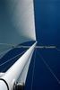
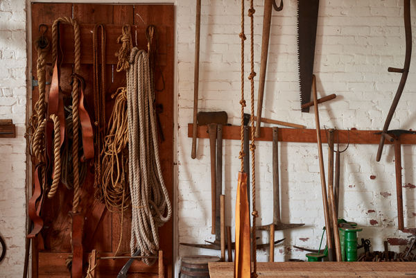
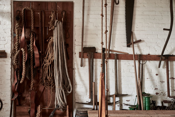
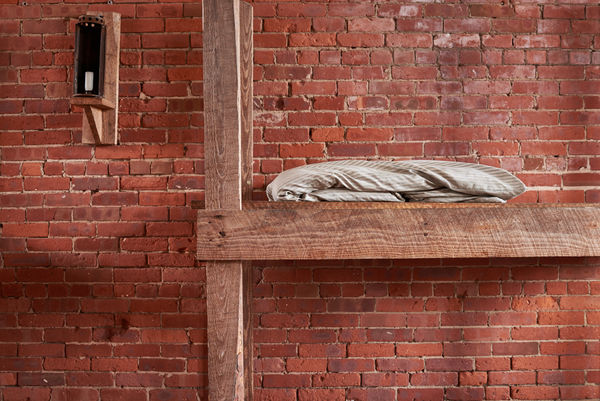
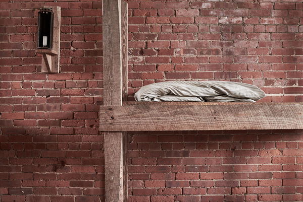
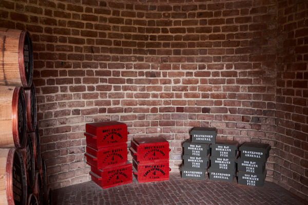
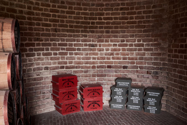
The following images were taken on a D610 using a Nikkor 35mm 1:2 D, ISO 100, f/8 at between 1/3 and 0.62 seconds. They were developed from the raw images using Capture One 9 Pro.
After my initial processing to tweak the exposure and white balance it looked like there was something unreal about them. The colors did not look like the scene I remembered - too saturated and unrealistic.
I returned to the raw session and reduced the saturation by about 25 units and increased the contrast by about 5 units to make up for the loss of color contrast. The result is closer to what I saw. The bricks and wood are duller but more real.
I don't think that there is a bias in my monitor and of course I have the advantage of actually having been at the location. I also have more experience with B&W film than with digital color so I may have a personal bias.
But I suspect that the digital process itself (raw capture an conversion through Capture One) also might have a "vivid color" bias. Keep in mind that these images were developed from raw so camera settings used by JPG do not apply.
Has any one else noticed this?
First pass
(Download)
De-saturated
(Download)
First Pass
(Download)
De-saturated
(Download)
First pass
(Download)
De-saturated
(Download)
Jan 24, 2016 12:06:04 #

selmslie wrote:
The following images were taken on a D610 using a ... (show quote)
Interesting question, and I hope we will draw others into the conversation.
First, I'll say that I prefer your second versions, the ones where you did some desaturation. The colors are still strong, not dull, but appear more realistic.
I do not have a camera anything like yours, I use Olympus cameras. But I encounter the same problems even in raw captures, though somewhat less so if I use the Olympus proprietary software. I prefer to take everything in through Lightroom, whose version of processing for Oly raws is not exactly what Oly does, and has some tendency to oversaturate reds and do something harder to define but easy to recognize with greens.
So: I have an import preset to take care of these things when the raw images are converted in LR. Eric Meijs, a Dutch archaelogist/photographer, kindly offers free LR import presets for us Oly users every time a change is made that warrants it. They take out all the built in bias, and it is fascinating to look at what they do under the hood. I use these as starting points to create the presets I want.I don't know anything about Capture One but it probably has some way to build your presets too. It sure saves a lot of time to have that stuff addressed on the front end.
Jan 24, 2016 12:36:46 #
Interesting. I prefer the less saturated versions.
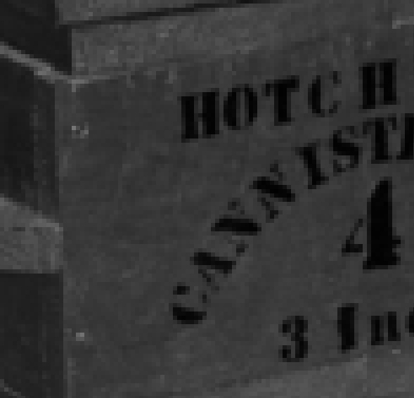
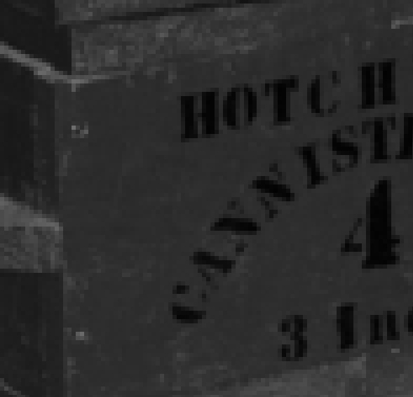
Looking at sections of the images closely the saturation comes at the expense of the loss of subtle tonal variations. This is easier to see when they are converted to grayscale.
The first example is from the desaturated version, the second from the more saturated version.
Mike
Looking at sections of the images closely the saturation comes at the expense of the loss of subtle tonal variations. This is easier to see when they are converted to grayscale.
The first example is from the desaturated version, the second from the more saturated version.
Mike
Jan 24, 2016 13:24:26 #
Blenheim Orange wrote:
Interesting. I prefer the less saturated versions.
Looking at sections of the images closely the saturation comes at the expense of the loss of subtle tonal variations. This is easier to see when they are converted to grayscale.
The first example is from the desaturated version, the second from the more saturated version.
Mike
Looking at sections of the images closely the saturation comes at the expense of the loss of subtle tonal variations. This is easier to see when they are converted to grayscale.
The first example is from the desaturated version, the second from the more saturated version.
Mike
The desaturated versions look more realistic but I like the warm feeling of the saturated ones.
Jan 24, 2016 13:27:30 #

selmslie wrote:
...
But I suspect that the digital process itself (raw capture an conversion through Capture One) also might have a "vivid color" bias. Keep in mind that these images were developed from raw so camera settings used by JPG do not apply.
Has any one else noticed this?
But I suspect that the digital process itself (raw capture an conversion through Capture One) also might have a "vivid color" bias. Keep in mind that these images were developed from raw so camera settings used by JPG do not apply.
Has any one else noticed this?
Does this help? S-
- Tweak the default color look of your camera http://blog.phaseone.com/tweak-the-default-color-look-of-your-camera
Jan 24, 2016 15:28:51 #
minniev wrote:
... I prefer your second versions, the ones where you did some desaturation. ... it probably has some way to build your presets too. ...
I'm sure it has a way to do presets. I just have not gotten this far with Capture One yet. Once I get there I should be able to overcome this issue. I was just a little surprised that the default settings seemed to be off.
Incidentally, I was also able to do the raw conversion with Picture Window Pro which easily produced a result with a more natural saturation. I also used Capture NX2 which was much more difficult. However, I want to concentrate on Capture One 9 since it is overall easier to use and more capable.
Thanks, I will follow up on your suggestion.
Jan 24, 2016 15:30:48 #
Blenheim Orange wrote:
... the saturation comes at the expense of the loss of subtle tonal variations. ...
The slight increase in contrast also contributes. Thanks for your observation.
Jan 24, 2016 15:34:14 #
larrywilk wrote:
The desaturated versions look more realistic but I like the warm feeling of the saturated ones.
There certainly is room personal preferences - whether the intent is to depict something close to reality or something more attractive. Both approaches have their place. Thanks for your input.
Jan 24, 2016 15:44:49 #
St3v3M wrote:
Does this help? S-
- Tweak the default color look of your camera http://blog.phaseone.com/tweak-the-default-color-look-of-your-camera
- Tweak the default color look of your camera http://blog.phaseone.com/tweak-the-default-color-look-of-your-camera
Thank you for the link. I'm sure it will help once I digest it.
I am finding that the bias is not consistent. It appears to involve the camera and the software too. I got different results with an A7 II on similar scenes using all three raw converters.
It's just that this particular combination (D610 and Capture One) stood out as being a bit off.
Jan 27, 2016 13:53:39 #
Not familiar with phase one, but probably a lot like Lightroom on import settings. I made my own preset that reflects my tastes, then just tweak the images to "fix them." (or ruin them, as the case may be)
I'm guessing that if you make a preset with -25 saturation, or whatever it was that you found as a sweet spot, you would save yourself some editing time.
I'm guessing that if you make a preset with -25 saturation, or whatever it was that you found as a sweet spot, you would save yourself some editing time.
Jan 27, 2016 14:17:33 #
bkyser wrote:
Not familiar with phase one, but probably a lot like Lightroom on import settings. I made my own preset that reflects my tastes, then just tweak the images to "fix them." (or ruin them, as the case may be)
I'm guessing that if you make a preset with -25 saturation, or whatever it was that you found as a sweet spot, you would save yourself some editing time.
I'm guessing that if you make a preset with -25 saturation, or whatever it was that you found as a sweet spot, you would save yourself some editing time.
As it turns out, Capture One has both definable presets and camera default settings that can be optionally applied to specific stages of the editing process.
They have default settings for every major make and model. It just happened that the saturation they provided for a D610 was a little too strong in the particular case - indirect window lighting and long exposures. It was also a bit off for short outdoor exposures. I worked out how to set them up so it is no longer a problem.
What Capture One does not address are simple 16-bit monochrome (not 48-bit RGB) scans. For that I am using Picture Window Pro which is simpler.
Jan 27, 2016 15:36:34 #
selmslie wrote:
The following images were taken on a D610 using a ... (show quote)
In the second two sets of photos, I think the desaturated versions look better. In the first one, the colors of the saturated are very vivid, of course; but I think the saturated photo has more depth to it. The second photo looks a tad flat in contrast. By itself it would probably look just fine.
Jan 27, 2016 15:47:30 #
ebrunner wrote:
In the second two sets of photos, I think the desaturated versions look better. In the first one, the colors of the saturated are very vivid, of course; but I think the saturated photo has more depth to it. The second photo looks a tad flat in contrast. By itself it would probably look just fine.
De-saturated 25 units suffers by direct comparison hence the need to increase the contrast. But it is closer to what my old eyes saw when I was there.
This has to be considered case by case.
If you want to reply, then register here. Registration is free and your account is created instantly, so you can post right away.