Natural Textures.
Jan 22, 2016 19:51:47 #

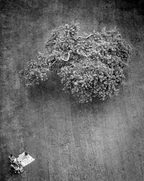
Taken from a tethered balloon known locally as Bournemouth Eye.
Jan 22, 2016 20:01:34 #
Jan 22, 2016 20:12:40 #
Thanks for looking and commenting Richard, that was very nearly an instant response. Hopefully the time difference in Oz means you're not up at some ridiculous hour as I am here - it's gone 1 a.m. and I'm off to bed now!
RichardTaylor wrote:
I like it a lot.
The POV
The processing
and the composition.
The POV
The processing
and the composition.
Jan 22, 2016 20:14:04 #
Jan 22, 2016 20:25:53 #
Frank2013
Loc: San Antonio, TX. & Milwaukee, WI.
magnetoman wrote:
Here I go again as you have asked nothing. It is a good image but I think you can make it better magnetoman. It appears a bit flat to me, your textures are there but maybe a bit more contrast would enhance them, and I feel the folks in the corner are a bit cramped. Not that its deal breaker but there are blown highlights on the blanket. Interesting perspective and I am hoping you may show us some more.Taken from a tethered balloon known locally as Bournemouth Eye.
Jan 23, 2016 03:25:27 #
If I just post a picture (without a question) it is fyc and I hope you will comment on it Frank - so my thanks for doing just that! This and the Critique section are where I hope to get comment that will help move my images up the quality ladder a bit - and widen my viewpoint.
I have struggled with the contrast a bit in this one and a localised area of processing hasn't worked as well as it might, so I will have another attempt at it. I really like the image, including the slightly strange position of the picnickers, but the highlights are a problem that I doubt I will overcome without getting the dreaded grey blank. Some of the foliage is also blown.
I have struggled with the contrast a bit in this one and a localised area of processing hasn't worked as well as it might, so I will have another attempt at it. I really like the image, including the slightly strange position of the picnickers, but the highlights are a problem that I doubt I will overcome without getting the dreaded grey blank. Some of the foliage is also blown.
Frank2013 wrote:
Here I go again as you have asked nothing. It is a good image but I think you can make it better magnetoman. It appears a bit flat to me, your textures are there but maybe a bit more contrast would enhance them, and I feel the folks in the corner are a bit cramped. Not that its deal breaker but there are blown highlights on the blanket. Interesting perspective and I am hoping you may show us some more.
Jan 23, 2016 08:08:15 #

A fascinating perspective and framing, keeps my attention for sure. I really like it. I'd love to see with a bit of lightening to a few of the tree's branches, if it's possible to achieve.
Jan 23, 2016 08:29:30 #
Yep, I'm still fiddling with it Linda. Thought the branches were blown in the original but they're not, so I must be able to come up with something better I guess. I'm trying some adjustment layers to see what I can get. Many thanks for looking.
Linda From Maine wrote:
A fascinating perspective and framing, keeps my attention for sure. I really like it. I'd love to see with a bit of lightening to a few of the tree's branches, if it's possible to achieve.
Jan 23, 2016 20:33:19 #

magnetoman wrote:
Taken from a tethered balloon known locally as Bournemouth Eye.
Very intriguing image. I like the viewing perspective, the post processing, and composition.
--Bob
Jan 24, 2016 01:09:45 #

magnetoman wrote:
Taken from a tethered balloon known locally as Bournemouth Eye.
Fascinating perspective!
It seems strange that the grandma, mother, and littl girl are oblivious to the balloon directly above... how high?
I'd like to see a touch more contrast in the mid-tonal range.
Dave
Jan 24, 2016 04:20:52 #
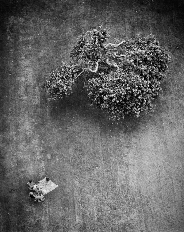
The balloon gets to 150 metres (around 490 feet)and is silent. Tethered by a single steel rope, I once asked the pilot what happens if the rope fails - he pointed to a piece of standard rope and said he would pull that! Tracing the rope, it was attached to a plug in the balloon that, I presume, would slowing let the gas out and let us drift to earth - either that or we get a white-knuckle ride through the skies! Heres what it looks like, and also my latest attempt at the post. Thanks for looking Dave.
Uuglypher wrote:
Fascinating perspective!
It seems strange that the grandma, mother, and littl girl are oblivious to the balloon directly above... how high?
I'd like to see a touch more contrast in the mid-tonal range.
Dave
It seems strange that the grandma, mother, and littl girl are oblivious to the balloon directly above... how high?
I'd like to see a touch more contrast in the mid-tonal range.
Dave

If you want to reply, then register here. Registration is free and your account is created instantly, so you can post right away.