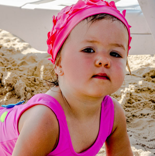
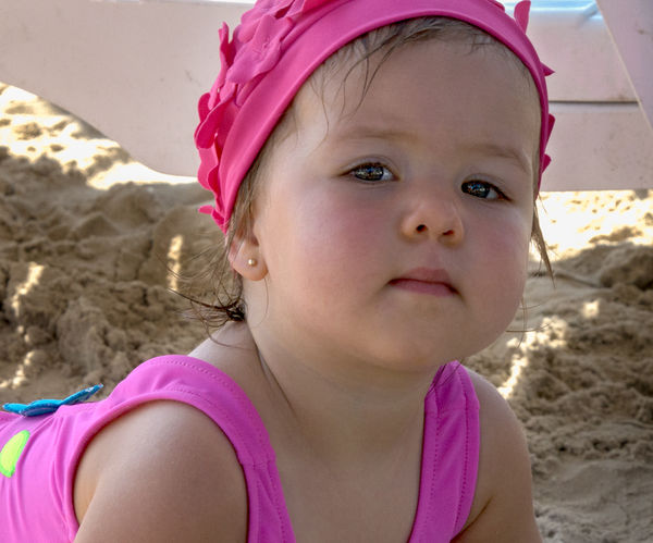
Swim Cap
Jan 17, 2016 11:25:24 #
Frank2013
Loc: San Antonio, TX. & Milwaukee, WI.
Would like comment on how to improve this for next time, or this time if there is something I can do with pp. If you can't explain it's fine to show me with a description of what you did.
Jan 17, 2016 12:30:32 #

For shooting, a bit more light on the face would have helped, but if you were capturing a fleeting expression that obviously wasn't an option. And bright white stuff in the background isn't ideal.
For PP, the complexion is a bit mottled as shot, but if you tint-shift red towards orange a bit and lighten a bit (and maybe desaturate if needed), it'll help the complexion come out a bit less ruddy.
For PP, the complexion is a bit mottled as shot, but if you tint-shift red towards orange a bit and lighten a bit (and maybe desaturate if needed), it'll help the complexion come out a bit less ruddy.
Jan 17, 2016 13:11:04 #
Much lower contrast, to emphasize the abundance of soft textures throughout the image - the skin, bathing suit, even the sand in the background. I think you rendered the image too harsh for this type of subject.
Jan 17, 2016 14:37:43 #

Frank2013 wrote:
Would like comment on how to improve this for next time, or this time if there is something I can do with pp. If you can't explain it's fine to show me with a description of what you did.
This image is much too contrasty and harsh. Without knowing what your camera settings were, and what you did in post processing , it is hard to suggest what went wrong or how to fix it.
Jan 17, 2016 16:19:55 #
Frank2013 wrote:
Would like comment on how to improve this for next time, or this time if there is something I can do with pp. If you can't explain it's fine to show me with a description of what you did.
When and if I give my opinion I have to try it first. I took your picture into Photoshop. Lightroom has some of the same sliders for my first half of the changes. I opened in camera raw and went into Luminance colors. Reds +33 Orange +2. Then went to sharpening area and added 5 Sharpen and about 40 in Luminance smoothing.
From here forward You will need something like, if not, Photoshop.
1) Made a duplicate layer and went to Camera raw layer and increased Luminance smoothing till I saw the skin smooth out in arms and chest to my liking then opened. I made a mask of this layer and opened only arms and chest and about 20% of this layer for the neck. 2) Made new layer and added red in the cheeks using the brush tool. 3) Made a new Layer of the base and put it on the top. Opened this layer in Camera raw and started to lighten the photo in shadows exposure and blacks and just watched how the eyes were adjusting to the changes. Once happy opened. Made a mask of this layer and just opened the eye area using a brush at 20% and kept going over the area till I was pleased. 4) Made new layer and colored under eye area and around the nose using a brush and changing colors as needed. Flattened image and finished. I think you will like it. Should I post my rendition?
Jim
Jan 17, 2016 16:50:01 #
Frank2013
Loc: San Antonio, TX. & Milwaukee, WI.
Jim-Pops wrote:
Please do PopsShould I post my rendition?
Jim
Jim
Jan 17, 2016 16:52:42 #
Jan 17, 2016 16:57:13 #

Jim-Pops wrote:
Here it is.
Looks terrific, Jim-Pops! Seems very appropriate for such a delicate sweetie. Frank, it's a delightful pose and expression! Does she look like your side of the family? :)
Jan 17, 2016 17:52:13 #
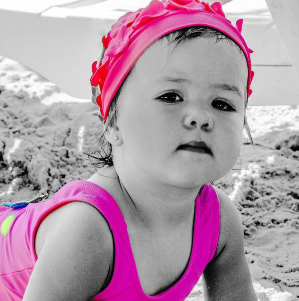
do you think it would be to kitschy to make the girl black and white and leave the cap and suite in color.
I did a quicky (I know I missed some of her cap) in Elements 13 with the guided and it only took a few seconds really.
could be done with layers but that would take a while longer.
gonna run the risk of showing even though I explained it.
I might also consider cloning the sand...or if you think the there might be a next time maybe try to keep her positioned for just sand in background. she looks like a cutypie
Frank2013 wrote:
Would like comment on how to improve this for next time, or this time if there is something I can do with pp. If you can't explain it's fine to show me with a description of what you did.
Jan 17, 2016 19:09:30 #

RiverNan wrote:
do you think it would be to kitschy to make the girl black and white and leave the cap and suite in color.
Truly quite awful RiverNan. The cute little girl who was rather over processed to start with now resembles something from a B film in the horror genre. Damian you have a sister!
Come on Nancy you must know this does not work. Make her soft and cute. This could be a quite adorable picture and really not suited to gimmicky PP. With a bit more effort you have the skill to make this lovely.
Jan 17, 2016 19:22:13 #
Hya Frank. Go right back to the beginning with this and process it again. Her eyes here look black so if thats how you shot it try and add some colour. The tots mouth is too hard needs softening. Its all bit too contrasty probably shot in hard light so that needs compensating for. That will actually sort out much of the blotchiness in the skin.
Probably still have some work to do on the skin.
Do this all in Photoshop using multiple layers for skin adjustments so you can go back adjust underlying layers until the skin looks looks soft and natural.
Jim Pops post is better but skin looks unreal. I know its not but its the sort of effect Portrait Pro gives. Too much flattening of colour and detail.
A couple of hours Frank and you will have an enchanting picture.
Jan 17, 2016 19:53:59 #
thought it might be a bit kitschy...
Billyspad wrote:
Truly quite awful RiverNan. The cute little girl who was rather over processed to start with now resembles something from a B film in the horror genre. Damian you have a sister!
Come on Nancy you must know this does not work. Make her soft and cute. This could be a quite adorable picture and really not suited to gimmicky PP. With a bit more effort you have the skill to make this lovely.
Come on Nancy you must know this does not work. Make her soft and cute. This could be a quite adorable picture and really not suited to gimmicky PP. With a bit more effort you have the skill to make this lovely.
Jan 18, 2016 09:17:36 #
A coupla things that are as yet to be mentioned. The very top of her cap is cut off, and the ridge of the sand dune, in the background, runs right through her head, I find both of these things distracting. I know that these things happen, I have done them my self. but it is still something that you should be aware of and try to avoid.
Jan 18, 2016 11:02:03 #
Frank2013
Loc: San Antonio, TX. & Milwaukee, WI.
R.G. wrote:
Good tip R.G. thanks.tint-shift red towards orange a bit and lighten a bit (and maybe desaturate if needed), it'll help the complexion come out a bit less ruddy.
rook2c4 wrote:
You have it right 2c4, appreciated. Much lower contrast, to emphasize the abundance of soft textures throughout the image
mcveed wrote:
mcveed you are correct, thank you.This image is much too contrasty and harsh.
Jim-Pops wrote:
Thanks of the rendition and detailed response Pops.Should I post my rendition?
Jim
Jim
Linda From Maine wrote:
Of course she is cute like me Linda. Frank, it's a delightful pose and expression! Does she look like your side of the family? :)
RiverNan wrote:
Thanks for the try Nan but not working for me.do you think it would be to kitschy to make the girl black and white and leave the cap and suite in color.
Billyspad wrote:
Yes Mr. Spad thats what I had to do. ThanksHya Frank. Go right back to the beginning with this and process it again.
A couple of hours Frank and you will have an enchanting picture.
A couple of hours Frank and you will have an enchanting picture.
boberic wrote:
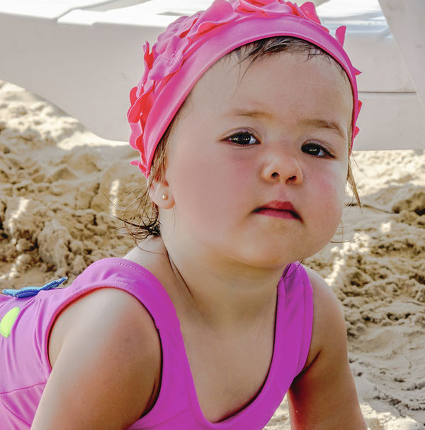
Not much I could do with the chair and background at the time. Im just glad I was able to catch her expression before she moved. As for the cap, cutting off the top makes one engage her eyes immediately, as you will notice in this last version I cropped even more.The very top of her cap is cut off, and the ridge of the sand dune, in the background, runs right through her head, I find both of these things distracting.
I would like to thank everyone for time spent giving me input for this photo. I have come up with what I feel could be a finished version of the shot. I realize it may not please everyone but end the end it is I and some family members that must like it. Please feel free to add comment.
Jan 18, 2016 11:09:39 #
You made me look like an amateur with your final PP. Great job! :thumbup: :thumbup: :thumbup:
If you want to reply, then register here. Registration is free and your account is created instantly, so you can post right away.