After
Jan 15, 2016 16:44:09 #

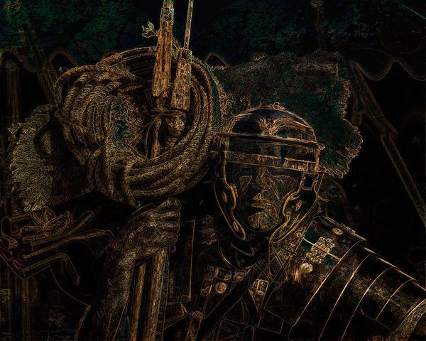
It's done, right or wrong it was not his decision - but he keeps a wary eye on the crowd, they seem restless..
Jan 15, 2016 17:34:25 #
Frank2013
Loc: San Antonio, TX. & Milwaukee, WI.
magnetoman wrote:
Very interesting shot. Great use of light. Nice selections, masking, and blending done here it seems to me. The left side seem a bit crowded magneto man. Well done.It's done, right or wrong it was not his decision - but he keeps a wary eye on the crowd, they seem restless..
Jan 15, 2016 17:48:38 #

Jan 15, 2016 19:38:46 #

Jan 16, 2016 02:25:49 #
You're right Frank , it does look a bit busy but I wasn't sure what to do with it. A simple crop would unbalance the picture, maybe just darkening the area would do it. In the original it's more obvious what goes on there and and therefore blends in better. Thanks for commenting, it's appreciated.
Frank2013 wrote:
Very interesting shot. Great use of light. Nice selections, masking, and blending done here it seems to me. The left side seem a bit crowded magneto man. Well done.
Jan 16, 2016 02:28:10 #
Thanks RG, I was pleased with the colours, although they seem to elevate his rank somehow!
R.G. wrote:
Very good choice of colours and the gold and bronze look very convincing.
Jan 16, 2016 02:35:43 #
Thank you Billy, it's another experiment with Topaz. Certainly peps-up this image. I didn't expect the response received thus far!
Billyspad wrote:
Very interesting shot and well executed to boot.
Jan 16, 2016 14:34:30 #
I like this a lot- very theatrical feel to it with tones of apprehension- bolstered by your monolog. Yes, knocking down exposure on the left would discourage my eye from wandering too long there. Also, that little sprig on the lances/poles draws unneeded attention- it just seems too happy for this image- too Gumby-ish" while some of the brightest parts of the entire work are right at the upper edge; those could be toned down, too. Given youve added voice to the image, Ill presume the warrior is the main subject but the top of the lances/poles is what I see most- much texture and detail in the rope and finials- which I like, but competes, with the character. Again, referencing your monolog, I like the facial tone and feel its just right. If the tonal value of the helmet- the horizontal piece across the eyes- could be brought up a tad and the rope/polls/lances/finials down, itd fit MY interpretation of the image. But
heck, its your image and really good.
magnetoman wrote:
It's done, right or wrong it was not his decision - but he keeps a wary eye on the crowd, they seem restless..
Jan 16, 2016 15:35:15 #
Thank you fuminous, that's a thorough, fair and helpful critique - I had spotted that sprig and felt the same as you. I may go back and have another go at the whole thing - remembering which Topaz filters formed the basis of the effect is the difficult part!
fuminous wrote:
I like this a lot- very theatrical feel to it with... (show quote)
If you want to reply, then register here. Registration is free and your account is created instantly, so you can post right away.