Digital art effect - Group of Three
Apr 20, 2012 12:18:54 #

As the process of doing the painting develops, I notice that I become more "engaged" with the story of the picture. It really anchors the experience and keeps it in my memory. The picture itself is a snapshot of a flash of time. The painting is more of a blending of the story and my reaction both to the story and my telling of the story.
What I would like input about is: Does any particular painting stand out and do something like that for you?
Davis
What I would like input about is: Does any particular painting stand out and do something like that for you?
Davis
Apr 20, 2012 17:10:42 #
docrob
Loc: Durango, Colorado
davis wrote:
As the process of doing the painting develops, I notice that I become more "engaged" with the story of the picture. It really anchors the experience and keeps it in my memory. The picture itself is a snapshot of a flash of time. The painting is more of a blending of the story and my reaction both to the story and my telling of the story.
What I would like input about is: Does any particular painting stand out and do something like that for you?
Davis
What I would like input about is: Does any particular painting stand out and do something like that for you?
Davis
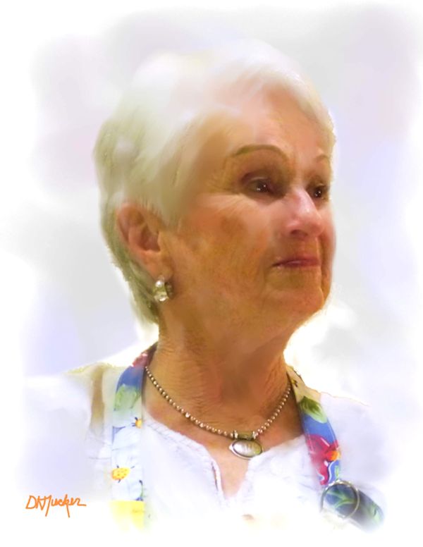
no but i think #3 is the best crafted of the bunch and i understand what you are trying to do.......go for it
Apr 20, 2012 19:03:09 #

Apr 20, 2012 19:57:08 #

Apr 20, 2012 21:28:20 #
Apr 21, 2012 08:21:50 #

I really love all three of these and would love to know what program and what tools you used to achieve this effect.
Apr 21, 2012 08:36:04 #

Apr 21, 2012 08:41:03 #
Initial editing and color adjustment, croping, etc. is PaintshopProX4. I then use Corel Painter4Elements to do the digital renditions. Then it is back to PSP for final processing, sizing, etc. Kinda tedious, but it works for me.
Thanks for your interest and comments!
Davis
Thanks for your interest and comments!
Davis
Apr 21, 2012 08:41:47 #
Initial editing and color adjustment, croping, etc. is PaintshopProX4. I then use Corel Painter4Elements to do the digital renditions. Then it is back to PSP for final processing, sizing, etc. Kinda tedious, but it works for me.
Thanks for your interest and comments!
Davis
Thanks for your interest and comments!
Davis
Apr 21, 2012 12:03:26 #

Interesting effect. I kinda like it! And I'm usually not one to like many different effects. Thanks!
Apr 21, 2012 13:41:51 #

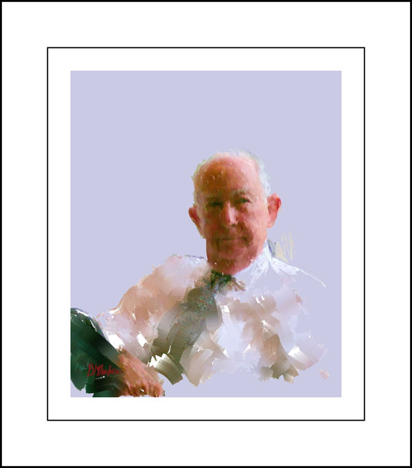
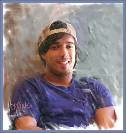
#3 is the most consistent in terms of painting effects. #1 seems to me to waste too much space. #2 is, in a way, almost disturbing, which is not saying that it's a bad thing. I think the technique could be very interesting with a different expression.
Apr 21, 2012 14:21:15 #

Apr 21, 2012 14:30:21 #
I hate to disagree with RMM, but in numbers 2 &3 the faces look too photographic. Number 1 not only has a painter-like face, but great use of negative space to highlight the portrait area. Again, nice work!
Apr 21, 2012 18:40:10 #
cheineck wrote:
I hate to disagree with RMM, but in numbers 2 &3 the faces look too photographic. Number 1 not only has a painter-like face, but great use of negative space to highlight the portrait area. Again, nice work!
You are allowed to disagree with me, but just this once. Don't let it happen again!
Apr 21, 2012 19:19:19 #
Oh darn, I'm sorry. And this from a guy originally from New Jersey!... Montclair. Haven't been in NYC in years. Kinda miss it.
If you want to reply, then register here. Registration is free and your account is created instantly, so you can post right away.