Two Crops of a Black & White
Jan 5, 2016 00:34:23 #

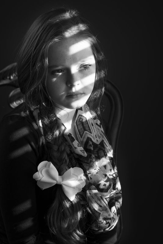
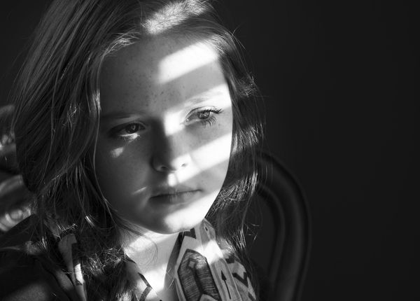
I think I like the tighter crop (at least for viewing on a computer monitor). Your thoughts welcome.
Jan 5, 2016 07:14:30 #
I think the tighter crop would look better in a portrait configuration without all of the negative space. What do you think?
Me (Tom)
Me (Tom)
Jan 5, 2016 10:02:44 #
tainkc wrote:
I think the tighter crop would look better in a portrait configuration without all of the negative space. What do you think?
Me (Tom)
Me (Tom)
Thanks for your thoughts, Tom. I do like the crop, as it quickly brings your attention to her expression(where I wanted the viewer focused). The light lets you know she's looking through the blinds of a window. But, I still like to leave the negative space in the direction of her gaze. It also lets me position her off-center a bit.
Jan 5, 2016 11:21:42 #

Beautiful photo...I think the closer crop is better for a portrait as well. I find that if I look at the other one my eye goes directly to the bow in her hair instead of her face.
Jan 5, 2016 12:36:53 #

Rick, I think I would like this portrait a lot more without the shadows from the blinds, that being said, I like the closer crop best.
Jan 5, 2016 12:54:37 #
Laura72568 wrote:
Beautiful photo...I think the closer crop is better for a portrait as well. I find that if I look at the other one my eye goes directly to the bow in her hair instead of her face.
Agree, either to the bow or somewhere around the scarf. Thanks, Laura.
Jan 5, 2016 12:55:19 #
jonsommer wrote:
Rick, I think I would like this portrait a lot more without the shadows from the blinds, that being said, I like the closer crop best.
Thanks, Jon.
Jan 6, 2016 06:19:39 #

Rick,
I agree with Jon. I guess I never really liked the window blind effect, but to each his own, if that is the effect you like and wanted. I just personally think it detracts rom the photo of the person in the image. It more or less confuses the issue making it somewhat 'busy' looking.
She looks like a sweet girl and the photo is nice, but I did not download it and only looked at it as the onscreen UHH version. I also like the cropped version better, but also think there is just a tad too much negative space.
Best regards,
Tom
Jan 6, 2016 10:03:30 #

Rick36203 wrote:
I think I like the tighter crop (at least for viewing on a computer monitor). Your thoughts welcome.
The tighter crop would look better without the top of the girls head cut off.
Jan 6, 2016 16:10:57 #

Rick
I like both versions of this pose even though I am generally drawn to a close crop.
You have done a great job using the window blind effect. It is not as easy to do as some might think. I applaud your efforts here.
As to cropping a part of the top of the head, that is a very acceptable position to crop at. Peter Hurley crops the top of the head for virtually all his shots. It costs over $1,200 just to get in front of his camera.
Jan 6, 2016 16:51:05 #
trc wrote:
Rick, br br I agree with Jon. I guess I never rea... (show quote)
I appreciate you taking the time to express your thoughts Tom. :)
Jan 6, 2016 16:51:47 #
photophly wrote:
The tighter crop would look better without the top of the girls head cut off.
Thank you.
Jan 6, 2016 16:59:58 #
BigDen wrote:
Rick
I like both versions of this pose even though I am generally drawn to a close crop.
You have done a great job using the window blind effect. It is not as easy to do as some might think. I applaud your efforts here.
As to cropping a part of the top of the head, that is a very acceptable position to crop at. Peter Hurley crops the top of the head for virtually all his shots. It costs over $1,200 just to get in front of his camera.
I like both versions of this pose even though I am generally drawn to a close crop.
You have done a great job using the window blind effect. It is not as easy to do as some might think. I applaud your efforts here.
As to cropping a part of the top of the head, that is a very acceptable position to crop at. Peter Hurley crops the top of the head for virtually all his shots. It costs over $1,200 just to get in front of his camera.
Thanks, BigDen. I enjoy reading the different views expressed here. It quite often helps me improve both behind the camera, and at the computer. :)
If you want to reply, then register here. Registration is free and your account is created instantly, so you can post right away.