Any advice is welcomed
Apr 19, 2012 11:06:00 #

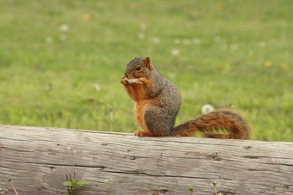
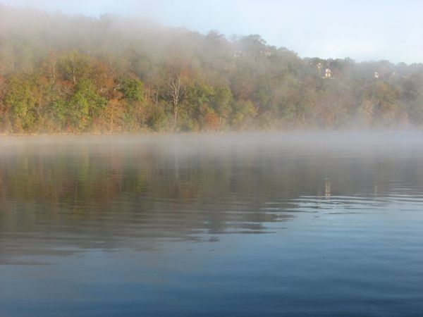
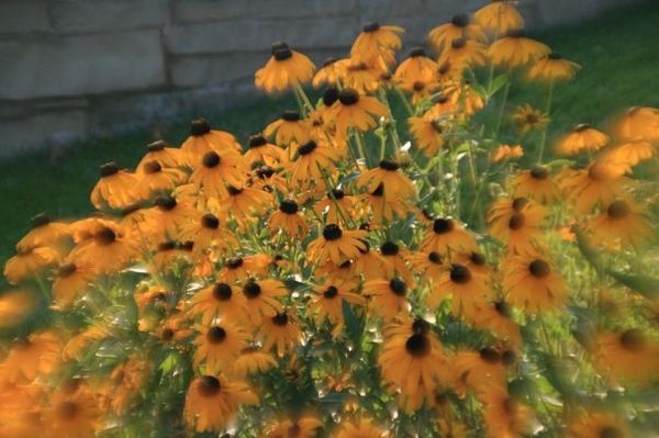
Here are a few shots I have taken, what do you all think and what I can do better?
Apr 19, 2012 11:49:09 #

Apr 19, 2012 12:16:39 #
That was on purpose, that was a special lens that I had for my camera that blured the outer edges.
Apr 19, 2012 14:03:11 #
On # 1 I would add some contrast and crop it down to more of the squirrel and log. On # 2 I would use a CPL and add more contrast as well. DOn't do # 3 again!!LOL
Apr 19, 2012 14:39:43 #
Apr 19, 2012 15:46:14 #
For me it is just a matter of personal preference, but if it it is something you like then by all means go for it.
Apr 19, 2012 15:59:51 #

Apr 19, 2012 17:05:33 #
Apr 19, 2012 17:15:09 #
i really like number three. acurate reality is so overrated. as a photography as an art form guy i like creative aproaches to photo cliches. your number three worksfor me, its like it was shot with an holga. However the photography as science people will abhor anything soft at even the sub atomic particle level. different strokes for different folks thats what i like about photography. iI also agree that #1 should be cropped closer. here is a guideline. when you have an interesting subject and boring background, fill the frame of your viewfinder with the subject.
Apr 20, 2012 06:05:04 #

Apr 20, 2012 08:57:32 #
I like the trees for sure, it makes the colors of the trees pop more but it also makes the water look a little muddy to me.
Apr 20, 2012 10:09:33 #

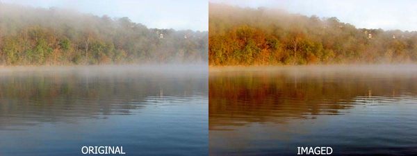
Cecil wrote:
What do you think?
Cecil
Cecil
I like the higher contrast in the water. The detail that I can now see in the trees is much better. The trees now "pop" out at me. I can clearly see the towers in the re-touched up version. I missed them in the original. Overall, very nice job!
Apr 20, 2012 11:55:24 #
Greg
Loc: Maryland
Cecil wrote:
Hi Emasmom
What do you think?
Cecil
What do you think?
Cecil
You removed all the 'mystery' from the shot!
Apr 20, 2012 13:24:54 #
Apr 25, 2012 13:16:50 #
Hi Emma's Mom, I think you have a good eye for capturing great photos. I feel compelled to offer my .02 worth. In photo #1 unless you are trying to emphasize blurry green backgrounds or dried wood, the subject is lost in the background and the foreground. That's why everyone is saying to crop it tighter. That will have the effect of being closer to the squirrel. In #2 I think you have a choice of improving it by either bringing out or creating some some detail such as Cecil did in his rendering(nice work) or cropping off the lower one third of the image to get rid of that clearer portion of the water to leave the image balanced. In #3 I have trouble understanding the use of that lens effect with the subject matter. It's a nice effect, but perhaps a different composition. The blur should be supportive of the subject, in this picture it tries to take over the subject, fights with it, so just a matter of composition. I noticed the nice picture of your avatar in another posting and my only comment would be that sometimes blending many similar hues of color in the same image renders a flatness to the shot. This image is dominated (albeit purposefully) with pinks, and whites. You have flesh tones and light colored hair. There is a lot of beauty in it, but composing with the use of a little bit of darker shadow area would complete the picture. The chair rail too seems a little awkward. Moving ahead, you won't have to change much at all to keep your photos interesting. Numbers one and two are simply pp (post production) work one the computer, and three and your avatar are more subjective.
Cheers
Cheers
If you want to reply, then register here. Registration is free and your account is created instantly, so you can post right away.