BW sunset, Tonal Range Acceptable?
Dec 19, 2015 13:46:45 #
Joanna27
Loc: Lakewood Ca
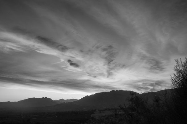
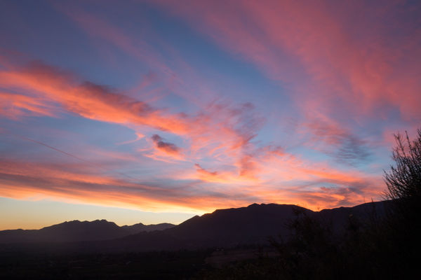
You can that this image is my avatar. My first BW looks muddy, so I tried again. This time I increased the tonal range of the BW image. I also tried to separate the far hills by adjusting the brightness. I've also attached the color, as shot image so you can see where I started from.
Was I successful? How would you improve it?
Going back to Mediation Mount in Ojai California to reshoot is not an option. Apparently my friend's camera shutter made too much noise and interfered with everyone's mediation. Actually everyone was busy taking iPhone photos except the one guy who complained. He was busy with his girlfriend (I guess they could have called it meditation). :)
Dec 19, 2015 14:10:45 #

Joanna27 wrote:
...
Apparently my friend's camera shutter made too much noise and interfered with everyone's mediation.
...
Apparently my friend's camera shutter made too much noise and interfered with everyone's mediation.
...
I don't think you ever realize how loud your shutter is until you're in a quiet room.
May we give it a try? S-
Dec 19, 2015 14:44:01 #

Joanna27 wrote:
You can that this image is my avatar. My first BW... (show quote)
Being one who shoots sunsets in black and white, I really like the image quite a bit. The tonal range is quite adequate.
--Bob
Dec 19, 2015 14:55:10 #
Joanna27
Loc: Lakewood Ca
Please work on my image!!
I welcome all your help.
My raw file is 14 bit, but I processed in 8 bit (Photoshop Elements). Until I read a post yesterday, I had not realized what difference that can make. While you guys are taking a crack at my photo, I going to redo it in Photoshop (16 bit). I'm interested in the difference.
I'm sure we were not aware how loud the shutter was. It's hard to ignore clicks that occur at random times. I'm not sure what that guy's problem really was. We were outdoors, and at least 20 yards away. He definitely was way more interested in his girlfriend than actually mediating on the sunset. But it was pretty quiet, so maybe I am not sensitive enough to his space. When i'm photography something, I'm not always super aware of my surroundings. In any case, I won't disturb him again.
St3v3M wrote:
I don't think you ever realize how loud your shutter is until you're in a quiet room.
May we give it a try? S-
May we give it a try? S-
Dec 19, 2015 15:00:25 #
Joanna27 wrote:
Please work on my image!!
I welcome all your help.
...
I welcome all your help.
...
Thanks. I'm always curious what other people can do! S-
Dec 19, 2015 18:04:32 #

There's no shortage of possibilities for added contrast. Beyond the basic contrast and lighting sliders you have the sliders for controlling the conversion of colours to B&W - in particular blue can be darkened.
Controlling noise and graininess is another story, but there's nothing that can't be handled with applications via the Adjustments brush.
-
Controlling noise and graininess is another story, but there's nothing that can't be handled with applications via the Adjustments brush.
-

Dec 19, 2015 18:10:40 #

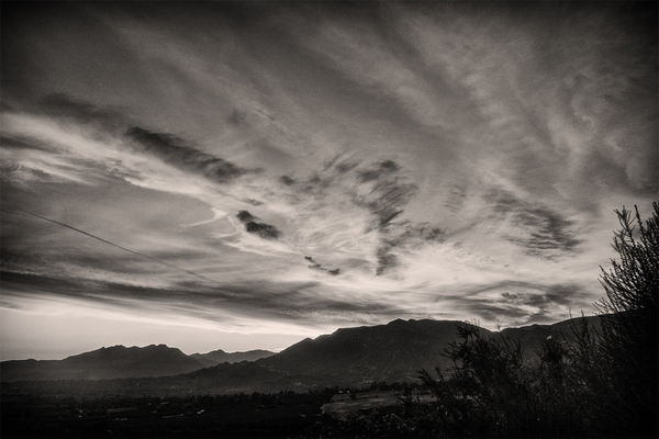
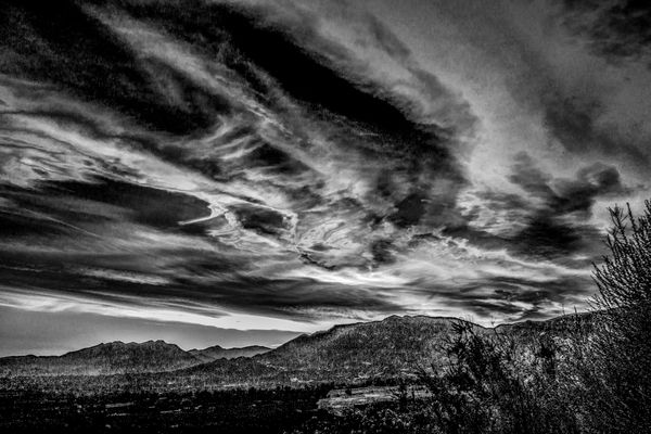
Hya Jo You captured all the tonal range so in that respect its a success. You color shot has impact which is lacking in the BW conversion its a tad bland in my humble opinion so tried a conversion to bring out some more detail and more visual impact. This will increase grain but suits the image.
Re the anti clicking romeo next time take Billy wiv ya. Romeo will not feel quite so amorous after being subjected to a barrage of Billy wit!
A real guy is always able to keep his mind on the job in hand huh.
Re the anti clicking romeo next time take Billy wiv ya. Romeo will not feel quite so amorous after being subjected to a barrage of Billy wit!
A real guy is always able to keep his mind on the job in hand huh.
Dec 19, 2015 21:20:54 #
Joanna27
Loc: Lakewood Ca
rmalarz wrote:
Being one who shoots sunsets in black and white, I really like the image quite a bit. The tonal range is quite adequate.
--Bob
--Bob
Thank you very much. FYC is where I learned to cover the entire tonal range.
Dec 19, 2015 21:28:28 #
Joanna27
Loc: Lakewood Ca
R.G. wrote:
There's no shortage of possibilities for added contrast. Beyond the basic contrast and lighting sliders you have the sliders for controlling the conversion of colours to B&W - in particular blue can be darkened.
Controlling noise and graininess is another story, but there's nothing that can't be handled with applications via the Adjustments brush.
-
Controlling noise and graininess is another story, but there's nothing that can't be handled with applications via the Adjustments brush.
-
Thank you. I like it. It more dramatic. Would you mind posting the orginal? I want to study what you and Billy did.
Can you tell me what you did? How do I handle noise and graininess with the adjustment brush?
Dec 19, 2015 21:31:45 #
Joanna27
Loc: Lakewood Ca
Billyspad wrote:
Hya Jo You captured all the tonal range so in that... (show quote)
Thank you Billy, I always appreciate your opinion. I wish you had been there, it would have been fun.
Back to the image, I like the increased drama. The color looks a bit warmer. What did you do?
Dec 20, 2015 00:38:20 #
What software do you use Jo for both PP and BW conversions?
This is done with Photoshop ans Nik Silver Efex
This is done with Photoshop ans Nik Silver Efex
Dec 20, 2015 01:04:06 #
Joanna27
Loc: Lakewood Ca
Billyspad wrote:
What software do you use Jo for both PP and BW conversions?
This is done with Photoshop ans Nik Silver Efex
This is done with Photoshop ans Nik Silver Efex
I also use photoshop and Nik silver Efex. I started with the neutral preset and adjusted sliders.
Perhaps I should be asking what settings did you use.
Dec 20, 2015 03:08:08 #
Joanna27 wrote:
I also use photoshop and Nik silver Efex. I started with the neutral preset and adjusted sliders.
Perhaps I should be asking what settings did you use.
Perhaps I should be asking what settings did you use.
I took your colored jpeg back into Camera Raw ie Open As in Photoshop and select Camera Raw from the drop down box.
Highlights and Whites slider slightly to the left. Shadows slider to the right to get detail you require. Increase Contrast and Clarity.
Open in PS then into Silver Efex and as follows for settings
Brightness 9%
Contrast 8%
Structure 60%
Shadows Slider all the way to the left
Highlights Slider all the way to the right
Grain per pixel 500
Soft - hard Place curser in center
Burn Edges All Edges (Soft 2)
From the drop down box marked Neutral
Select Fuji Neopan ACROS 100
Gentle S shape on the Levels and Curves
Hope that helps
Billy
Dec 20, 2015 07:44:53 #
Joanna27 wrote:
Thank you. I like it. It more dramatic. Would you mind posting the orginal? I want to study what you and Billy did.
Can you tell me what you did? How do I handle noise and graininess with the adjustment brush?
Can you tell me what you did? How do I handle noise and graininess with the adjustment brush?
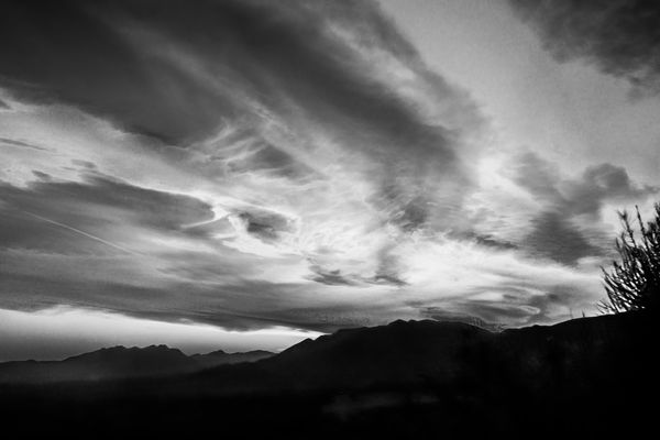
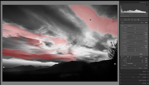
This was done in Lightroom and I'm not sure how things translate into Photoshop procedures. I believe that Photoshop has brushes that you can feather, and if there isn't a way to employ auto-masking for the brush you can work on selections.
In #2 one of the areas that was selected to work on (the grainiest and blotchiest bits of the sky) is highlighted in red. On the right you can see the adjustments for that particular selection. The feathering didn't need to be so high, but I find that the brush is less likely to force an unwanted selection if you use feathering. And when you don't use auto-mask the feathering is necessary to avoid making hard-edged selections.
You can see that the Sharpness slider is to the left (this is a heavy-handed way to smoothen) and the Noise slider is to the right (a more delicate and less intrusive way to smoothen). Negative Sharpen is needed with heavy grain whereas positive Noise works with fine noise and fine grain. I lead with Noise and if necessary follow up with negative Sharpen. And for the really persistent stuff......
...... the Clarity slider is to the left, as is the Contrast slider. You don't want to lose contrast and clarity across the whole shot (i.e. globally), but it can be OK in a selection (i.e. in a local adjustment) and it will help persistent graininess and blotchiness to blend in more unobtrusively.
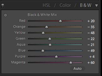
Now about that graininess........ #3 shows the brightness settings for the individual colours after conversion to B&W. Darkening blue can be very effective for introducing darkness to the sky, but the trouble is the adjustment affects blue in the whole frame. And the same thing applies to all of the other adjustments. These sliders are so effective at targeting specific colours that if you're heavy-handed with them they can cause graininess and blotchiness. And the same thing applies to adjustments in the HSL section for colour shots. Anything more than moderate adjustments from the central setting and you risk causing graininess which can be very persistent and difficult to reduce.
My main intention for this edit was to deliberately push the contrast to give you an idea of the possibilities. I could have gone much further but realism would have been lost completely. So I was happy to darken blue substantially, knowing that I could counteract the blotchiness with the Adjustments brush (to a certain extent). But for a normal edit I would have been more moderate with that and the other colour adjustments, and if I wanted more contrast I would have done it in the main edit and with more selections.
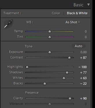
Now about the main edit..... #4 shows the global adjustments that I used to manipulate the brightness and contrast levels. Most of it's fairly obvious. It might seem a bit strange that I went positive with the Whites and negative with the Highlights, and in a similar vein went positive with the Shadows and negative with the Blacks. With these you do whatever suits the image. There are no universal dos and don'ts - except maybe that maxing the Whites and Blacks (till they show up as saturation) will help you to achieve maximum contrast overall......
.........then again maximum contrast isn't always a desired objective. I only occasionally push the whites to the point of blowing the highlights and usually back off a bit from that extreme.
You just have to use your eye to judge what the image needs, and if you have to find out by experimenting every inch of the way, that's fine. In fact if you do that instead of using pre-sets you'll learn lots more.
PS - I usually criticise others for leaving skies visibly grainy or blotchy, so lets keep this edit between ourselves...... :-D .
-
Dec 20, 2015 08:56:48 #
Frank2013
Loc: San Antonio, TX. & Milwaukee, WI.
I opted for a bit different type of drama here Joanna27. Thanks for the opportunity to play.
If you want to reply, then register here. Registration is free and your account is created instantly, so you can post right away.