Securing a Line Under Black Venn
Dec 17, 2015 16:15:48 #

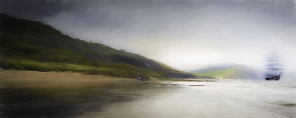
I'm expecting a kicking, so don't hold back! I've been trying, without a load of success, to create an Impressionist image , so invested in Topaz and took something of a shortcut. The original is a Ps composite, now with Topaz Impressions added, and then a layer or two of minor adjustment or additions. It's pretty-much what I set out to achieve, but is now just digital art rather than a photograph, so I'm interested to see how it's received here.
Dec 17, 2015 17:07:12 #
Frank2013
Loc: San Antonio, TX. & Milwaukee, WI.
magnetoman wrote:
I'm expecting a kicking, so don't hold back! I've been trying, without a load of success, to create an Impressionist image , so invested in Topaz and took something of a shortcut. The original is a Ps composite, now with Topaz Impressions added, and then a layer or two of minor adjustment or additions. It's pretty-much what I set out to achieve, but is now just digital art rather than a photograph, so I'm interested to see how it's received here.
I'm not one to get too hung up on photo, snapshot, piece of artwork, composite or what ever mgnetoman.....so I'll just say it's a mighty fine image you should be proud of.
Dec 17, 2015 17:46:56 #

magnetoman wrote:
... It's pretty-much what I set out to achieve, but is now just digital art rather than a photograph, so I'm interested to see how it's received here.
If the base is a photograph, then what's the difference between this and any other post processing? The artist's vision is what matters! S-
Dec 17, 2015 19:00:43 #

Nothing wrong with this my man. You had the vision and how you get there and what you use to achieve that vision is not important. Its original and its yours so the only thing that remains is whether the viewers like it. This one does.
Dec 17, 2015 19:07:08 #
magnetoman wrote:
... so I'm interested to see how it's received here.
Would you mind showing the before and after so we can get a feel for where you started on this journey? S-
Dec 18, 2015 02:46:43 #
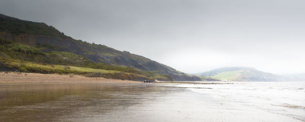
Pleased to, and thanks for your interest. This is a crop from the original, just to lose some sky and foreground - so it gives a more panoramic look. Taken in August on a misty day.
St3v3M wrote:
Would you mind showing the before and after so we can get a feel for where you started on this journey? S-
Dec 18, 2015 02:48:40 #
Thank you Frank, glad you like it.
Frank2013 wrote:
I'm not one to get too hung up on photo, snapshot, piece of artwork, composite or what ever mgnetoman.....so I'll just say it's a mighty fine image you should be proud of.
Dec 18, 2015 02:51:43 #
I guess you're right, the method is not important if the end result succeeds - it's just that Topaz having done a lot of the hard work, feels a bit of a cheat. Mind you, I'm very grateful for the time it has saved me! Many thanks for commenting Billy.
Billyspad wrote:
Nothing wrong with this my man. You had the vision and how you get there and what you use to achieve that vision is not important. Its original and its yours so the only thing that remains is whether the viewers like it. This one does.
Dec 18, 2015 02:53:30 #
magnetoman wrote:
Pleased to, and thanks for your interest. This is a crop from the original, just to lose some sky and foreground - so it gives a more panoramic look. Taken in August on a misty day.
I like the after much better! Thank you for sharing and sharing new possibilities with us! S-
Dec 18, 2015 03:01:04 #
Thank you Steve - I think I'm going to enjoy my Topaz investment, and will probably be bothering you all with some more creations in due course! Critique, suggestions and encouragement from Hoggers is a great way forward.
St3v3M wrote:
I like the after much better! Thank you for sharing and sharing new possibilities with us! S-
Dec 18, 2015 07:49:37 #

Firstly I am a big fan of Topaz, I have all of their software but the trick is to use it and then use your creative eye to fix what it stuffs up, to gentle it down when it needs it. Yes this pic works and I like it a lot. Its a wonderful effect but you have to look at all the details when you do this sort of stuff because artefacts can kill an otherwise powerful pic. A quarter of the way in from the right just below the top you have a small circle which grabbed my eye immediately, you need to fix it. At the mid point just below the top you have a dark semi circle which needs to be softened because it looks false. Above the hills on the top left you have some fairly severe dark lines, IMO they need to be softened somewhat. The original hills on the left had loads of detail, in the processing you have been left with almost no detail, it just looks dark. Impressionism was/is about light! And right in the middle of the pic on the small cliffs at the shore you have several white dots which are probably the most outstanding contrasty points on the pic so they grab the eye and drag it away from the wonderful boat. I believe you need to either tone them down or better clone them out. Am I picky? Yup , sorry I am. But its a really good pic with very interesting processing so its worth getting right.
Peter
Peter
Dec 18, 2015 08:44:01 #
greg vescuso
Loc: Ozark,Mo.
I'm no artist, but really like this image. The process you used for the over all texture works very well without looking too photoshopped. The feel you get from this shot is to want to head up this river and explore why and how this ship got to were it is almost like a ghost ship. I think in person printed on the right canvas this would be something that could be hung on a gallery wall. Very nicely done. Greg
Dec 18, 2015 10:04:32 #

magnetoman wrote:
I'm expecting a kicking, so don't hold back! I've been trying, without a load of success, to create an Impressionist image , so invested in Topaz and took something of a shortcut. The original is a Ps composite, now with Topaz Impressions added, and then a layer or two of minor adjustment or additions. It's pretty-much what I set out to achieve, but is now just digital art rather than a photograph, so I'm interested to see how it's received here.
I think it's pretty wonderful. A subtle and creative piece of digital art. Really nice work. It isn't quite impressionist to me though I'm no expert, more like romantic type European stuff from the 1800s, a school of art I find very appealing.
Nice management of the texture and tones in this, and nice balance in the created composition. I might not have set him down quite so close to the right edge but that's a quibble based on my personal preferences, fine just as is.
Thank you for sharing and I hope you'll keep on with this project!
Dec 18, 2015 11:03:58 #
I don't mind picky at all Peter, all critique and suggestions welcomed! Thanks for the guidance - I agree with your comments but feel I have to learn more about Topaz adjustments (and variety of effects) before returning to Ps for final touches. I did make a few changes with Ps prior to posting, and do feel that more is required, but just need to learn more first.
conkerwood wrote:
Firstly I am a big fan of Topaz, I have all of the... (show quote)
Dec 18, 2015 11:06:11 #
Thanks Greg, I may well have this printed in due course just need to master one or two adjustments first.
greg vescuso wrote:
I'm no artist, but really like this image. The process you used for the over all texture works very well without looking too photoshopped. The feel you get from this shot is to want to head up this river and explore why and how this ship got to were it is almost like a ghost ship. I think in person printed on the right canvas this would be something that could be hung on a gallery wall. Very nicely done. Greg
If you want to reply, then register here. Registration is free and your account is created instantly, so you can post right away.