Monhegan - Big Views - Comments Appreciated
Nov 23, 2015 11:23:26 #

I posted this on the Critique Section by accident (not enough coffee I guess), but meant to put it here. I want YOUR help whether you visit the Critique Section or not so I'm reposting it here.
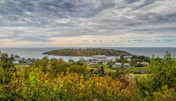
The first is taken from the Lighthouse, which sits on the highest cliff. I wished for a bigger sensor on this one, to capture all that detail.
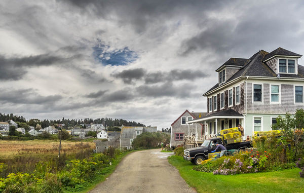
The second is taken in the village on the main street. These people will show up in other images. Some of you already saw them in pictures last month of the Lobsterman's Wife, and their small boat was in the pictures yesterday. They are the crew of the lobster boat "Chris".
The first is taken from the Lighthouse, which sits on the highest cliff. I wished for a bigger sensor on this one, to capture all that detail.
The second is taken in the village on the main street. These people will show up in other images. Some of you already saw them in pictures last month of the Lobsterman's Wife, and their small boat was in the pictures yesterday. They are the crew of the lobster boat "Chris".
Nov 23, 2015 17:55:13 #

So this a poor lobster-man I should empathize with cos of his tough life huh. Out in all weathers in dangerous seas etc etc.
My house would fit in his attic rooms and his car is better than mine! He just blew the sympathy vote!
Nice shot of a pleasant domestic setting min. Maybe a small crop from the left and I betya Frank wants a flip lol. Is that really the color of grass in this place? Seems unaturally garish on my monitor.
The scenery reminds me Wales in the UK with similar architecture and a rugged coastline. That's another place to avoid. Cold inhospitable with slightly odd people
The first shot min does zilch for me and I bet your the same. Big vista showing nothing in particular. Make the sky crazy give it a real filter soaking, anything, but as it is its luke warm.
Im sure the audience here will be impressed to know our valued opinion and carefully constructed critique takes second place to another forum lol
Nov 23, 2015 18:09:26 #
Frank2013
Loc: San Antonio, TX. & Milwaukee, WI.
minniev wrote:
I posted this on the Critique Section by accident... (show quote)
Number 1 is very well composed minniev, how ever I feel the colors in the foreground should be toned down somehow as I find them competing with the background subject of this frame. Actually on second look you should have gotten on a ladder to get above the shrubbery or borrowed a hedge trimmer. I want to see the houses hidden by the second bit of foreground.
Number 2 is not doing much for me at all minniev which is hard to believe cause your stuff usually knocks my socks off. I think all the colors seem a bit overdone and the subject of your title seems to be a secondary thought.
I am beginning to feel your struggle though....if that's what you are trying to portray you have succeeded.
Nov 23, 2015 19:06:50 #
Billyspad wrote:
So this a poor lobster-man I should empathize with... (show quote)
You are right about the colors. I have no idea what happened here. On my monitor the same ol' sRGB colors I always export in are glum and dark, and I figured I'd get in trouble for how dull they were. But here they are looking like neon. I just dunno. Must not be my day. First, clicking the wrong forum button, then submitting something with neon grass that I've never seen before. It must be a sign I need a week off.
You can keep feeling sorry for Chris, tho. Not his truck or his sternman's and that an apartment house. His truck is a little bigger than my lawnmower. But they help each other. The big truck probably belongs to one of the older guys.
Nov 23, 2015 19:11:51 #
Frank2013 wrote:
Number 1 is very well composed minniev, how ever I... (show quote)
Like I told Billy, I don't know what happened to the colors. They are quite dull on my monitor because it was such a cloudy day but they went berserk on upload. No explanation, just the same old sRGB settings I always use. I've had photos turn duller on me by uploading to UHH but this is the first time I've had any turn into one of those neon Elvis paintings. I think its an omen of some kind.
Believe I'll go back to Fish Beach for some more monochromes, or up to the cliffs for some trees. They'll all be trouble but hopefully I can prevent them from changing colors on me.
Nov 23, 2015 23:23:01 #

I truly like both your images. My personal taste would be to crop much of the sky out of the first one to draw more interest into the little town. And, on the second one I would crop out much of the left side to shift the emphasis back to the lobster man. I offer no criticisms, just those two observations.
:thumbup:
:thumbup:
Nov 23, 2015 23:38:40 #
ImageCreator wrote:
I truly like both your images. My personal taste would be to crop much of the sky out of the first one to draw more interest into the little town. And, on the second one I would crop out much of the left side to shift the emphasis back to the lobster man. I offer no criticisms, just those two observations.
:thumbup:
:thumbup:
Thanks for the tips! I will surely try it (but on the ones that have the real colors and not the crazy greens).
Nov 24, 2015 08:02:04 #

[quote=minniev]
Love the image with the people! If you cropped until the telephone pole, as suggested, you'd lose some uninteresting houses and put more focus on the people. I love the colors!!!!
The landscape doesn't grab me and I've been looking at it for a long time to decide why. I do like the foreground. I do like the houses. Not crazy about the sky and island. Alas, no suggestions.
Nov 24, 2015 08:22:20 #
[quote=ediesaul]
Thanks Edie. The colors are not as intended, they are an Anomaly. Still don't know what I did to "hot" them up so much when I uploaded them. Glad you like the crew of the Chris. I'll have more of them later, got to know the sternman (the one on the truck) who is a Starving Artist doubling as lobsterman, very interesting to talk to these people who are bound to this island as if in chains.
You might like the island-scape better if you could see the Little People better. They're there, but quite tiny. It's seldom I wish for a full frame camera but I did here because of them, and the birds and goats and such that are here and there in the image.
minniev wrote:
Love the image with the people! If you cropped until the telephone pole, as suggested, you'd lose some uninteresting houses and put more focus on the people. I love the colors!!!!
The landscape doesn't grab me and I've been looking at it for a long time to decide why. I do like the foreground. I do like the houses. Not crazy about the sky and island. Alas, no suggestions.
Thanks Edie. The colors are not as intended, they are an Anomaly. Still don't know what I did to "hot" them up so much when I uploaded them. Glad you like the crew of the Chris. I'll have more of them later, got to know the sternman (the one on the truck) who is a Starving Artist doubling as lobsterman, very interesting to talk to these people who are bound to this island as if in chains.
You might like the island-scape better if you could see the Little People better. They're there, but quite tiny. It's seldom I wish for a full frame camera but I did here because of them, and the birds and goats and such that are here and there in the image.
If you want to reply, then register here. Registration is free and your account is created instantly, so you can post right away.