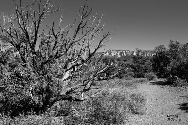
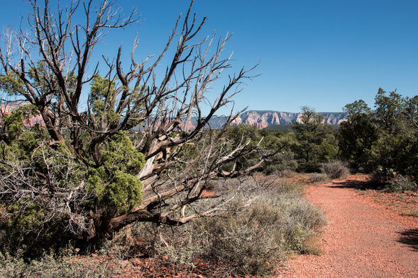
Dead Tree in Sedona: Another Color vs B&W
Nov 21, 2015 18:40:35 #
Joanna27
Loc: Lakewood Ca
Took this photo on a recent trip to Sedona Az. For this trip I violated the "Don't take family on a photoshoot" rule. My photos are more of the snapshot type. Grr. However I did catch one image I like. I'm posting both the color and BW version. I think I like the BW version better because I like the shape of the tree branches against the sky. In the color photo my eye is drawn away from the tree, toward the pathway.But the color is pretty.
You guys tell me... BW / Color / Don't carpool with family?
You guys tell me... BW / Color / Don't carpool with family?
Nov 21, 2015 18:59:27 #

We all take snapshots Joanna thats what they are and we are snappers. Nothing more and certainly nothing less.
This snap does not work in colour just shows as a big messy bush/tree.
BW is better as ir simplifies the image but could stand a contrast boost in places to bring out the full tonal range. Appears to be no true black and no true white. Ol Ansel would be turning in his grave. Not sure what program you use for BW conversion this looks like PS or LR jobby?
A dedicated converter such as Silver Efex or Topaz would I think give you the tonal range just by using the presets. Or in PS convert a shot for the sky ignoring what happens to the bush and then another shot for the bush. Put one image over the other in a layer stack and brush through details you need with a layer mask.
Nov 21, 2015 19:05:05 #
Frank2013
Loc: San Antonio, TX. & Milwaukee, WI.
Joanna27 wrote:
Took this photo on a recent trip to Sedona Az. For... (show quote)
Never pass up family time. I have become a fan of B&W so I do like this one, but the well treated color version of this photo takes the ribbon here for me. My eyes are drawn to the color in the background mountains. Great job of not overcooking the color here 27.
Nov 21, 2015 19:10:45 #
Joanna27
Loc: Lakewood Ca
Billyspad wrote:
We all take snapshots Joanna thats what they are a... (show quote)
BW conversion was Silver Effex, normal, standard presets. I'll try a contrast boast if I can figure out how to do it. I agree that the tree is a big mess in color.
Nov 21, 2015 19:12:34 #
In the color version, you have the nice color interaction between green foilage and red rock, which defines the scene. That green/red aspect is obviously lost in the b&w rendition. However, the b&w version emphasizes and dramatizes the branches of the tree on the left much more effectively.
So ultimately it comes down to what YOU want to express with this image. The dramatic tree and its branches, or the landscape and its fascinating color palette?
This is what I would do if this was my image:
Keep both versions, as two seperate images! Each version expresses something different.
So ultimately it comes down to what YOU want to express with this image. The dramatic tree and its branches, or the landscape and its fascinating color palette?
This is what I would do if this was my image:
Keep both versions, as two seperate images! Each version expresses something different.
Nov 21, 2015 19:23:30 #
Joanna27
Loc: Lakewood Ca
Frank2013 wrote:
Never pass up family time. I have become a fan of B&W so I do like this one, but the well treated color version of this photo takes the ribbon here for me. My eyes are drawn to the color in the background mountains. Great job of not overcooking the color here 27.
Thank you.
I love the colors of Sedona. The colors are real. Image is pretty much as shot. I added polarization to make the sky a bit darker and truer to real life.
I think I would have composed this a little different for a color image. Less emphasis on the tree, perhaps a different angle. Unfortunately this was the only composition I could get. Ground dropped off to the left and Brothers and Sisters on the right. Everyone was hot, tired and wanted to go back to the car.
Nov 21, 2015 19:31:49 #
Joanna27
Loc: Lakewood Ca
P
Sedona is so colorful and full of interesting shapes. I often have trouble picking the "best" treatment. I love the red-green contrast of the rocks/plants and the shape of the scraggy desert plants.
I'll take your advice and keep both.
Thanks
rook2c4 wrote:
In the color version, you have the nice color inte... (show quote)
Sedona is so colorful and full of interesting shapes. I often have trouble picking the "best" treatment. I love the red-green contrast of the rocks/plants and the shape of the scraggy desert plants.
I'll take your advice and keep both.
Thanks
Nov 21, 2015 19:34:23 #
Joanna27 wrote:
BW conversion was Silver Effex, normal, standard presets. I'll try a contrast boast if I can figure out how to do it. I agree that the tree is a big mess in color.
If you search the net Silver Efex presets can be found to supplement the standard ones. Some are free but none are expensive. You will find one that suits this image perfectly. Also play around with drop down box titled Neutral under the Film Types in the right hand panel.
If you put your curser over the small preview box in the same panel it brings up a tiny window that shows you if you have in fact captured the full tonal range. Its a line of boxes marked 1 to 10 and uses Ansel zonal range theory. Seems over complicated at first all this stuff but BW conversion is not a simple click to desaturate the colours
Nov 21, 2015 19:35:19 #
Joanna27
Loc: Lakewood Ca
Thanks for not hassling about me about my name in the corner. I took it off on the photo I intended to submit and of course I sent the wrong one. :oops:
Nov 21, 2015 19:45:02 #
Joanna27
Loc: Lakewood Ca
Billyspad wrote:
If you search the net Silver Efex presets can be f... (show quote)
Billy
Just to be sure I understand, Silver Efex is one of the Nix plugs, right? I used the Neutral filter but didn't change any of the presets.
I will go back and Find the preview you are talking about. Should have checked the histogram but I relied on presets.
I agree with you about desaturating the color. That looks funny to me.
Thanks, really appreciate the info.
Nov 21, 2015 19:57:35 #

Joanna27 wrote:
... I used the Neutral filter but didn't change any of the presets.
The neutral pre-set is just the starting point. On the right-hand side, try the different sliders to see what happens. Push them far so you can really understand the differences.
You will also see colored circles further down. Click the blue to see one major change, click back to neutral, then click the red. Here is one explanation of what is going on:
http://www.photographymad.com/pages/view/using-coloured-filters-in-black-and-white-photography
Scroll down on the following page to find a quick tour, lessons and videos on Silver Efex. It's awesome software!
http://support.google.com/nikcollection/?hl=en#topic=2991541
Nov 21, 2015 20:53:42 #
Joanna27
Loc: Lakewood Ca
Linda From Maine wrote:
The neutral pre-set is just the starting point. On... (show quote)
Thanks I will look at these resources. I have played with the brightness & contrast sliders. Don't have anything I like yet. I'll work with the other sliders. The tonal range of the posted picture is 0 - 7. I'm missing the upper 3 boxes. Increasing constrast covers the entire tonal range but it looks funny.
Question: is my goal to have the entire tonal range in my image?
Nov 21, 2015 21:46:37 #
Joanna27 wrote:
Thanks I will look at these resources. I have played with the brightness & contrast sliders. Don't have anything I like yet. I'll work with the other sliders. The tonal range of the posted picture is 0 - 7. I'm missing the upper 3 boxes. Increasing constrast covers the entire tonal range but it looks funny.
Question: is my goal to have the entire tonal range in my image?
Question: is my goal to have the entire tonal range in my image?
If you like Ansel Adams work and who doesn't then yes its your goal.
And you have hit the problem I have at times and will make two or three different versions and combine them with layer masks. Making Global adjustments can prove frustrating. Two or more images combined is easier.
Did you try the drop down box marked Neutral. Another film type can cure the problem sometimes.
Nov 21, 2015 23:05:29 #
Joanna27
Loc: Lakewood Ca
Billyspad wrote:
If you like Ansel Adams work and who doesn't then yes its your goal.
And you have hit the problem I have at times and will make two or three different versions and combine them with layer masks. Making Global adjustments can prove frustrating. Two or more images combined is easier.
Did you try the drop down box marked Neutral. Another film type can cure the problem sometimes.
Yes I used the Neutral drop down box. Combining photo is an interesting idea. I'll try it tomorrow.
I know this is not an exact science but I'm going to ask anyway. Is there a rule of thumb for how much of the image should at each of the ten tonal boxes?
Nov 22, 2015 00:31:59 #
Joanna27
Loc: Lakewood Ca
Ppp
These links are good. I'm reading thru the Nix help pages now. A lot of info.
Linda From Maine wrote:
The neutral pre-set is just the starting point. On... (show quote)
These links are good. I'm reading thru the Nix help pages now. A lot of info.
If you want to reply, then register here. Registration is free and your account is created instantly, so you can post right away.