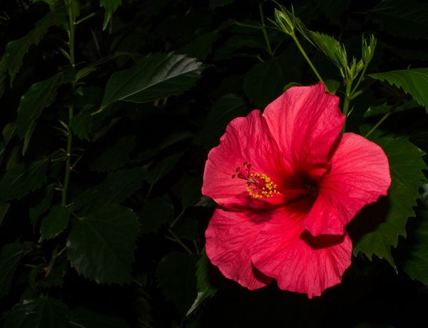
Red Hibiscus
Nov 16, 2015 13:29:25 #

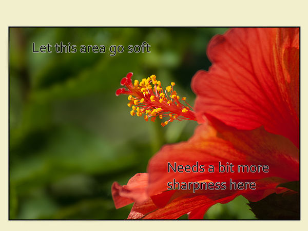
Shot this with a Nikon D7100 at ISO 100, f/14 with a 35mm prime sychronized at 1/320s. I used f/14 to block out ambient light at around 11:00am. Will appreciate your comments pro and con.

Nov 16, 2015 13:32:55 #

Nicely done Bunkershot. Red can be a difficult colour especially with saturation.
Nov 16, 2015 14:39:25 #
Nov 16, 2015 16:30:56 #
Hi
Since I have shot my share of these Couldn't resist commenting.
Let me begin by saying I think overall people here are much to kind.I'm just a cranky old guy and a bit harsh However it's all meant to be helpful.
I agree the contrast is a bit low. I see you cranked the shadows up +45 and the highlights down +45 As well as turning the contrast itself down =13
You probably know 11 am in the Fl Sun is not the best time to shoot flowers.
Your use of a fill flash was a good thing to get detail out of the shadows
Your choice of F stops gave it depth of field throughout. I find all the detail in the background leaves distracting
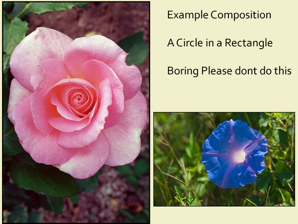
I don't care for the composition So many people shoot round flowers straight on ending up with a circle in a rectangle
It makes a good picture for a textbook but not all that pleasing from a composition standpoint
Overall I'd say technically not bad
You may judge for yourself if my examples of the same subject are more interesting or not
Since I have shot my share of these Couldn't resist commenting.
Let me begin by saying I think overall people here are much to kind.I'm just a cranky old guy and a bit harsh However it's all meant to be helpful.
I agree the contrast is a bit low. I see you cranked the shadows up +45 and the highlights down +45 As well as turning the contrast itself down =13
You probably know 11 am in the Fl Sun is not the best time to shoot flowers.
Your use of a fill flash was a good thing to get detail out of the shadows
Your choice of F stops gave it depth of field throughout. I find all the detail in the background leaves distracting
I don't care for the composition So many people shoot round flowers straight on ending up with a circle in a rectangle
It makes a good picture for a textbook but not all that pleasing from a composition standpoint
Overall I'd say technically not bad
You may judge for yourself if my examples of the same subject are more interesting or not
Bullseye composition

Nov 16, 2015 16:46:22 #
Nov 16, 2015 17:34:20 #

Nov 16, 2015 18:06:16 #
Nov 17, 2015 07:41:42 #
I like the composition and, yes, you could have brought out more detail. However, there will always be someone who is better... what's important is to stay true to yourself.
Please your self and others will follow!
Please your self and others will follow!
Nov 17, 2015 10:05:51 #
Snap Shot wrote:
I like the composition and, yes, you could have brought out more detail. However, there will always be someone who is better... what's important is to stay true to yourself.
Please your self and others will follow!
Please your self and others will follow!
Excellent point (although I might replace the word better with different)
The examples I used certainly were not technically better. Just maybe photographicly more interesting. That is for the viewer to judge.
Posts here usually have a lot of technical information BUT very few (including my own) include insight into the purpose of creating the image in the first place.
Is the purpose to create a technically perfect capture or perhaps a piece of art worthy of hanging at the NY Met
There is no way to know if the maker was successful unless one knows what the end objective was.
The original posted image is certainly worthy of printing in a flower identification book. On the other hand the examples I used to make a point are not. they would be more at home in an artsy coffee table book
Different images for different purposes
Nov 17, 2015 10:16:22 #
Nov 17, 2015 10:18:03 #
I find the photo very pleasing to the eye. I think using a smaller f stop would have brought even more attention to the flower, the star here, and would have made as nice of a photo, different and maybe better. However, I like all the detail and deep DOF as we'll. Another thought, try cropping to horizontal with the flower off to the right in the frame. At any rate, I like it and would have been pleased with it had it been my photo! Nicely done.
Nov 17, 2015 14:28:11 #
My thanks to you Photolady and all who commented. I learned a great deal and was able to incorporate many of the suggestions. I must say, as a relative newcomer to UHH, that one can learn a lot simply by doing what I did. Great site with wonderful members.
Nov 17, 2015 15:19:19 #
Bunkershot wrote:
My thanks to you Photolady and all who commented. I learned a great deal and was able to incorporate many of the suggestions. I must say, as a relative newcomer to UHH, that one can learn a lot simply by doing what I did. Great site with wonderful members.
Much better Grasshopper!
Nov 17, 2015 15:42:17 #
Nov 17, 2015 16:16:15 #

First let me say that while not perfect, I do like the image. I happen to really like hibiscus and have several in my yard. Since it is digital this is not necessarily the final product.
I did laugh when I read this:
"Let me begin by saying I think overall people here are much to kind."
I think in my very first post I said I decided to join because this seemed like a friendly place.
But since this is a critique, it should have read 'too kind'. :)
Edit: I didn't see version 2 before I posted this. :thumbup:
---
If you want to reply, then register here. Registration is free and your account is created instantly, so you can post right away.