Easter with Payton
Apr 10, 2012 10:04:31 #
Apr 10, 2012 10:11:18 #

Apr 10, 2012 12:09:08 #

Apr 10, 2012 12:17:03 #
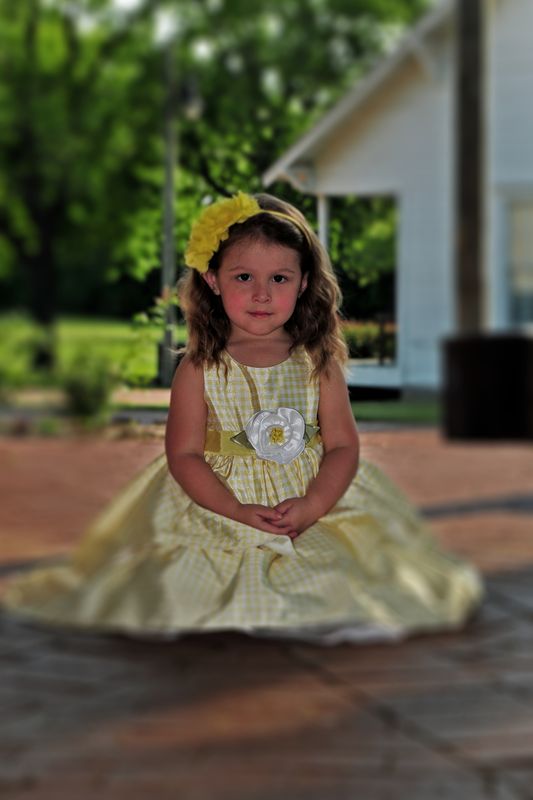
I love the girl in 1 but to me the background is distracting. What would it look like with editing the depth of field? (look at me. Actually trying to sound as if I know what I am talking about!!! LOL)
All the pictures are great!
All the pictures are great!
Apr 10, 2012 13:17:57 #
enjoyinglife wrote:
I love the girl in 1 but to me the background is distracting. What would it look like with editing the depth of field? (look at me. Actually trying to sound as if I know what I am talking about!!! LOL)
All the pictures are great!
All the pictures are great!
How is this?
Apr 10, 2012 13:45:12 #

enjoyinglife wrote:
I love the girl in 1 but to me the background is distracting. What would it look like with editing the depth of field? (look at me. Actually trying to sound as if I know what I am talking about!!! LOL)
All the pictures are great!
All the pictures are great!
NOOOOOO! This is my personal opinion but one I voice a lot here, do NOT try and create bokeh/blurred background in post. It rarely looks natural and to me looks cheap (very much like colour selection another one of my photography pet peeves).
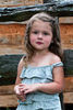
#1 - Your skin tone is way off, she is very, very red. The background is distracting, and she looks underexposed. You also have her dead center of the frame. I do like the pose, the way she is holding her hands and her cute little facial expression.
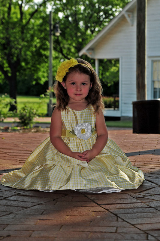
#2 - I would have angled her a little more so her feet didn't seem to be growing out of her head. Once again your skin tone is off, there is a pole growing out of her lower body. And she is centered in the frame again.
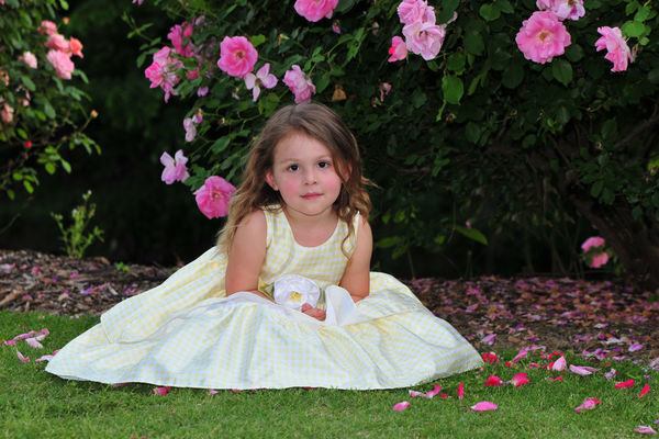
#3 - This is the best of the bunch. A larger DOF would have blurred the bush behind her a little more, separting her and making her the main focal point.
Are you using a single focal point and placing that on the eyes yourself or are yous letting the camera decided what is important? I'm asking because your focus seems soft, if you are letting the camera pick, turn that feature off and use single focal point, place it over the eye closets to the camera. It will help get your images sharper.
Apr 10, 2012 15:34:48 #
NOOOOOO! This is my personal opinion but one I voice a lot here, do NOT try and create bokeh/blurred background in post. It rarely looks natural and to me looks cheap (very much like colour selection another one of my photography pet peeves).
I agree, just playing around with it.
#1 - Your skin tone is way off, she is very, very red. The background is distracting, and she looks underexposed. You also have her dead center of the frame. I do like the pose, the way she is holding her hands and her cute little facial expression.
Here skin is naturally a little on the red side and after just a little exertion she gets real splotchy on her face and arms, it has always been a challenge to get it right. I get the WB right but then have to tweek it to tone down her cheecks. I would be happy to post one out of the camera and let you see what you can do. I would really appreciate it. As far as being centered she was in the middle of a large gazebo and there was nothing interesing about having anything on the right or left. Might have made a mistake but to be every single shot does not have to be based on rule of thirds.
#2 - I would have angled her a little more so her feet didn't seem to be growing out of her head. Once again your skin tone is off, there is a pole growing out of her lower body. And she is centered in the frame again.
Agreed.
#3 - This is the best of the bunch. A larger DOF would have blurred the bush behind her a little more, separting her and making her the main focal point.
Probably so.
Are you using a single focal point and placing that on the eyes yourself or are yous letting the camera decided what is important? I'm asking because your focus seems soft, if you are letting the camera pick, turn that feature off and use single focal point, place it over the eye closets to the camera. It will help get your images sharper.[/quote]
Single and I aways try to get the eye closest to lens. I was on my stomach most of these shots and when you are my age and weight it is not so comfortable a position. I am glad I got the shot. I definately noticed they are soft but considering the subject matter I was not real concerned, kind of matched the scene.
Thank you for your comments, I always enjoy them on other posts and like everyone else, love your avatar.
Apr 10, 2012 16:11:17 #
Maybe this is better. I went back and I think I had the saturation to high and a couple of other mistakes. Can't do much about the centering.

Apr 11, 2012 01:44:09 #
Apr 11, 2012 08:42:19 #
Apr 11, 2012 10:57:52 #
jtipps wrote:
OK, try these.
:D :D :D
Crop for subject - Blur BG - Rule of thirds - Full Face
Great model!
Apr 11, 2012 11:07:27 #
If you want to reply, then register here. Registration is free and your account is created instantly, so you can post right away.