sunday Morning
Oct 4, 2015 08:15:27 #
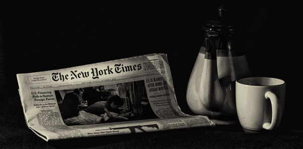
Some of the lessons I've learned from comments and reading is that simple works best in still life photography. I have here three elements that are all central to the theme of Sunday Morning with the paper. Do you like this?
Oct 4, 2015 08:30:44 #
ebrunner wrote:
I do basically like it. I like the concept very much (wish I'd thought of it). I do have some nits to pick with the execution...Some of the lessons I've learned from comments and reading is that simple works best in still life photography. I have here three elements that are all central to the theme of Sunday Morning with the paper. Do you like this?
I think the spotlight effect on the masthead is juuuusssst a scoche overdone. That's a personal opinion! I'd back it off just a little so my eye still goes to the masthead but my eye doesn't quite realize why. I'd also like to see just a little more separation between the top of the coffee pot and the background. There are ways to do that in post but of course you have to be careful that you can't see what was done, at least IMO. I was taught that "if you can see what was done, it's overdone." I think it's a swell picture overall! :thumbup: :thumbup:
Oct 4, 2015 08:34:13 #
Frank2013
Loc: San Antonio, TX. & Milwaukee, WI.
ebrunner wrote:
Do you like this?
Yes ..but you know its not that easy with me ebrunner. My opinion of course. The name of the paper is too bright, that ray of sunlight might catch part of the pot, and maybe some team rising from the cup.
Oct 4, 2015 08:47:41 #
Frank2013 wrote:
Excellent suggestions! Indeed, I now wish I could see the coffee in the cup, with the vapor rising from it, which would really pop against the black background. :thumbup:Yes
..but you know its not that easy with me ebrunner. My opinion of course. The name of the paper is too bright, that ray of sunlight might catch part of the pot, and maybe some team rising from the cup.
Oct 4, 2015 08:56:38 #
Chuck_893 wrote:
I do basically like it. I like the concept very mu... (show quote)
Glad you liked it. Comments are very helpful. I was wondering about the masthead spot myself. I'll work on this one because I really like it. Thanks.
Oct 4, 2015 08:58:18 #
Frank2013 wrote:
Yes
..but you know its not that easy with me ebrunner. My opinion of course. The name of the paper is too bright, that ray of sunlight might catch part of the pot, and maybe some team rising from the cup.
I thought about steam and showing some coffee in the cup. Both excellent suggestions. I think that could be done. Thank you.
Oct 4, 2015 09:18:28 #

The lighting on the curves of the cup and pot are very pleasing. Worth working on this one a bit more, for sure, Erich.
Oct 4, 2015 09:44:22 #

The suggestions you have recieved all make sense but personally think its superb just as it is. Steam from the cup is a bit twee. We know its a coffee cup does not need Starbucks printed on it to get the message across.
The highlight on the masthead made me think why? And I do not make a habit of thinking. It adds a bit of illuminated mystery almost.
Would not change a damn thing my man. Steam and non spot lit paper would just make it normal rather than an original ebrunner piece.Normal may just make it a perfect photo and boring at the same time
Love it fella well done for thinking out of that $4 box.
Oct 4, 2015 09:51:09 #
Frank2013
Loc: San Antonio, TX. & Milwaukee, WI.
Chuck_893 wrote:
Excellent suggestions! Indeed, I now wish I could see the coffee in the cup, with the vapor rising from it, which would really pop against the black background. :thumbup:
Great to see you back 893. Looking forward to your input.
Oct 4, 2015 13:13:21 #

ebrunner wrote:
Some of the lessons I've learned from comments and reading is that simple works best in still life photography. I have here three elements that are all central to the theme of Sunday Morning with the paper. Do you like this?
Like it a lot. As a native New Yorker, I love the N.Y.T.!
One niggle: without some obvious support behind, the the up-fold of the "Times" is puzzling, and thus distracting. I agree with Chuck that the top of the pot needs more definition.
Y'r gettin' good!
Dave
Oct 4, 2015 20:15:06 #
Linda From Maine wrote:
The lighting on the curves of the cup and pot are very pleasing. Worth working on this one a bit more, for sure, Erich.
I agree. THis is a good start; but it is not a finished product yet. Thanks.
Oct 4, 2015 20:17:57 #
Billyspad wrote:
The suggestions you have recieved all make sense b... (show quote)
I will certainly take your advice under advisement. You might just be right about the steam. Still, I might be able to improve it. One thing is for sure, I'm going to save this copy just as is before I work on a different version.
Oct 4, 2015 20:19:11 #
Uuglypher wrote:
Like it a lot. As a native New Yorker, I love the N.Y.T.!
One niggle: without some obvious support behind, the the up-fold of the "Times" is puzzling, and thus distracting. I agree with Chuck that the top of the pot needs more definition.
Y'r gettin' good!
Dave
One niggle: without some obvious support behind, the the up-fold of the "Times" is puzzling, and thus distracting. I agree with Chuck that the top of the pot needs more definition.
Y'r gettin' good!
Dave
Thank you for your input. I do appreciate it.
If you want to reply, then register here. Registration is free and your account is created instantly, so you can post right away.