Monhegan Light - Monochrome?
Oct 1, 2015 21:20:53 #

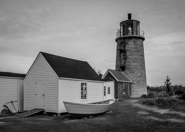
I kept hoping for a grand sunset to light the face of this beautiful old lighthouse up but alas, not this trip (unless perhaps I'm stranded another day, then another chance....) How does it come across in monochrome?
Oct 1, 2015 21:30:01 #

I think you know you needed some sky to lift this picture min. Looks a lovely old structure probably needs color and mother nature being more co-operative.
Oct 1, 2015 21:34:56 #
Billyspad wrote:
I think you know you needed some sky to lift this picture min. Looks a lovely old structure probably needs color and mother nature being more co-operative.
I bet I can jack up the sky once I get it home. I think there's detail hiding in there. But mother nature wasn't kind this trip. Luckily, she was abundant on my last visit and gave me a hot orange sunset splashed across the front.
Oct 2, 2015 23:24:09 #
jim hill
Loc: Springfield, IL
minniev wrote:
I kept hoping for a grand sunset to light the face of this beautiful old lighthouse up but alas, not this trip (unless perhaps I'm stranded another day, then another chance....) How does it come across in monochrome?
Hi Min,
This piece has beautiful grey tonalities. I love it's feeling of somber stillness. A great place for contemplation. Things are arranged nicely from an interesting angle.
I think a crop to the very edge of the boat house on the left side might be helpful. That might leave the steps into the place a bit short but it might be worth a try. And you might tweak the highlights only with a little more contrast.
Oct 3, 2015 04:15:58 #

minniev wrote:
I...How does it come across in monochrome?
I like the shapes. I like the tones. I like the photograph.
Oct 3, 2015 07:12:47 #
jgordon wrote:
I like the shapes. I like the tones. I like the photograph.
Thank you. This rendition is clearly all about shape and tone. The Monhegan light is not dramatic unless there's a grand sunset pasted across its front. It is of an austere design, perched on a high cliff with no backdrop.
Part of the charm of the island is its austerity. Everything is oriented to function.
Oct 3, 2015 07:24:15 #
jim hill wrote:
Hi Min,
This piece has beautiful grey tonalities. I love it's feeling of somber stillness. A great place for contemplation. Things are arranged nicely from an interesting angle.
I think a crop to the very edge of the boat house on the left side might be helpful. That might leave the steps into the place a bit short but it might be worth a try. And you might tweak the highlights only with a little more contrast.
Thanks Jim. I see what you mean about the highlights, I tried it and it helped. I'll tinker with the crop and see what that might do. As I said to JGordon, the island is beautiful in its austerity. The islanders are driven more by function than design, but it ends up creating a fascinating playground for photographers and artists.
It is very hard to take a satisfactory photo of something that has been painted so beautifully by so many.
Oct 3, 2015 16:35:32 #

Looks good to me I like the lines. First of the little ramp, then of the clapboard and boat...then the roof lines all leading to the circular light house and lines of the blocks.
I agree a crop on the left maybe to what looks like a downspout would crisp it up.
I agree a crop on the left maybe to what looks like a downspout would crisp it up.
Oct 4, 2015 05:49:01 #
RiverNan wrote:
Looks good to me I like the lines. First of the little ramp, then of the clapboard and boat...then the roof lines all leading to the circular light house and lines of the blocks.
I agree a crop on the left maybe to what looks like a downspout would crisp it up.
I agree a crop on the left maybe to what looks like a downspout would crisp it up.
Thanks Nan for the feedback and the suggestion. This version is all about lines and shapes. I have some shot tighter, but of course, in my usual fashion, got torn by my attraction to that darned anchor leaning against the wall. I have a hard time simplifying things. I'm still trying!!
Oct 4, 2015 08:20:33 #
jgordon wrote:
I agree with jgordon. I basically like it, and I would not myself crop it (I think it would alter the balance and not for the better). But absolutely, like tasting the soup, it needs something. We all have pictures like this that are aaaaalllmost there...I like the shapes. I like the tones. I like the photograph.
As an old black and white printer, I think it looks a little flat, like it needs a no. 3 paper instead of the no. 2 it's printed on now, i.e raise the contrast just a scoche. Then indeed I'd try to burn in the sky. Nowadays we can select just the sky and tweak it by itself. I'd personally very careful not to try to go too far. The light itself was very flat, so (IMO) you shouldn't try to make it look like the sun was out because that's apt to look fake.
But speaking of fake, something else that I might try (and I'm thinking of doing it with an image I have that's also pretty flat) is a pencil sketch effect, or charcoal, or one of those. If you hate those phony filters that's fine; I rarely use them myself but this might be one image that benefits from being phonied up. :mrgreen:
Oct 4, 2015 19:04:09 #
Chuck_893 wrote:
I agree with jgordon. I basically like it, and I w... (show quote)
Hi Chuck, glad to see you back! Like your new avatar too.
Thanks for the feedback. Yeah, I'm gonna have another go at it when I get home where I have my nice big monitor and all my software toys to play with. A bit more life in the sky, a bit more contrast in the buildings. A sketch effect would be an interesting option, I hadn't thought of that. I have no objection to ANYTHING I can do to an image, all of it is fun to me!!!
If you want to reply, then register here. Registration is free and your account is created instantly, so you can post right away.