Interesting Bird?
Sep 28, 2015 18:25:27 #
Sep 28, 2015 18:44:52 #

I like it a lot, Frank! There might be suggestions that do make it better, but as-is this grabs my attention, is unique and interesting, and quite pleasing.
Sep 28, 2015 20:08:34 #

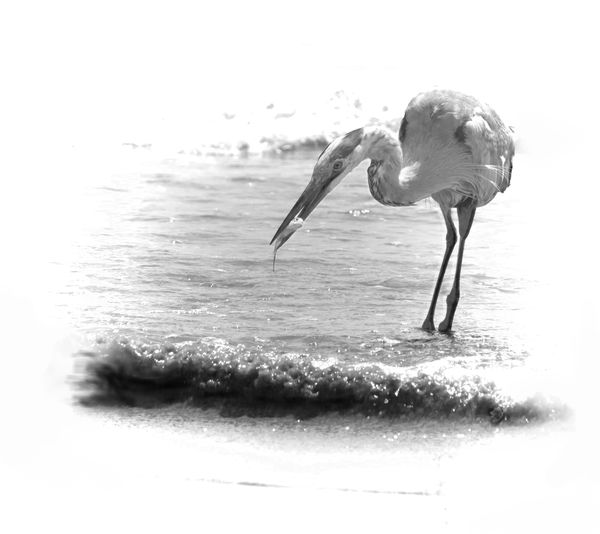
A small levels adjustment Frank makes the bird stand out more and its all about the vignette then.
Because its so strong it makes one believe its there to disguise the background rather than to bring the bird to the fore.
I actually like this effect but I know many reviewers are anti vignette.
Your call my man publish and be damned. Oh just do not call it art lol lol lol.
Because its so strong it makes one believe its there to disguise the background rather than to bring the bird to the fore.
I actually like this effect but I know many reviewers are anti vignette.
Your call my man publish and be damned. Oh just do not call it art lol lol lol.
Sep 28, 2015 20:52:48 #

Sep 28, 2015 21:07:10 #
Frank2013
Loc: San Antonio, TX. & Milwaukee, WI.
Linda From Maine wrote:
I like it a lot, Frank! There might be suggestions that do make it better, but as-is this grabs my attention, is unique and interesting, and quite pleasing.
Thank you for commenting Linda, I feel it can be better.
Sep 28, 2015 21:11:47 #
Frank2013
Loc: San Antonio, TX. & Milwaukee, WI.
Billyspad wrote:
A small levels adjustment Frank makes the bird stand out more and its all about the vignette then.
Because its so strong it makes one believe its there to disguise the background rather than to bring the bird to the fore.
I actually like this effect but I know many reviewers are anti vignette.
Your call my man publish and be damned. Oh just do not call it art lol lol lol.
Because its so strong it makes one believe its there to disguise the background rather than to bring the bird to the fore.
I actually like this effect but I know many reviewers are anti vignette.
Your call my man publish and be damned. Oh just do not call it art lol lol lol.
Mr. Spad as you know I am slowly acquiring my PP skills. I could not quite get there with levels for some reason I will keep trying but in the mean time is this more in line with your thoughts.
Matt I would like your thoughts again also.

Sep 28, 2015 21:50:01 #
I like the way the bird stands out a lot more. It gives good definition to the subject and the image doesn't look so washed out. To my eye the stark white surrounding it now complements it.
Sep 28, 2015 22:54:38 #
Frank2013
Loc: San Antonio, TX. & Milwaukee, WI.
MattPhox wrote:
I like the way the bird stands out a lot more. It gives good definition to the subject and the image doesn't look so washed out. To my eye the stark white surrounding it now complements it.
Thanks Matt, I think I understand now and believe this also works in color, which I didn't at first.
Sep 29, 2015 06:11:43 #

Sep 29, 2015 07:18:42 #
Frank2013
Loc: San Antonio, TX. & Milwaukee, WI.
rlaugh wrote:
I like this look also, and it does work in both B&W and color!
I think people will either like the treatment or won't. I did not think the color would work but was surprised. Thank you for commenting.
Sep 29, 2015 07:34:37 #
Very nice my man very very nice indeed.
For future reference Frank Levels and Curves work in similar ways. So if you can access curves you could use that to darken your bird in the mono version. Drag the curve down at the bottom to darken and up at the top to lighten That's a simplistic tutorial but you will soon get the hang of it.
For future reference Frank Levels and Curves work in similar ways. So if you can access curves you could use that to darken your bird in the mono version. Drag the curve down at the bottom to darken and up at the top to lighten That's a simplistic tutorial but you will soon get the hang of it.
Sep 29, 2015 07:38:56 #
Frank2013
Loc: San Antonio, TX. & Milwaukee, WI.
Billyspad wrote:
Very nice my man very very nice indeed.
For future reference Frank Levels and Curves work in similar ways. So if you can access curves you could use that to darken your bird in the mono version. Drag the curve down at the bottom to darken and up at the top to lighten That's a simplistic tutorial but you will soon get the hang of it.
For future reference Frank Levels and Curves work in similar ways. So if you can access curves you could use that to darken your bird in the mono version. Drag the curve down at the bottom to darken and up at the top to lighten That's a simplistic tutorial but you will soon get the hang of it.
Thanks for giving me your thoughts. I will work more on the mono but just couldn't get it with either of those, but did get what you mean about it being washed out, didn't see that originally. Hope my sports hints help. I am expecting too see some champions.
Sep 30, 2015 11:31:55 #
Frank2013
Loc: San Antonio, TX. & Milwaukee, WI.
Frank2013 wrote:
I will work more on the mono
Well here's the mono......still not happy with it though. Can't put my finger on it.

Sep 30, 2015 13:21:42 #

Frank I am not crazy about vignettes. But to me the colored one works better. The B/W seemed washed out.
Oct 1, 2015 11:00:22 #
Frank2013
Loc: San Antonio, TX. & Milwaukee, WI.
NJFrank wrote:
Frank I am not crazy about vignettes. But to me the colored one works better. The B/W seemed washed out.
Tend to agree NJ but have been playing around and the heavy vignette is starting to grow on me. Do you find the second B&W any more appealing or no?
If you want to reply, then register here. Registration is free and your account is created instantly, so you can post right away.