Sarah
Aug 26, 2015 12:39:55 #
ozmerelda
Loc: Osprey, FL
Hi All!
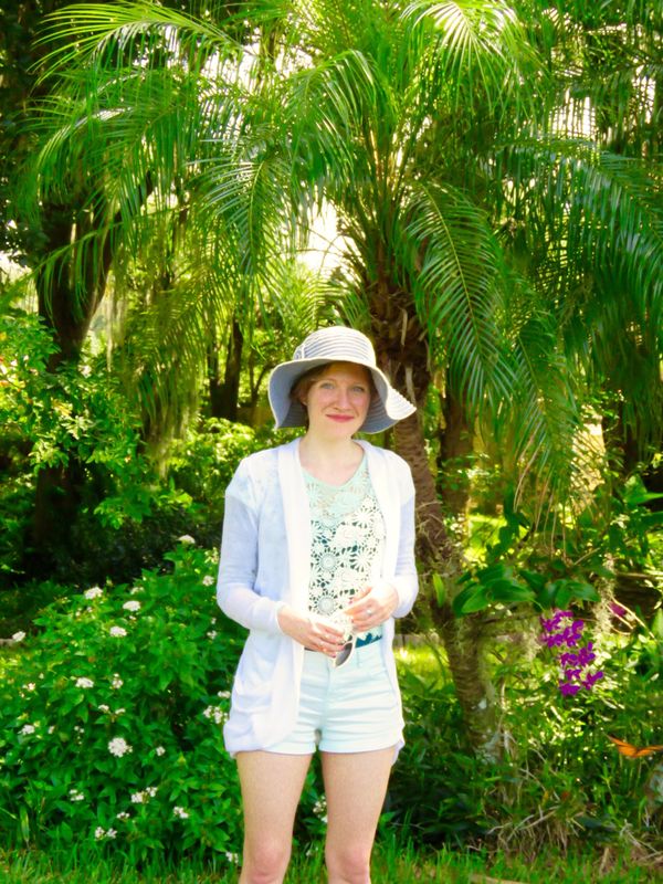
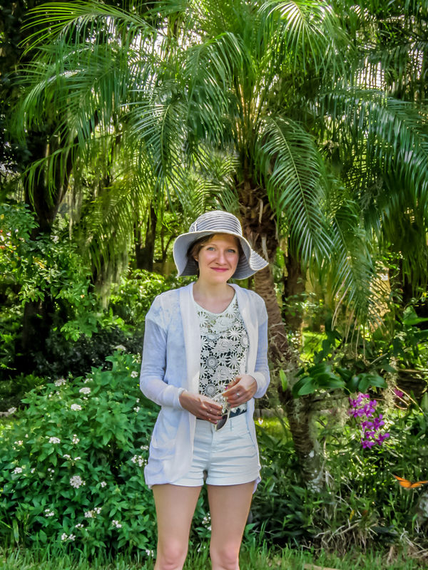
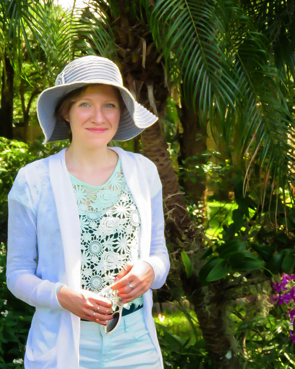
I am wondering how I can make this photo better. I altered the colors in Photos. making the greens more intense.
Canon SX 60.
Thanks for any input.
OZ
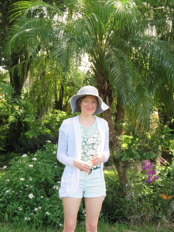
I am wondering how I can make this photo better. I altered the colors in Photos. making the greens more intense.
Canon SX 60.
Thanks for any input.
OZ
Aug 26, 2015 13:32:28 #
In my opinion the photo was over-exposed by 1 to 1 1/2 stops and your focus was soft. I lowered the overall exposure by 1 stop, open up the exposure on her face, darkened and blurred the background. Nothing you can do about the sharpness, image is just soft. Re-cropped to make the young lady the only subject of the photo.
Aug 26, 2015 13:45:09 #

wayne-03 wrote:
In my opinion the photo was over-exposed by 1 to 1 1/2 stops and your focus was soft. I lowered the overall exposure by 1 stop, open up the exposure on her face, darkened and blurred the background. Nothing you can do about the sharpness, image is just soft. Re-cropped to make the young lady the only subject of the photo.
:thumbup:
Aug 26, 2015 14:10:36 #

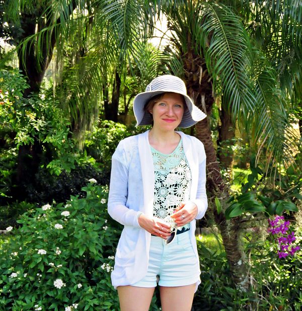
One thing the whole image seems to have benefited from is more Clarity, especially around her face. On top of that I smoothened out the light levels as much as poss and sharpened a bit using a fair bit of masking.
You stated a preference for vivid colours, so I went with that but thought that yellow was coming over a bit strong in your own edit, so I subdued it a bit in mine. The rest was toning down or cloning out various distractions.
-
You stated a preference for vivid colours, so I went with that but thought that yellow was coming over a bit strong in your own edit, so I subdued it a bit in mine. The rest was toning down or cloning out various distractions.
-
Aug 26, 2015 15:00:16 #
Aug 26, 2015 15:02:49 #
Aug 26, 2015 16:45:44 #
rborud
Loc: Minnesota
ozmerelda wrote:
Hi All!
I am wondering how I can make this photo better. I altered the colors in Photos. making the greens more intense.
Canon SX 60.
Thanks for any input.
OZ
I am wondering how I can make this photo better. I altered the colors in Photos. making the greens more intense.
Canon SX 60.
Thanks for any input.
OZ
ozmerelda
Could this help?
RBorud
Aug 26, 2015 18:18:23 #

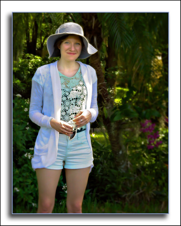
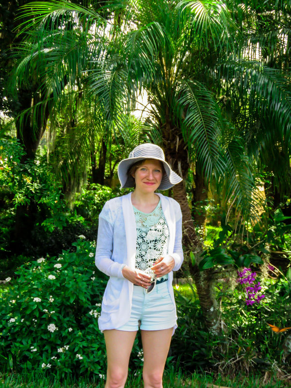
Processed similar to Wayne-03. A crop with more emphasis on the model but, not too close to the knee. Pushed the darks closer to black, a little sharpening, a little adjustment in the blues, a tiny mid-tone contrast increase, and a masked gradient vignette at reduced opacity.
Aug 26, 2015 19:00:17 #

Rick36203 wrote:
Processed similar to Wayne-03. A crop with more emphasis on the model but, not too close to the knee. Pushed the darks closer to black, a little sharpening, a little adjustment in the blues, a tiny mid-tone contrast increase, and a masked gradient vignette at reduced opacity.
:thumbup: :thumbup: :thumbup:
Aug 26, 2015 19:17:11 #
Rick36203 wrote:
Processed similar to Wayne-03. A crop with more emphasis on the model but, not too close to the knee. Pushed the darks closer to black, a little sharpening, a little adjustment in the blues, a tiny mid-tone contrast increase, and a masked gradient vignette at reduced opacity.
If it's going to be Cropped, I'd go with this. :thumbup:
Aug 27, 2015 12:10:25 #
ozmerelda
Loc: Osprey, FL
Rick36203 wrote:
Processed similar to Wayne-03. A crop with more emphasis on the model but, not too close to the knee. Pushed the darks closer to black, a little sharpening, a little adjustment in the blues, a tiny mid-tone contrast increase, and a masked gradient vignette at reduced opacity.
Thanks, this is my favorite. I so appreciate it.
:) :) :) :) :)
Aug 27, 2015 13:59:38 #

ozmerelda wrote:
Hi All!
I am wondering how I can make this photo better. I altered the colors in Photos. making the greens more intense.
Canon SX 60.
Thanks for any input.
OZ
I am wondering how I can make this photo better. I altered the colors in Photos. making the greens more intense.
Canon SX 60.
Thanks for any input.
OZ
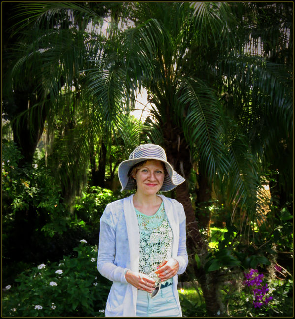
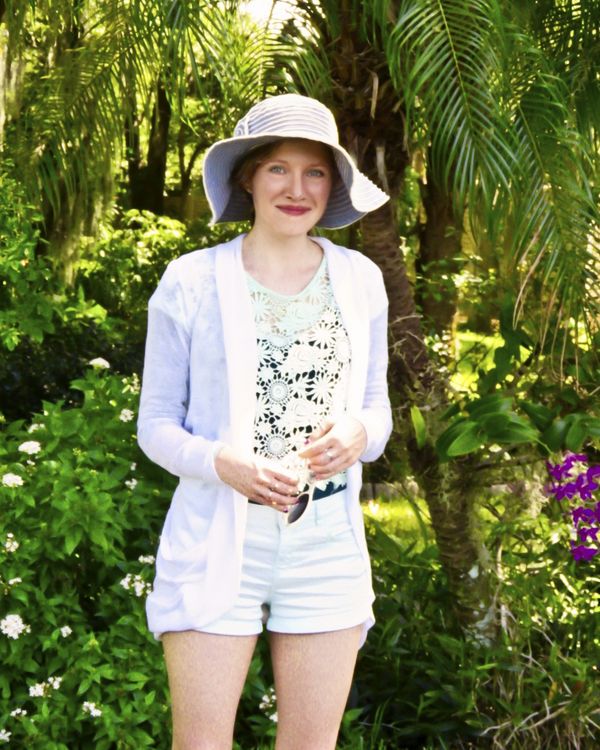
Nice image to work with...my take is attached...
Aug 27, 2015 14:43:05 #
ozmerelda
Loc: Osprey, FL
hb3 wrote:
Nice image to work with...my take is attached...
I think it is quite lovely. :) :) :) :)
Aug 27, 2015 14:59:17 #
What a great image! It reminds me of the photos from the 1920's and flapper Era!
You should crop as suggested to showcase just the lovely Lady, and render in B&W. Forget the color and softness.
Thanks for sharing!
You should crop as suggested to showcase just the lovely Lady, and render in B&W. Forget the color and softness.
Thanks for sharing!
Aug 27, 2015 17:12:01 #

If you want to reply, then register here. Registration is free and your account is created instantly, so you can post right away.