trip picture and need suggestions for editing
Mar 28, 2012 20:58:16 #
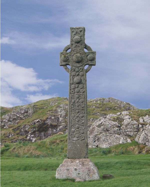
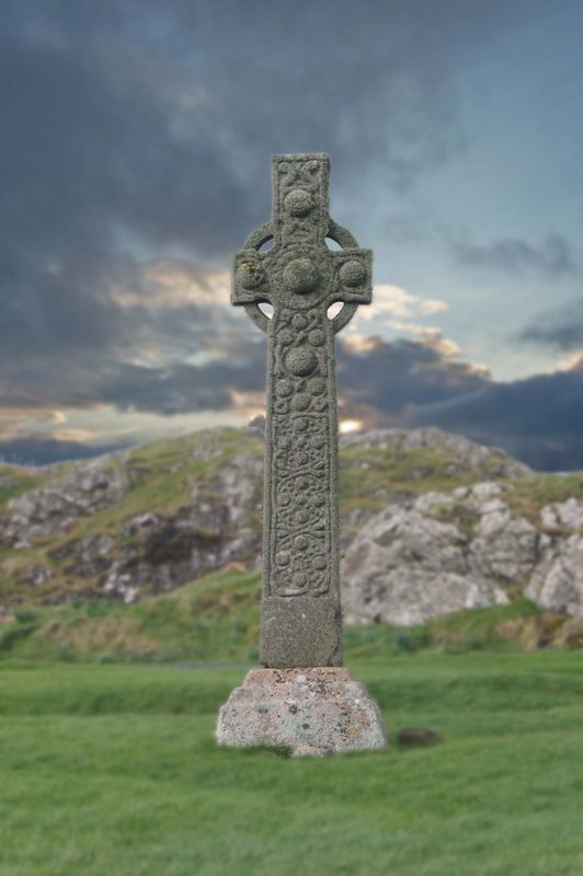
Our recent trip to Scotland was a present for my husband who is a Presbyterian pastor. I want to print and frame a reminder of the trip. I have PSed this picture (added blue sky and enhanced the contrast) but this is new for me. What else do I need to do to improve?
Mar 28, 2012 23:00:41 #
Mar 29, 2012 09:05:03 #
jdtx
Loc: SA, Tx.
a levels boost I think would help, or curves whichever you get the best results from
Mar 29, 2012 09:06:41 #
Wow, what a photo to practice an OOB ( out of bounds ) on. Wish I could find a program to work with that is easy for that effect.
Sarge
Sarge
Mar 29, 2012 10:11:30 #

Very nice composition.
Although I generally like blue skys I'm not sure it adds in this case. A foreboding gray sky might go better. Or maybe a sunset. I have one I'll try on it.
I feel it needs to have the cross "pop" more. Increased brightness, sharpening, and maybe contrast of cross and maybe blurring the background could help. Probably should have darkened background while cross was selected to go better with sky, too.
Selection is crude on example...just to share some thoughts.
enjoyinglife wrote:
Our recent trip to Scotland was a present for my husband who is a Presbyterian pastor. I want to print and frame a reminder of the trip. I have PSed this picture (added blue sky and enhanced the contrast) but this is new for me. What else do I need to do to improve?
One take
Mar 29, 2012 12:12:58 #
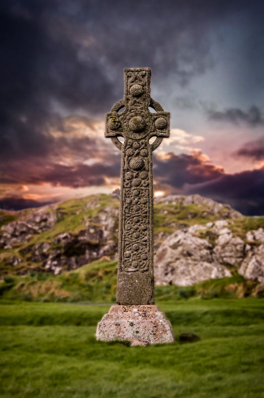
Great ideas! I really like the idea of foreboding skies although I think the sample is a bit much. I do want it to reflect somewhat how it looked when we were there. On the original photo the skies was just gray and I replaced the sky. Maybe I should do the same but a stormy day. . .
Unfortunately our weather in Texas has not been cooperating. Either blue skies or gloomy gray skies.
Unfortunately our weather in Texas has not been cooperating. Either blue skies or gloomy gray skies.
Mar 29, 2012 12:50:10 #
MtnMan wrote:
Very nice composition. br br Although I generally... (show quote)
Nice!!! That sky really makes it. Good edit.
Mar 29, 2012 12:59:18 #
I agree it kind of dominates and you don't want that. It just happend to be be hanging out in my "Skys" keyword tag.
You may find some on the Internet that you can download...at least to try out. I don't have any gloomy ones yet cause I hadn't thought of it before.
Another thing you can try if you find a good one is the lighting effects in Elements. I'm still experimenting with them...takes some fiddling.
You may find some on the Internet that you can download...at least to try out. I don't have any gloomy ones yet cause I hadn't thought of it before.
Another thing you can try if you find a good one is the lighting effects in Elements. I'm still experimenting with them...takes some fiddling.
enjoyinglife wrote:
Great ideas! I really like the idea of foreboding skies although I think the sample is a bit much. I do want it to reflect somewhat how it looked when we were there. On the original photo the skies was just gray and I replaced the sky. Maybe I should do the same but a stormy day. . .
Unfortunately our weather in Texas has not been cooperating. Either blue skies or gloomy gray skies.
Unfortunately our weather in Texas has not been cooperating. Either blue skies or gloomy gray skies.
Mar 29, 2012 21:45:38 #
Mar 30, 2012 10:06:00 #
:thumbup: :thumbup: :thumbup:
I see you also increased contrast and sharpness of the cross. It really "pops" now. Almost a 3D effect. Nice.
I see you also increased contrast and sharpness of the cross. It really "pops" now. Almost a 3D effect. Nice.
enjoyinglife wrote:
Still not the skies that I want but what about the blur. Is that better?
Mar 30, 2012 10:07:42 #

enjoyinglife wrote:
Great ideas! I really like the idea of foreboding skies although I think the sample is a bit much. I do want it to reflect somewhat how it looked when we were there. On the original photo the skies was just gray and I replaced the sky. Maybe I should do the same but a stormy day. . .
Unfortunately our weather in Texas has not been cooperating. Either blue skies or gloomy gray skies.
Unfortunately our weather in Texas has not been cooperating. Either blue skies or gloomy gray skies.
I did one for you...I hope you don't mind.
I used Lightroom 4 to:
1.) Add red to the lower portion of the sky
2.) Lower the exposure of the sky and grass and hill.
3.) Add a vignette to the whole shot
4.) Raise the exposure on the cross just slightly
5.) Raise the black levels
6.) Raise the contrast.
Mar 30, 2012 17:28:56 #
thank you! I am a beginning photographer but even more a novice at editing. Trying to learn both and not sure which is more confusing.
Mar 30, 2012 18:35:05 #
Nice!
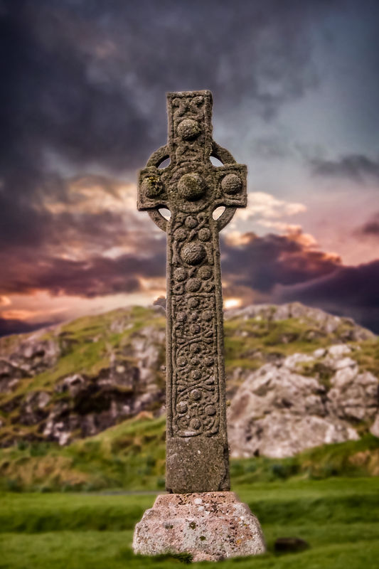
Now it looks like it needs a bit of straightening. I didn't notice that before.
I am also wondering about cropping out some or all the foreground up to the base? Or trying a portrait 6x4 that comes to the bottom of the base, and maybe gives less sky and horizontal?
Now it looks like it needs a bit of straightening. I didn't notice that before.
I am also wondering about cropping out some or all the foreground up to the base? Or trying a portrait 6x4 that comes to the bottom of the base, and maybe gives less sky and horizontal?
rpavich wrote:
I did one for you...I hope you don't mind.
I used Lightroom 4 to
I used Lightroom 4 to
Mar 30, 2012 18:37:42 #
I noticed the straightening also. That I know how to do! I plan to print a 8x10 so I can crop some of the foreground.
Mar 30, 2012 18:44:21 #
Here's the latest with what I was suggesting. Oops, may have over-straghtened. It would print 8 x 12, which our Costco does also.
I must say I'm liking this result. It really highlights your subject while presenting it in its environment with a sense of drama.
BTW I put the middle of the cross member on the 1/3 line. You could try moving the line to the bottom of the cross member which would reduce a little more sky.
I must say I'm liking this result. It really highlights your subject while presenting it in its environment with a sense of drama.
BTW I put the middle of the cross member on the 1/3 line. You could try moving the line to the bottom of the cross member which would reduce a little more sky.
enjoyinglife wrote:
I noticed the straightening also. That I know how to do! I plan to print a 8x10 so I can crop some of the foreground.
If you want to reply, then register here. Registration is free and your account is created instantly, so you can post right away.