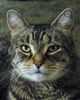
The Stare
Jul 12, 2015 10:14:37 #


Jul 12, 2015 14:05:04 #
Billyspad wrote:
Glad to be on board.
Posted for comments and critique.
Posted for comments and critique.
* * *
Adding an echo to Billyspad, also glad to be on board.
Discovered this sort of accidentally Billy, I don't think many people are aware of its existence yet. Excuse me for not responding directly to the photo this morning as I'm having to deal with life...which gets in the way of art at times.
Jul 12, 2015 14:05:15 #

Welcome and thank you for being the first to post to For Your Consideration!!!
It will be interesting to see what others say, but your image intrigues me. At first glance, I would say, it's over processed and out of focus, however the more I look the more I keep looking. It's as if it reminds me of something.
It's possible you may have intentionally over processed the image to create the effect you're looking for, but the focus throws me. Was that on purpose? I have so many questions!!!
Thank you again for being the first to post! S-
Jul 12, 2015 14:06:58 #
jenny wrote:
* * *
Adding an echo to Billyspad, also glad to be on board.
...
Adding an echo to Billyspad, also glad to be on board.
...
Good morning Jenny, and welcome! S-
Jul 12, 2015 14:09:13 #

Jul 12, 2015 14:11:54 #
blackest wrote:
Zoolander ?
Welcome, and funny, but it's something more... S-
For reference - Zoolander's Blue Steel
http://www.google.com/search?hl=en&site=imghp&tbm=isch&source=hp&biw=1366&bih=643&q=zoolander&oq=zoolander&gs_l=img.1.0.0l10.884.6352.0.7801.20.11.5.4.4.0.86.845.11.11.0....0...1ac.1.64.img..0.20.871.R1xHHQoytAU#hl=en&tbm=isch&q=zoolander+blue+steel
Jul 12, 2015 14:15:38 #
On first look I was puzzled, but the longer I gaze the more attractive the image becomes. Is it perhaps the over done Rembrandt Lighting, The lack of sharpness, The color. Cannot decide why but I do like it.
Jul 12, 2015 14:16:34 #
letmedance wrote:
On first look I was puzzled, but the longer I gaze the more attractive the image becomes. Is it perhaps the over done Rembrandt Lighting, The lack of sharpness, The color. Cannot decide why but I do like it.
Welcome, and interesting isn't it. Almost haunting. S-
Jul 12, 2015 14:28:04 #
Subscribed; the "Stare" could be lightened up and brought more in focus. Art, but not my kind of art!
Jul 12, 2015 14:35:57 #
juicesqueezer wrote:
Subscribed; the "Stare" could be lightened up and brought more in focus. Art, but not my kind of art!
Welcome, and while many will agree, it is an interesting idea. S-
Jul 12, 2015 14:48:45 #
This has a very familiar feel to it.
I feel like it is similar to something I've seen, maybe an art movement from the '60's?
Great start to a new board, Billy!!!
:-)
GT
I feel like it is similar to something I've seen, maybe an art movement from the '60's?
Great start to a new board, Billy!!!
:-)
GT
Billyspad wrote:
Glad to be on board.
Posted for comments and critique.
Posted for comments and critique.
Jul 12, 2015 14:53:06 #
GTinSoCal wrote:
This has a very familiar feel to it.
I feel like it is similar to something I've seen, maybe an art movement from the '60's?
Great start to a new board, Billy!!!
:-)
GT
I feel like it is similar to something I've seen, maybe an art movement from the '60's?
Great start to a new board, Billy!!!
:-)
GT
Welcome, and you may be on to something... S-
Jul 12, 2015 15:03:43 #
I am not a critic nor a critic's son. I can only tell you what I see and feel.
First off, it appears to why over processed, to much Magenta in the face.
Second, his eyes are too soft for a person that is staring. He appears to be more in fear and bewilderment.
On Edit.
Perhaps a better name, something like Apprehension
First off, it appears to why over processed, to much Magenta in the face.
Second, his eyes are too soft for a person that is staring. He appears to be more in fear and bewilderment.
On Edit.
Perhaps a better name, something like Apprehension
Jul 12, 2015 15:24:41 #
Bill Houghton wrote:
I am not a critic nor a critic's son. I can only tell you what I see and feel.
First off, it appears to why over processed, to much Magenta in the face.
Second, his eyes are too soft for a person that is staring. He appears to be more in fear and bewilderment.
On Edit.
Perhaps a better name, something like Apprehension
First off, it appears to why over processed, to much Magenta in the face.
Second, his eyes are too soft for a person that is staring. He appears to be more in fear and bewilderment.
On Edit.
Perhaps a better name, something like Apprehension
What I love most about this image is, that where it would have been a Delete for me, it's changing my mind and starting quite the discussion!
Welcome Bill! S-
Jul 12, 2015 16:09:19 #

Subscribed! I like this. Lots of emotion, grabs the viewer. I don't think focus or lighting need to be perfect in this one to get the message across. Apprehension on his face, can't pay the bills, rent's due, kids to be fed, whatever. An effective image.
If you want to reply, then register here. Registration is free and your account is created instantly, so you can post right away.