Light House at North Head
Jul 9, 2015 11:58:07 #
Jul 9, 2015 12:41:53 #

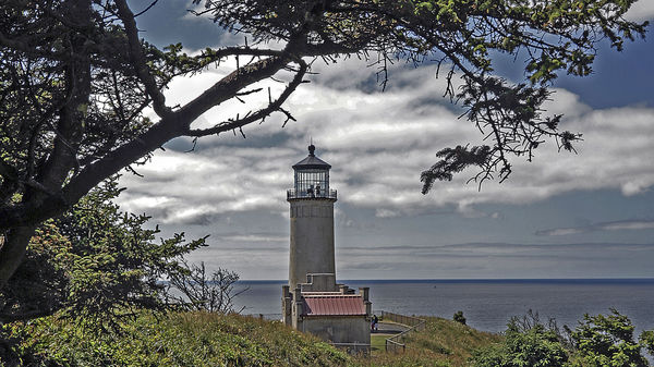
The composition is pleasing on this with the light house framed by the tree. But the processing needs a little work. I am not sure what you have done but the lighthouse and background look like it has has a heavy dose of the burn tool. It all needs to be brightened up a little. The background is also splotchy. Maybe someone with more knowledge than me can tell you what is going on here. I suspect either noise that wasn't handled well or too heavy handed on the post.
Jul 9, 2015 15:09:20 #

The subject is well framed but I'm just not a big fan of the subject being dead center. I would crop 1/2 inch off of the right edge and 2 1/2 inches off the left edge. The white halo around the darker parts and the weird goings on in the sky above the lighthouse suggest too much sharpening/contrast?? The foliage in the front looks kinda flat and needs some darkening. If you still have the original, I'd start over and go a little lighter on the sharpening and contrast.
Jul 9, 2015 18:06:47 #
bud 77
Loc: Long Beach, WA
Country's Mama wrote:
.The composition is pleasing on this with the light house framed by the tree. But the processing needs a little work. I am not sure what you have done but the lighthouse and background look like it has has a heavy dose of the burn tool. It all needs to be brightened up a little. The background is also splotchy. Maybe someone with more knowledge than me can tell you what is going on here. I suspect either noise that wasn't handled well or too heavy handed on the post.
Cm, Thank you for the critique. I took a series of pictures that day, all on the tripod and two second delay and was pleased with all but this one. The more I fixed it the worse it got and to add insult to injury I deleted the original. I am going back and shoot it again if the sun ever shines again. I think that it is far to late to make a good picture out of what I have left. bud
Jul 9, 2015 18:10:34 #
bud 77
Loc: Long Beach, WA
SonyA580 wrote:
The subject is well framed but I'm just not a big fan of the subject being dead center. I would crop 1/2 inch off of the right edge and 2 1/2 inches off the left edge. The white halo around the darker parts and the weird goings on in the sky above the lighthouse suggest too much sharpening/contrast?? The foliage in the front looks kinda flat and needs some darkening. If you still have the original, I'd start over and go a little lighter on the sharpening and contrast.
Thanks for lookingSonyA580. I am going to return to North Head and shoot it again. I inadvertently deleted the original and I don't think what I have left is repairable. bud
Jul 9, 2015 22:04:25 #

There is a lot that I like about this photo: the framing by the foliage, the various layers from top to bottom, and the subject itself. CM spoke about some of the p/p issues, but I'm more concerned about the placement of the lighthouse itself. It's neither dead center or on a third, so it seems a bit awkward. I'm glad that you'll be retaking this photo. I hope that you can still achieve the same framing, yet find a way to position the lighthouse more favorably.
Jul 9, 2015 23:47:44 #

SteveR wrote:
There is a lot that I like about this photo: the framing by the foliage, the various layers from top to bottom, and the subject itself. CM spoke about some of the p/p issues, but I'm more concerned about the placement of the lighthouse itself. It's neither dead center or on a third, so it seems a bit awkward. I'm glad that you'll be retaking this photo. I hope that you can still achieve the same framing, yet find a way to position the lighthouse more favorably.
Steve, I hear what you are saying and I understand. I think a greater problem is the tree. I am a proponent of framing and trees often work well - when utilized with consideration to the entire image, they are wonderful tools of perspective. This one is problematic for the image: it is too dark and takes up too much viewing area. Simply, when considering balance, it is too overwhelming.
Although the lighthouse is thought to be the focus of attention, its presence has been downplayed. Keep the lighthouse, but call a tree surgeon. Then give consideration to the position and elevations of the camera.
Jul 11, 2015 01:27:09 #

This looks like a Lightroom overcook to me - too much clarity slider and not enough contrast slider perhaps? There is an interesting method that takes the image down to a fairly flat contrast, if that's what you're after, without losing the plot completely. Assuming exposure is OK, take Contrast slider all the way left, Highlight all the way left, Shadow all the way right. Now, hit the Alt key and slide Whites until the first dots of white appear on the black screen. Now hit Alt again and slide Blacks until the first dots of black (or any colour) appear on the white screen. Have a look at the result - you may like to add just a touch of Clarity and/or Vibrance, or you can bring deeper colour back with the Contrast slider if that's your taste. Hope you find this helps and, if not, just bin it! If you use Lr, always, always create a virtual copy before making major changes, although the joy of Lr is it doesn't really matter because you have never changed the original file anyway - just hit Reset to return to how it was shot. Of course, if this isn't a Lr image, all this is of no use to you!!
Jul 11, 2015 05:06:53 #
lightchime wrote:
Steve, I hear what you are saying and I understand... (show quote)
It needs to be pruned, for sure.....there's a piece at the end, dangling there, that I'd love to just whack off.....but this kind of framing has its place on postcards and in magazines. However, I think it would be impossible to keep the tree and place the lighthouse correctly, so it's a moot point.
If you want to reply, then register here. Registration is free and your account is created instantly, so you can post right away.