STEAM Nickel Plate Road 765 B&W and Color version
Jun 24, 2015 18:35:37 #
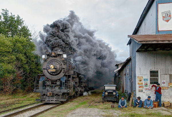
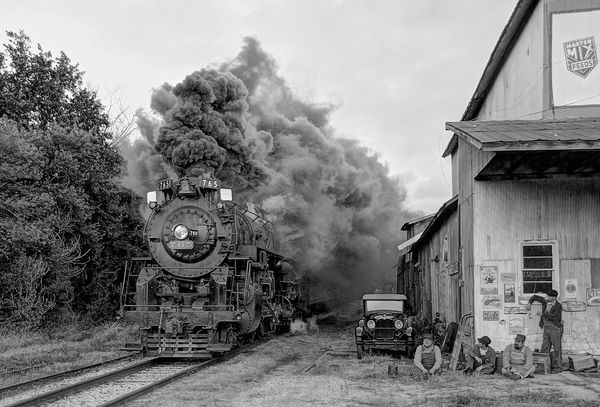
dug this one out of the archives from 2009 I wanted to do a comparison of the image as a Black & White versus the original color version, little post processing done, some Dodge and Burn and saturation reduction and Contrast added.
Jun 24, 2015 18:58:19 #
Jun 24, 2015 19:01:46 #
Jun 24, 2015 20:11:26 #

RichardTaylor wrote:
Both great, however my preference is #1.
Ditto. The smoke seems more dynamic in the color version, as well as the contrast in the engine.
Jun 24, 2015 22:01:33 #

Jun 24, 2015 23:30:42 #

Jun 25, 2015 07:54:52 #
gtwhogger wrote:
dug this one out of the archives from 2009 I wanted to do a comparison of the image as a Black & White versus the original color version, little post processing done, some Dodge and Burn and saturation reduction and Contrast added.
I like them both. I'd love to see how it looks in a sepia tone. I think it would be a very good mimic of a period photo.
Jun 25, 2015 11:30:42 #

I'll be the odd man out here (what's new?)--I prefer the black and white, as I generally do with photos of this sort. There's no particular reason; it's just a general preference.
gtwhogger wrote:
dug this one out of the archives from 2009 I wanted to do a comparison of the image as a Black & White versus the original color version, little post processing done, some Dodge and Burn and saturation reduction and Contrast added.
Jun 25, 2015 11:47:03 #
Jun 25, 2015 11:48:50 #
Mr. B wrote:
I like them both. I'd love to see how it looks in a sepia tone. I think it would be a very good mimic of a period photo.
Thanks,
I thought about doing a Subtle Sepia version but ran out of time, I'll play with it this evening
Jun 25, 2015 11:50:38 #
jaymatt wrote:
I'll be the odd man out here (what's new?)--I prefer the black and white, as I generally do with photos of this sort. There's no particular reason; it's just a general preference.
Steam has always been my favorite in B&W
Jun 25, 2015 11:52:29 #
My favorite is #2, looks like it could have been taken in 1930! Don't see any clues as to modern items, the people, car, signs and building look period correct to me. Well done, great photo.
Jun 25, 2015 11:53:31 #

Jun 25, 2015 21:46:09 #

Very nice! I like the Colorado as it somehow brings out the intensity of the smoke.
Jun 25, 2015 21:47:26 #
If you want to reply, then register here. Registration is free and your account is created instantly, so you can post right away.