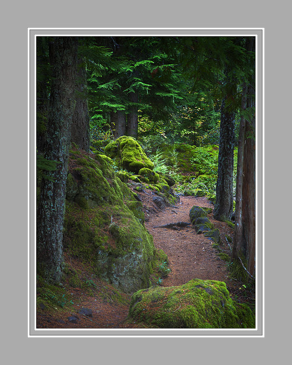
Along the Trail
Jun 22, 2015 19:41:05 #
OK, here is a new one. I'm especially interested in reactions to the composition, aesthetic elements, color, and lighting.
If you see something that really bothers you, please comment. More than once people have pointed out an obvious detail that I simply overlooked.
For those of you who don't care for the mock matting, please understand that I prefer to have you see the image in closer to the context that it will be presented. sometimes the difference between using white, grey, or black matting can be important when it goes before the judges.
Also, if you think you have a better title, please share.
Have at it.
Jun 22, 2015 19:58:51 #
Photographer Jim wrote:
OK, here is a new one. I'm especially interested ... (show quote)
Beautiful photo. I really like the pathway and the way it snakes into the background. I also think the highlights on the moss and the branches are very striking. Lots of detail is visible in the highlights and the shadows. Neither the whites nor the blacks appear to be blown out at all. My only quibble is the greens. I would probably de-saturate the greens just a bit. That is probably personal preference though.
The composition is very nice. The over all effect is very soothing and relaxing. It makes me want to be in the photo. Well done.
Jun 22, 2015 21:13:44 #

I love the composition and the color palette. Shadows are very well balanced, but for my taste, the colors seem to be a bit oversaturated.
Jun 22, 2015 21:30:04 #

Beautifully crafted piece of work Jim. The work of a master. Obviously taken by someone who understands compositional elements fully and knows his equipment inside out.
Colour wise the greens are a tad over saturated but know you would not have missed that its intentional and I have to say in my humble opinion it was the right choice for this image. Im not familiar with the place so could be wildly wrong but on my monitor the pathway looks a little too magenta but you saw the scene not I.
You really just posted another lesson in photography for us mere mortals my friend.
Jun 22, 2015 22:45:58 #
For those commenting so far, thank you for your input. I considered the saturation levels of the greens, and did decide to tone down the ones in the upper portion of the image. In the print, the mosses on the rock, although intense, actually look about right.
Just to clarify things for everyone, Billyspad is NOT my shill, and receives no monetary compensation whatsoever for his comments. At least, that is NOW the case after his obvious colorblind comment concerning a supposed magenta color-cast in the image's path. Some people just don't know when they have it good! :twisted:
Just to clarify things for everyone, Billyspad is NOT my shill, and receives no monetary compensation whatsoever for his comments. At least, that is NOW the case after his obvious colorblind comment concerning a supposed magenta color-cast in the image's path. Some people just don't know when they have it good! :twisted:
Jun 22, 2015 23:02:34 #
Photographer Jim wrote:
For those commenting so far, thank you for your in... (show quote)
I did mention I could be wildly wrong!! My monitor has valves and is powered by solar energy and its a cloudy day and my wife refuses to cook me carrots. What chance does a man stand when faced with that? So do I still get my paycheck now?
Jun 22, 2015 23:11:54 #

Photographer Jim wrote:
OK, here is a new one. I'm especially interested ... (show quote)
Lovely image Jim. Is this Olympic NP? Looks like it. I like the composition with the meandering path. Some folks might fault the foremost rock for "blocking" but I think its a lovely anchor for the base. The textures are, for me, what makes the image exceptional. You can "feel" the contrasting texture of bark and moss due to excellent capture and processing.
Some of the green color is a little off to me. The mosses, which are pretty neon-ish in real life, seem OK. What is throwing me off is the cedar or spruce or whatever the trees are, which seem to need something to tame their tone just a touch. Some of the lichen towards the front is a little "hot" onscreen but I suspect it will tame itself in the print process.
Very nice work. As always.
Jun 22, 2015 23:28:01 #
Billyspad wrote:
I did mention I could be wildly wrong!! My monitor has valves and is powered by solar energy and its a cloudy day and my wife refuses to cook me carrots. What chance does a man stand when faced with that? So do I still get my paycheck now?
I'll think about it. :evil:
Jun 22, 2015 23:37:18 #
minniev wrote:
Lovely image Jim. Is this Olympic NP? Looks like i... (show quote)
Ah yes, the lichen. I was wondering if anyone would comment. By the way, I agree. After making the first test print and while waiting for comments, I slightly backed down the cyan saturation and they calmed down a bit. I think they got pumped up when I was adjusting the contrast. Thanks.
No, not Olympic NP. It was taken along the trail to Lower Proxy Falls in Oregon.
Jun 22, 2015 23:51:17 #

Photographer Jim wrote:
OK, here is a new one. I'm especially interested ... (show quote)
Xxxxxxxxxxxx
Hi, Jim,
The impact of this is identical to that of W.E.Smith's "enchanted Garden" ...out of the darkness and into the light!
Composition is extremely effective; there is a palpable traction of the viewer into the depths of the scene.
Anything that "...really bothers me..." ?
No, but I'd consider some desaturation of the "growing green" in the foliage of the top-center conifer.
Otherwise...let it ride.
Anyone with problematic high blood pressure could benefit from quietly viewing this image!
Dave
Jun 23, 2015 00:14:14 #

My initial impressions are that it's too dark and that the frame is distracting.
Jun 23, 2015 06:49:32 #
Frank2013
Loc: San Antonio, TX. & Milwaukee, WI.
Photographer Jim wrote:
OK, here is a new one. I'm especially interested ... (show quote)
Jim it is such a pleasure to view your work, I wish you would treat us a little more often. What others have already said you are addressing and can print and see the results I won't be redundant. I have not fully analyzed how much or how to go about it but I am sure you will figure it out. The upper most portion of the scene seems naturally dark to me like some kind of vignette. Maybe just the right and left corners. the middle seems to be ok as it is blending into darkness as background. One other nitpick is the bluish brighter limb in the top middle left part of the background.
Jun 23, 2015 08:49:41 #
CanadaNorm
Loc: Ontario Canada
I really like this photograph. Saturation etc. is a bit of a personal preference thing. I do think the foreground moss covered rock is distracting. Perhaps if you desaturated or lowered it's exposure.
Jun 23, 2015 11:00:15 #

Dear Jim,
You've got comments from some of the best photographers on the site, so please take my comments for their minus two cents' worth.
The photo doesn't do anything for me.
I don't like the color saturation.
I don't see a focal point. Does the path end right in the middle, straight ahead, where there's some growth? Does it veer to the right or left? Does it continue straight? I can't tell. I don't know where my eyes should go. I'm sorta stuck right there in the confines of the photo when my mind and heart think I should be meandering on. I do think the boulder at the bottom of the photo anchors the view and, with there being no focal point in the distance, I don't feel invited to move ahead.
There's also no special lighting that might enhance the photo - no rays coming between the trees slanting across the path, for instance. There's more light at the far end of the photo than in front, but the sky and bits of light peeking through look over-exposed.
Because the lighting is best on the large rock on the far left with the lichen, I wonder if that's supposed to be the focal point. If it is, it's uninteresting to me. And again, it stops me in my tracks.
I don't know how I got to this place and I feel I should just turn around and leave. There's nothing there to keep me. I don't see the wonder of nature. I don't feel a breeze. I don't hear birds singing. I don't see the beauty of flowers or smell their sweet scents. There's no rippling brook. There's no place for me to sit and ponder or read.
Sorry about the negative review. Again, please take into consideration that you've already received high praise from the best of the best.
Jun 23, 2015 11:29:59 #

JIm, I am so surprised by all the saturation comments. I was just up at Jay Cooke State Park at the end of May. It has much the same landscape as this. The moss and the trees were this green. It has been raining almost daily in Minnesota and yes ...it is this green! Exactly .. it looks perfectly natural to me.
Anyway .. love the light in this. It leads the eye up ahead .. out into the clearing. I've done hundreds of shots like this and the ones I like have soft, diffused light like this one and the light is placed more like this.
Anyway .. love the light in this. It leads the eye up ahead .. out into the clearing. I've done hundreds of shots like this and the ones I like have soft, diffused light like this one and the light is placed more like this.
If you want to reply, then register here. Registration is free and your account is created instantly, so you can post right away.