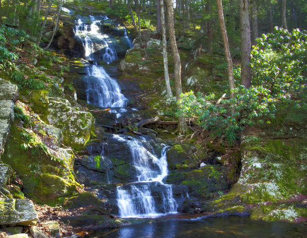
Buttermilk Falls, NJ along the Dellaware river
Mar 19, 2012 14:47:58 #
Shot with a Sony DSLR-A850 3 times EV -1, 0, and +1. All 3 picture were combined for HDR in Photoshop CS5. Each picture was shot using ISO 500, TS 1/20, TA F13 and focal length of 26mm.
What is your impression?
What is your impression?
Buttermilk Falls
Mar 19, 2012 15:33:00 #
Mar 19, 2012 15:43:30 #

Love waterfalls,but not too many in my state. Love these you have photographed. Would be inviting to walk thru them on a hot summer day.
Mar 20, 2012 09:29:12 #
Mar 20, 2012 12:57:31 #

Mar 20, 2012 15:32:13 #

Mar 20, 2012 16:02:28 #
I love the composition and waterfalls are one of my all time favorite things to photograph, but to my eye the colors don't look right. Also, for a 3 shot image it seems that there should be more contrast.
Just out of curiosity, is there a reason why you shot with the ISO at 500? Based on the image above it looks like there was plenty of light so that you wouldn't have to bump it up that much....
Just out of curiosity, is there a reason why you shot with the ISO at 500? Based on the image above it looks like there was plenty of light so that you wouldn't have to bump it up that much....
Mar 20, 2012 16:18:18 #
I shot at ISO 500 in order to get F13 (depth of field), I could have adjusted the Ts, but there were too many people wandering in and out and I didn't want to take a chance as well as wind factors. The shot was taken at 4:11pm and the sun was just about to go behind the hill. The bluish cast on the waterfall comes from richer tone in On One special effects, to give it a cold glow against a warm forest. This was my first attempt at HDR and I could have shot +2 and -2 for a better seperation or more contrast shots. It might be a hare to bluish, but I am shade blind and that is the best I could do with my eyes. Thank you for the your comment, it will help me improve.
Jewell wrote:
I love the composition and waterfalls are one of my all time favorite things to photograph, but to my eye the colors don't look right. Also, for a 3 shot image it seems that there should be more contrast.
Just out of curiosity, is there a reason why you shot with the ISO at 500? Based on the image above it looks like there was plenty of light so that you wouldn't have to bump it up that much....
Just out of curiosity, is there a reason why you shot with the ISO at 500? Based on the image above it looks like there was plenty of light so that you wouldn't have to bump it up that much....
Mar 20, 2012 16:48:25 #
Ahhh...yeah wind and people! Always fun things to shoot around. =)
I think maybe part of the contrast issue is as a result of the high ISO in combination with only a -1 and +1 separation. I could be wrong though.
Maybe also part of the color thing to my eye might be the process that Photoshop uses versus other programs like Photomatix to make the HDR image. I've never used Photoshop's HDR processing so I can't be sure.
My mom always told me "practice makes perfect". I always thought she was full of it. I'm finding that photography is just another way for my mother to chant this at me from the heavens. =) hehe
Look forward to your 2nd, 3rd, 4th, 10th tries! =)
If you want to reply, then register here. Registration is free and your account is created instantly, so you can post right away.