display
May 13, 2015 07:29:22 #

I have been invited to display my images at the local hospital, I am having trouble picking out samples as I am my own worst critic, can you please comment on good choices? Thank you!
(Download)
(Download)
(Download)
(Download)
(Download)
(Download)
(Download)
(Download)
(Download)
(Download)
(Download)
(Download)
(Download)
(Download)
(Download)
(Download)
(Download)
(Download)
(Download)
(Download)
May 13, 2015 07:34:43 #
May 13, 2015 07:38:36 #

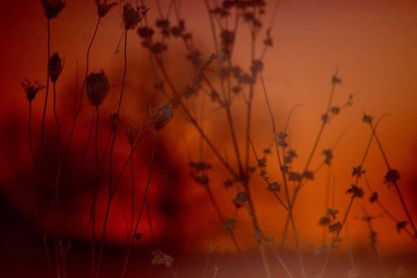
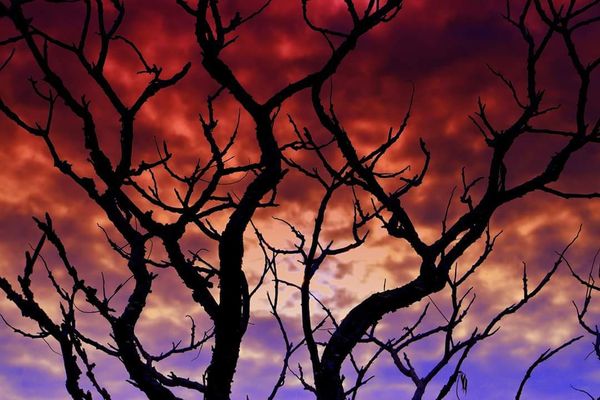
Not that my opinion matters, but numbers two and three are terrific! I don't care all that much for the first, but it's a nice enough shot, just eye of the beholder.
How nice you received the invitation, and clearly it's well deserved!
How nice you received the invitation, and clearly it's well deserved!
May 13, 2015 07:41:11 #
Treepusher wrote:
Not that my opinion matters, but numbers two and three are terrific! I don't care all that much for the first, but it's a nice enough shot, just eye of the beholder.
How nice you received the invitation, and clearly it's well deserved!
How nice you received the invitation, and clearly it's well deserved!
Thank you I am trying to add more please check back if you can
May 13, 2015 07:49:38 #
wendyjo wrote:
I have been invited to display my images at the local hospital, I am having trouble picking out samples as I am my own worst critic, can you please comment on good choices? Thank you!
3,1,6,5. In that order. Love 3.
May 13, 2015 07:52:59 #
Yooper 2 wrote:
3,1,6,5. In that order. Love 3.
Thanks, still adding , please check back, this is taking longer than I thought
May 13, 2015 07:59:52 #

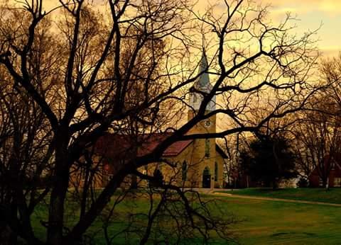
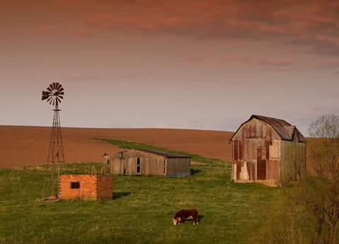
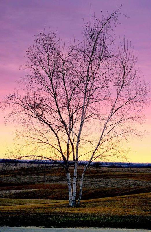
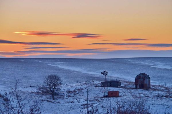
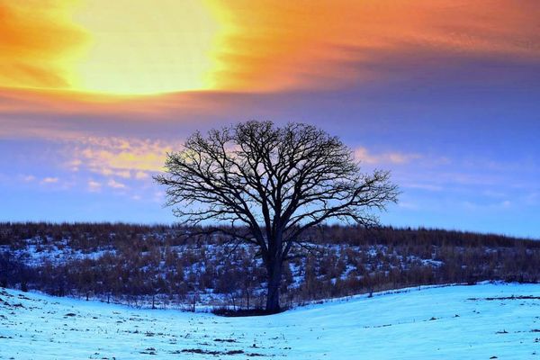
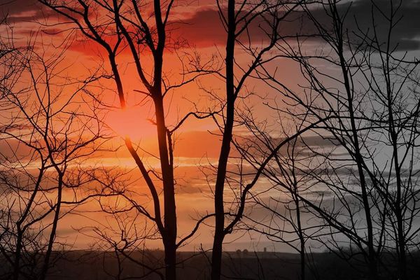
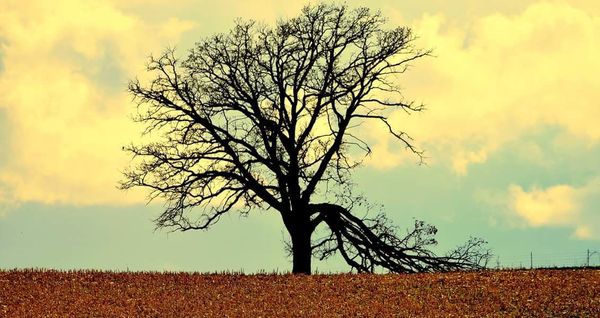
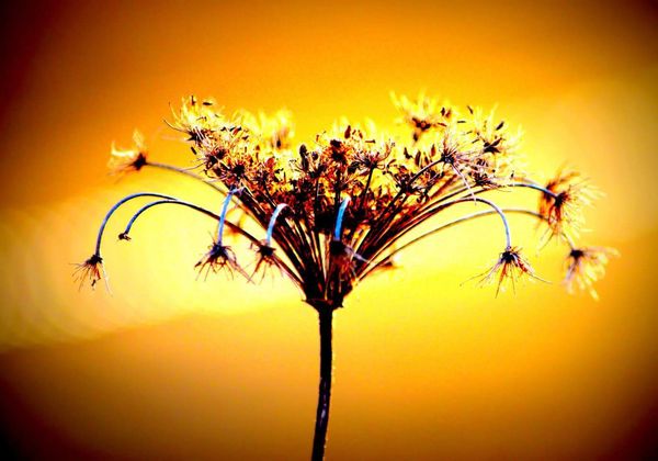
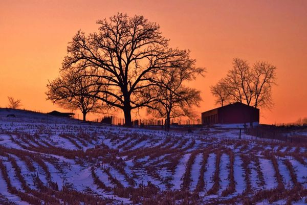
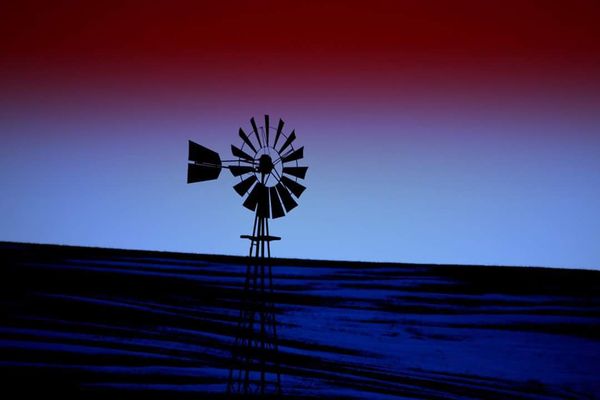
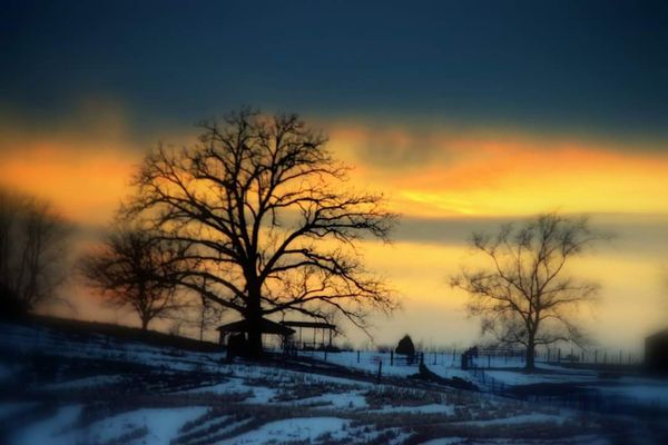
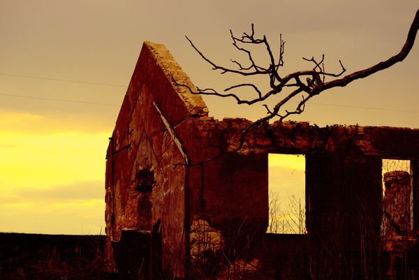
You need not take this to heart, as I just came back and don't think you have anything of mine to look at yet for my quality of work, but I am responding because it seemed like you wanted feedback, and I know I always like people to comment on my works. #1 displays well with the church being lit through the tree by the sun, although it would be nicer if the tree were not as thick with branches (we cannot control mother nature), #3 is fabulous in composition and coloration, and #5 has a beautiful strata of colors from the sunset in the sky as it does in the field; a marvelous piece. #2 has nice color and the composition is ok and I like it, but I can't say there is any one thing that stands out about it, and #5 should be a good picture, but I think it is simply too dark.
May 13, 2015 08:23:24 #
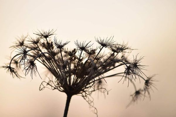
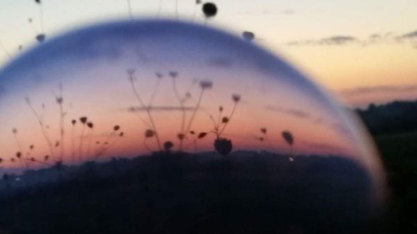
I believe that any of these would cause one to pause when walking down the hospital corridor. My order of preference is as follows: 2,3,9,10,1,4,8,6,7,5
Putting pictures 2 and 10 side by side would be of interest since they are the same subject at different times of year.
I like your sense of composition.
Putting pictures 2 and 10 side by side would be of interest since they are the same subject at different times of year.
I like your sense of composition.
wendyjo wrote:
I have been invited to display my images at the local hospital, I am having trouble picking out samples as I am my own worst critic, can you please comment on good choices? Thank you!
May 13, 2015 08:31:14 #
May 13, 2015 10:38:34 #
1,2,3,4,9,17, and 19
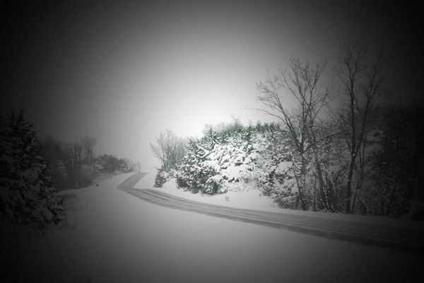
The rest simply are not to a displayable level. Do not show the B/W's. The last leave on the computer.
Take your VERY best, never put in a less than your best. It will detract to a huge degree from your other work, and will be the image and opinion that viewers will take away with them. Some of those I chose because I looked at the region you will be showing them in...always try to play to the audience. ;)
May 13, 2015 10:56:06 #

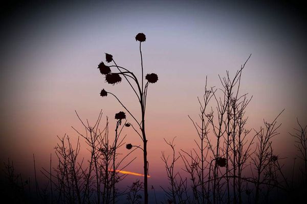
Here's my opinion..... ;) I like the 1st one But it doesn't seem quite straight. I like 4, & I like 5 but the horizon isn't straight, I like 12 but I would crop it differently. really like the colors of 13. (One thing to remember - always check the horizon levels - I learned that from UHH) ;)
May 13, 2015 12:26:32 #
ok, back again in response to all the photos. I agree with Didereaux with all of them, except that I also like number 10.
I also disagree with MissStephie about straightening the hoirizon on number 5, because the base of the tree is straight and would look atilt if you straightened the horizon.
I also disagree with MissStephie about straightening the hoirizon on number 5, because the base of the tree is straight and would look atilt if you straightened the horizon.
May 14, 2015 09:10:27 #
May 14, 2015 09:15:12 #
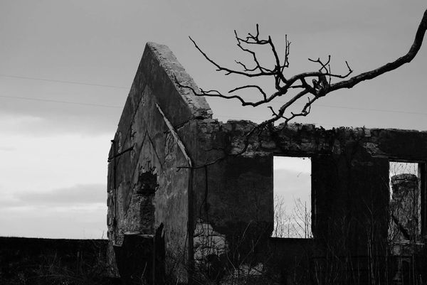
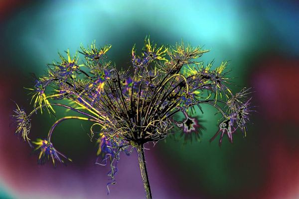
not at all, I rather like this color version! It gives some depth to the picture.
May 14, 2015 10:55:33 #
lishareading wrote:
not at all, I rather like this color version! It gives some depth to the picture.
So this is a yes, I see the confusion, I called it a ruin.....
If you want to reply, then register here. Registration is free and your account is created instantly, so you can post right away.