3 vetsions of mid-tone contrast
Apr 26, 2015 12:59:45 #

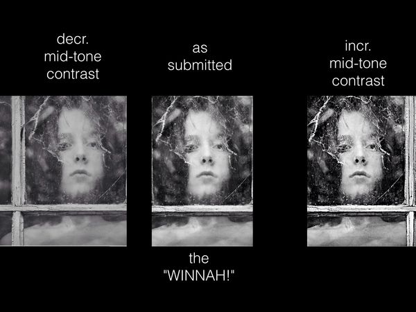
from an image submitted to Critique Section.
the OP (jim hill) suggested trying the comparison snd posting .
Dave in SD
the OP (jim hill) suggested trying the comparison snd posting .
Dave in SD
Apr 26, 2015 13:12:15 #

With sincere respect, Dave, I pick Girl #3; my failing eyesight tends to go for increased contrast (and girls)
Apr 26, 2015 13:27:50 #

I'm surprised at how much it demisted/de-hazed the window. I'd always assumed that haze and mist were a problem at the bright end of the luminosity range. Then again, Clarity affects contrast in the mid-tone range, and Clarity can be used to demist/de-haze, so perhaps I shouldn't have been too surprised.
If you don't mind me asking, how did you alter the contrast specifically in the mid-tone range?
If you don't mind me asking, how did you alter the contrast specifically in the mid-tone range?
Apr 26, 2015 13:39:05 #
jim hill
Loc: Springfield, IL
Uuglypher wrote:
from an image submitted to Critique Section.
the OP (jim hill) suggested trying the comparison snd posting .
Dave in SD
the OP (jim hill) suggested trying the comparison snd posting .
Dave in SD
I much prefer the middle one. I had tried more contrast but doing so was much to harsh for the girls iridescent skin. This model had a glow about her whole being that I tried to capture. She is the soft beautiful skinned person you see in my original - the middle one. The one on the left is pretty flat, don't you think?
The window was quite dirty not having been tended to in many years. That was part of the challenge to me - to capture this person's beauty through all the ravages of time without destroying the effect.
Thanks for showing me what you meant. I do now understand.
Apr 26, 2015 13:47:47 #
R.G. wrote:
I'm surprised at how much it demisted/de-hazed the window. I'd always assumed that haze and mist were a problem at the bright end of the luminosity range. Then again, Clarity affects contrast in the mid-tone range, and Clarity can be used to demist/de-haze, so perhaps I shouldn't have been too surprised.
If you don't mind me asking, how did you alter the contrast specifically in the mid-tone range?
If you don't mind me asking, how did you alter the contrast specifically in the mid-tone range?
Normally, on my desk-top, i'd use the tone curve to reduce slope steepness in the appropriate brightness range.
These example were done quickly on the iPad with the "Photogene" Clarity slider. To lower contrast I just went global by nudging the contrast slider to the left a tad.
Apr 26, 2015 13:54:23 #
jim hill wrote:
I much prefer the middle one. I had tried more con... (show quote)
if there was any doubt as to my placement of "the WINNAH !" there's nomquestion in my mind that your original version is the preferred one for the reasons you stated so well. "Luminous iridesense" !!!!
Dave
Apr 26, 2015 13:56:00 #
Uuglypher wrote:
Normally, on my desk-top, i'd use the tone curve to reduce slope steepness in the appropriate brightness range.
These example were done quickly on the iPad with the "Photogene" Clarity slider. To lower contrast I just went global by nudging the contrast slider to the left a tad.
These example were done quickly on the iPad with the "Photogene" Clarity slider. To lower contrast I just went global by nudging the contrast slider to the left a tad.
Thanks for the info. I seem to remember that Curves gave a good visual representation of what was being affected. But I always found the Blacks/Shadows/Brightness/Highlights/Whites sliders more intuitive for some reason
Apr 26, 2015 16:15:42 #
jim hill
Loc: Springfield, IL
Uuglypher wrote:
if there was any doubt as to my placement of "the WINNAH !" there's nomquestion in my mind that your original version is the preferred one for the reasons you stated so well. "Luminous iridesense" !!!!
Dave
Dave
Thanks Dave. I always want to know if someone has an idea. And you stated it so appropriately. I appreciate that.
Apr 27, 2015 10:03:16 #

Uuglypher wrote:
from an image submitted to Critique Section.
the OP (jim hill) suggested trying the comparison snd posting .
Dave in SD
the OP (jim hill) suggested trying the comparison snd posting .
Dave in SD
It depends on the story you want to tell.
For me the right one is out as completely unrealistic. I lean towards the left one (decreased contrast) because it is more realistic with the dirty window and for me tells the story of looking through a dirty window better...more dreamy. The girl is longing to be outside that window and see better what she is looking at.
But if, as you noted, you want to emphasize the beauty of the girl I can understand preferring the center one.
Apr 27, 2015 11:28:49 #

Uuglypher wrote:
from an image submitted to Critique Section.
the OP (jim hill) suggested trying the comparison snd posting .
Dave in SD
the OP (jim hill) suggested trying the comparison snd posting .
Dave in SD
No version really diminishes the impact of this interesting image, but I like the original version best. It seems more consistent with the time period my mind has assigned to it, so it may just be my own impression rather than some objective opinion.
I am afraid I don't have any objective opinions anyway.
Apr 27, 2015 13:54:19 #
jim hill
Loc: Springfield, IL
minniev wrote:
No version really diminishes the impact of this interesting image, but I like the original version best. It seems more consistent with the time period my mind has assigned to it, so it may just be my own impression rather than some objective opinion.
I am afraid I don't have any objective opinions anyway.
I am afraid I don't have any objective opinions anyway.
Me either - I am totally subjective when it comes to making pictures; somewhat objective when selecting, I hope.
Apr 27, 2015 21:09:05 #

Uuglypher wrote:
from an image submitted to Critique Section.
the OP (jim hill) suggested trying the comparison snd posting .
Dave in SD
the OP (jim hill) suggested trying the comparison snd posting .
Dave in SD
My choice, as well. I think the mid-range tonality gives a certain depth, while maintaining the mystique of the subject.
The far right version is just too harsh. The one on the left is lacking impact.
--Bob
If you want to reply, then register here. Registration is free and your account is created instantly, so you can post right away.